Jump to content

Photo

Flucht's Avatars


  • Please log in to reply
30 replies to this topic

#21 Sahardy

Sahardy

    Veteran

  • Members
  • PipPipPip
  • 1,399 posts

Posted 08 February 2013 - 02:37

And just to prove that I can make the same boring crap as everyone else, I decided to go with the faded and dull style that everyone else seems to be using for their sigs. In my opinion these look like crap. I prefer my own style but whatever

Posted Image


Not "everyone" does that.
That avatar is just: Background - Render - Scanlines - Text

Sahardy.gif
good photographyer. great drawer. but im most best at photoshop.


#22 TreeFrog

TreeFrog

    Veteran

  • Members
  • PipPipPip
  • 2,739 posts
  • Badge

Posted 08 February 2013 - 02:47

Indeed. I do anime stuff because I enjoy it. It poses a challenge for me because in order to make it work you have to be able to edit properly. I prefer brighter colors and things that stand out. I really dislike the styles everyone prefers. they all look like crap to me.


Not really a good tactic to go bashing everyone else. Make friends not enemies. 8)

#23 flucht

flucht

    New Member

  • Members
  • Pip
  • 25 posts

Posted 08 February 2013 - 06:35

Wasn't bashing. Just saying that I don't like the particular styles most people use. I like my avatars. I agree they could be a bit better. I'm just a bit frustrated with some of the people coming into my avi thread telling me that my work is shit. *shrug* I'm not upset =D Just here to make FS a better looking place xD

FluchtTWIMCz_zps8ece50fa.png


#24 flucht

flucht

    New Member

  • Members
  • Pip
  • 25 posts

Posted 08 February 2013 - 06:37

And just to prove that I can make the same boring crap as everyone else, I decided to go with the faded and dull style that everyone else seems to be using for their sigs. In my opinion these look like crap. I prefer my own style but whatever

Posted Image


Not "everyone" does that.
That avatar is just: Background - Render - Scanlines - Text


Okay so what do you suppose I add to it? There is only so much you can put into a 200x200 box without making it look cluttered and unorganized. I'm at a loss for ideas here. some advice?

FluchtTWIMCz_zps8ece50fa.png


#25 PeterOwnz

PeterOwnz

    Veteran

  • Members
  • PipPipPip
  • 1,126 posts

Posted 08 February 2013 - 06:46

c4d effect renders set to different layer modes and blended in, sometimes if you motion blur all the c4d and the background you can get some more flow as well, and one of the hardest part of any graphic design project is that it is almost never for you, its not your aesthetic's that you are trying to please. I know I am a noob at making avi's and you probably don't want me of all the artists to be telling you what you can do, but perhaps less contrast? all of your avis seem to have a high level of contrast that is kind of bringing the quality down. And a few color correction overlays can be helpful as well.
I am not trying to mean and I'm not saying they are terrible. :D
ezgif-com-gif-maker-20.png

#26 flucht

flucht

    New Member

  • Members
  • Pip
  • 25 posts

Posted 08 February 2013 - 07:02

c4d effect renders set to different layer modes and blended in, sometimes if you motion blur all the c4d and the background you can get some more flow as well, and one of the hardest part of any graphic design project is that it is almost never for you, its not your aesthetic's that you are trying to please. I know I am a noob at making avi's and you probably don't want me of all the artists to be telling you what you can do, but perhaps less contrast? all of your avis seem to have a high level of contrast that is kind of bringing the quality down. And a few color correction overlays can be helpful as well.
I am not trying to mean and I'm not saying they are terrible. :D


Thanks =] I think the contrast problem is coming from one of the filters I use. I should increase the opacity on the textures I lay over the images. I noticed that as well. I appreciate the feedback. I'm working on them a bit and I think they've gotten better within the last few days but who am I to judge my own work >.<

FluchtTWIMCz_zps8ece50fa.png


#27 PeterOwnz

PeterOwnz

    Veteran

  • Members
  • PipPipPip
  • 1,126 posts

Posted 08 February 2013 - 07:04

c4d effect renders set to different layer modes and blended in, sometimes if you motion blur all the c4d and the background you can get some more flow as well, and one of the hardest part of any graphic design project is that it is almost never for you, its not your aesthetic's that you are trying to please. I know I am a noob at making avi's and you probably don't want me of all the artists to be telling you what you can do, but perhaps less contrast? all of your avis seem to have a high level of contrast that is kind of bringing the quality down. And a few color correction overlays can be helpful as well.
I am not trying to mean and I'm not saying they are terrible. :D


Thanks =] I think the contrast problem is coming from one of the filters I use. I should increase the opacity on the textures I lay over the images. I noticed that as well. I appreciate the feedback. I'm working on them a bit and I think they've gotten better within the last few days but who am I to judge my own work >.<

good sir it is time for you to hold a cnc thread!
ezgif-com-gif-maker-20.png

#28 PeterOwnz

PeterOwnz

    Veteran

  • Members
  • PipPipPip
  • 1,126 posts

Posted 08 February 2013 - 07:08

try this out: http://mizoresyo.dev... ... -349208808
its a tut made by a friend, it is fairly simple and Gimp-compatible
ezgif-com-gif-maker-20.png

#29 flucht

flucht

    New Member

  • Members
  • Pip
  • 25 posts

Posted 27 April 2013 - 14:29

try this out: http://mizoresyo.dev... ... -349208808
its a tut made by a friend, it is fairly simple and Gimp-compatible

Thanks Peter. I've been working on my technique quite a bit. your support is appreciated.


FluchtTWIMCz_zps8ece50fa.png


#30 Sustortias

Sustortias

    Veteran

  • New Members
  • PipPipPip
  • 2,214 posts

Posted 27 April 2013 - 21:11

Gimp is as good as PS really.


I use PS just cos I like the adjustment filters, gimp has some amazing features that ps doesn't & is uber good for text.


Keep at it, your better than I was when I started out (heck I was a slapper & just didn't know it LOL).


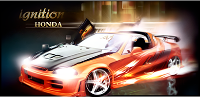
Ignition_Honda_410x200_zps03cc040c.png


#31 flucht

flucht

    New Member

  • Members
  • Pip
  • 25 posts

Posted 02 May 2013 - 19:19

Gimp is as good as PS really.


I use PS just cos I like the adjustment filters, gimp has some amazing features that ps doesn't & is uber good for text.


Keep at it, your better than I was when I started out (heck I was a slapper & just didn't know it LOL).

That's just it, I'm not just starting >.< I've been doing this for years. I'm just more used to sigs. 


FluchtTWIMCz_zps8ece50fa.png


1 user(s) are reading this topic

0 members, 1 guests, 0 anonymous users

Font:
Arial | Calibri | Lucida Console | Verdana
 
Font Size:
9px | 10px | 11px | 12px | 10pt | 12pt
 
Color: