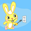
Just made this moments ago. CnC 
p.s. my real name is Tyler  Sssshhhhhhhhhhhhh...
Posted 06 January 2014 - 08:26
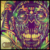
Just made this moments ago. CnC
p.s. my real name is Tyler Sssshhhhhhhhhhhhh...

So who wants to buy me Zombie Brand on League of Legends?
Posted 06 January 2014 - 20:52
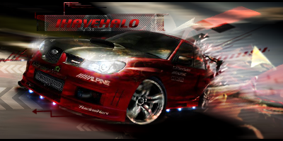
The smudging technique is pretty good, but the render is really bad as it doesn't have much to do with the colours you used. Also you should had used abit more of dark colours to create contrast with the huge amount of bright spots on the background.
And placement, thats really messy. At first look your sig is very distracting, when I try to focus on the render I get distracted by text, when I look at text the background pops up, and it goes on and on.
I think if you practice this skill abit more we can expect pretty interesting pieces coming up
Posted 06 January 2014 - 22:24
The smudging technique is pretty good, but the render is really bad as it doesn't have much to do with the colours you used. Also you should had used abit more of dark colours to create contrast with the huge amount of bright spots on the background.
And placement, thats really messy. At first look your sig is very distracting, when I try to focus on the render I get distracted by text, when I look at text the background pops up, and it goes on and on.
I think if you practice this skill abit more we can expect pretty interesting pieces coming up
Thanks for the CnC. I plan on doing some more. I was going for a pop culture type of feel. But yea, that was the only storm trooper I could find that I thought might work for this goal "look". The head and elbow where cut in the pic hence the placement issues. But, I truly appreciate the CnC. I think one of my biggest weaknesses is creating amazing contrast using dark colors. Definitely something I need to work on.
Any more CnC guys would be much appreciated after all, its how we all get better!
So who wants to buy me Zombie Brand on League of Legends?
Posted 09 January 2014 - 14:00
The flag looks a little flat. Maybe try putting it on a different layer, like you should have anyways in your .psd file, and duplicating the layer a few times. That will make it more visible, kind of like the opacity setting. Also, the blue smudge in the bottom corner looks off and there is a weird spot on the gun and two weird lines below the edges of the "l". Don't take this personally though, Iove your work! 
Edit: I see the lines under every letter. Maybe it was intentional?
Edited by beLIEve, 09 January 2014 - 14:01.
0 members, 1 guests, 0 anonymous users