Jump to content

Photo

GGT Voting Round 2 -- Child's Imagination.


  • Please log in to reply
50 replies to this topic

#1 WarQueen

WarQueen

    Veteran

  • Members
  • PipPipPip
  • 2,185 posts
  • Badge

Posted 11 November 2013 - 17:38

Welcome to the 7th Grand Graphics Tournament -- ROUND 2!. Artists today are gathered together to do a battle royal for top bragging rights and a bit of a prize. Who wins?

Well, that my fellow players is up to you!


The theme you're voting on is 'Child's Imagination'.


What is 'Child's Imagination'?

A child has an amazing gift to see the world diffently from that of an adult. While adults see an ordinary toy, a child sees a world of adventure or their best friend (i.e. Calvin and Hobbes).

A child will carry on a conversation with a friend who is invisible or inanimate to the adult's eye yet completely visible or animate to the child's eye (atleast in their imagination).

A child sees a favorite toy as a protector against the boogeyman in the closet.

Etc. etc. etc.


Below you'll find the entries. Please take a moment and look them over, vote for those in each set that you find most appealing and give a bit of a reason for your rating.

Please rate each entry in each group on a scale of 1 to 10 with a vote of 10 being 'this blows my mind it is so good' and 1 being 'this is phale'.

You have up to 15 points to distribute between the two entries in each grouping.

You DO NOT need to give out all 15 points. The MAX you can give is 10 points on 1 piece per group.


(Note: 10 points = +1, 5/10 = +.5, etc etc on tally sheet)

Please include a reason with your votes - you only have to give a reason for one per set. It doesn't have to be technical. You can just say I liked this one best, or something along those lines but we all know an artist thrives on feedback so don't hesitate to really say what you think.

If your vote looks like you're trolling or joking I will contact you about it, and it won't count unless I'm satisfied that you weren't trolling.

Example:

Group samples

a 10/10 - I like it, it is a decent composition. / Good but could use (insert suggestion)
b 5/10 - I don't care for it. / Needs work

or

a 5/10
b 8/10 - I liked this one best of this group
c 2/10

Voting closes at 23:00 Server Time on Wednesday November 13th

Votes that do not have a reason will not be counted. (You may say "I liked this one best from this group" or something simple - no need for a full cnc)

*artists, you may vote, but do not skip your own group, votes will be adjusted when tallied.


Please vote for every grouping.


On behalf of my fellow artists, thank you for taking the time to vote and I hope you enjoy the bounty of art that is being laid before you.


NOTE: Everyone who votes will be entered into a drawing for a FREE avatar!! 3 people will be randomly selected after the voting.


Edited by WarQueen, 12 November 2013 - 12:54.

WarQueenSig1_zpsfe2b03d4.png


#2 WarQueen

WarQueen

    Veteran

  • Members
  • PipPipPip
  • 2,185 posts
  • Badge

Posted 11 November 2013 - 17:38

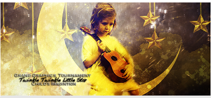
Group 1


A ) By ArtistGorn

The artist wished to have their entry removed. Reason unknown.


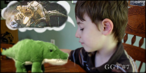
B ) By clock96

msg-34948-0-45838800-1383679721.jpg


GROUP 2


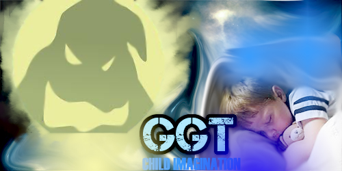
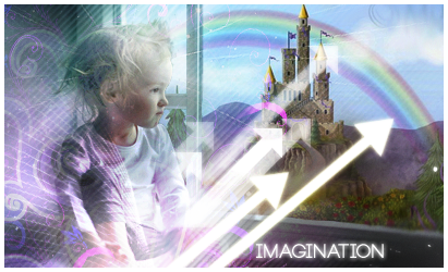
A ) By jzaz

GGTENTRYROUNDTWO_zpsfa171dc6.png


B ) By MindyN5

vyWyFiJ.png


GROUP 3


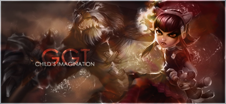
A ) By beanopoly

GGTChildsImaginationSig1-Round2_zps898f3


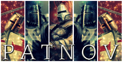
B ) By patnov

fw8l.jpg


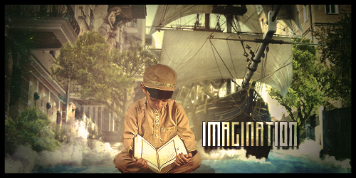
GROUP 4


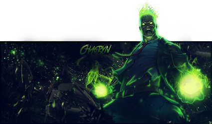
A ) By Chagryn

GGTEntry2B_zps134899cc.png


B ) By ghetoghost

GGTround2_zps975c591d.png


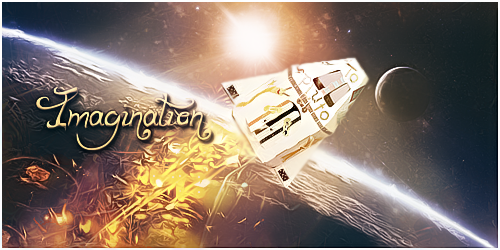
GROUP 5


A ) By zeder

GGT721_zpseac22c14.png


B ) By jsustin12

byjsustin12.png


Edited by WarQueen, 14 November 2013 - 18:57.

WarQueenSig1_zpsfe2b03d4.png


#3 WarQueen

WarQueen

    Veteran

  • Members
  • PipPipPip
  • 2,185 posts
  • Badge

Posted 11 November 2013 - 17:39

Tally Sheet


G1

A - 11.2

B - 7.4


G2

A - 9.95

B - 10.05


G3

A - 9.9

B - 9.3


G4

A - 12.6

B - 7.9


G5

A - 5.9

B - 9.6


Edited by WarQueen, 14 November 2013 - 18:50.

WarQueenSig1_zpsfe2b03d4.png


#4 Kijjum

Kijjum

    Member

  • Members
  • PipPip
  • 398 posts
  • Badge

Posted 11 November 2013 - 19:08

G1

A -10/10- it's very nice, it puts the imagination in the room :)

B -5/10- it's kind of blurry and not enough detail, still good tho :)


G2

A -7/10 looks nice, i like the daydreaming aspect

B -8/10 i like how you mixed the iron man with the kid :P


G3

A -7/10 sorry, not enough points to give them both 10

B -8/10 i love it, him looking out to the castle is amazing


G4

A -10/10 it's amazing, favorite one. that's what i feel like when reading

B -5/10 still nice, again, not enough points to spread out


G5

A -5/10 i don't really like this one, sorry. it's blurry, but nice try :)

B -10/10 i like this one, perfect with the astronaut theme


#5 volcom

volcom

    Member

  • Members
  • PipPip
  • 236 posts
  • Badge

Posted 11 November 2013 - 19:12

G1:

A- 7/10 Good effects, I think the artist tried to get a little too much to go with this one. Overall decent piece.

B- 6/10 A little blunt and to the point. Not a bad piece though.


G2:

A-10/10 utterly amazing. This exactly what I would imagine a child's imagination is like.

B-5/10 Again effects are nice but not really sure what the artist trying to convey. It might be just me but I do not see a child's imagination anywhere in this one.


G3: 

A-10/10 I like this one a lot. Definitely my favorite one. 

B-5/10 This is okay but the artist did not do a very good job blending the different images together. This was either rushed or just plain laziness.


G4:

A-3/10 No. Just no.

B-9/10 Exquisite. I love it. Flames could have been a little better though.


#6 Roan

Roan

    Veteran

  • Members
  • PipPipPip
  • 6,278 posts
  • Badge

Posted 11 November 2013 - 19:45

CQ, votes per group do have to give 15 points altogether?

What if (I don't mean it's the case), both entries in a group are poor, we must split the 15 even though it's not what we would give?.


Just making sure I understand what I read, or not. :P


Firesinged_zpsd6b00c6e.png


#7 MindyN5

MindyN5

    New Member

  • Members
  • Pip
  • 27 posts

Posted 11 November 2013 - 20:23

G1

A - 10/10 Amazing. Amazing effects and this so perfectly put together from all the ingredients involved to the theme. Perfect.

B - 2/10 I like the idea of self made effects and the things included, but the rest leave much room for hope.


G2

A - 6/10 I had this exact same idea. Out come is nice, but these arrows cover lot of area that could have more ingredients.

B - 7/10 I get a feeling as if the kid in the image is deep within his imagination becoming the iron man.


G3

A - 6/10 Nice image, however does not have anything to do with imagination. Tibbers is real ;)

B - 4/10 Well, generally decent image, doesn't make me see the imagination. Also that c4d going over the kids neck, is an issue.


G4

A - 8/10 Nice image. Includes all the ingredients again. Star twinkle at the top gives in illusion of imagination. Ugly borders.

B - 5/10 Nice image again, but character blending to background is off too much. The background should be in this case adjusted.


G5

A - 8/10. Idea itself is so flawless and understandably very hard to execute for this purpose. How ever its made well and the not 10 pts comes from blurs at wrong places.

B - 4/10 If only this image had something to do with kids, or with imagination, it would be quite great, but I feel like its so much off the theme that I have to give it only this.


I mean not to offend anyone, I try to give feedback according to my own perspective of this whole competition.


zBAD9V9.png?1


#8 Patnov

Patnov

    Member

  • Members
  • PipPip
  • 382 posts

Posted 11 November 2013 - 23:08

I will vote tomorrow... CQ, i'm eligible for one free avi?  :D  lol Joking, i only use my avis.... ;)


Patnovsig.png


Sig By DMR > Thx Dear, i love it!


#9 jsustin212

jsustin212

    Veteran

  • Members
  • PipPipPip
  • 3,554 posts

Posted 12 November 2013 - 02:35

G1:

A- 7/10 Good effects, I think the artist tried to get a little too much to go with this one. Overall decent piece.

B- 6/10 A little blunt and to the point. Not a bad piece though.


G2:

A-10/10 utterly amazing. This exactly what I would imagine a child's imagination is like.

B-5/10 Again effects are nice but not really sure what the artist trying to convey. It might be just me but I do not see a child's imagination anywhere in this one.


G3: 

A-10/10 I like this one a lot. Definitely my favorite one. 

B-5/10 This is okay but the artist did not do a very good job blending the different images together. This was either rushed or just plain laziness.


G4:

A-3/10 No. Just no.

B-9/10 Exquisite. I love it. Flames could have been a little better though.


you missed a group


jsus_zpsa8d5d247.png


#10 ghetoghost

ghetoghost

    Veteran

  • Members
  • PipPipPip
  • 1,564 posts

Posted 12 November 2013 - 03:27

G1

A - 10 Amazingness!

B - 5 Feels to blah


G2

A - 9 Great piece, not my style though

B - 6 Blah but not as blah


G3

A - 10 Freaking sexy!

B - 5 The child looks creepy 


G4

A - 9 I feel like this piece captures the child imagination the most

B - 6 Blah and blah


G5

A - 7

B - 8 

A captured the theme while i feel like B had nothing to deal with the theme. B is sexy but i would give both lower scores if i could 


~ ~ ~ ~ ~ ~ ~ ~ ~ ~ ~ ~ ~ Live. Love. Learn. Die. ~ ~ ~ ~ ~ ~ ~ ~ ~ ~ ~ ~ ~


Are you an artist? Want to be listed as one under the Artist Directory; click here


#11 WarQueen

WarQueen

    Veteran

  • Members
  • PipPipPip
  • 2,185 posts
  • Badge

Posted 12 November 2013 - 04:47

CQ, votes per group do have to give 15 points altogether?

What if (I don't mean it's the case), both entries in a group are poor, we must split the 15 even though it's not what we would give?.


Just making sure I understand what I read, or not. :P

Whoops! Thank you, Roan!! That was suppose to read "Do Not".


I will vote tomorrow... CQ, i'm eligible for one free avi?  :D  lol Joking, i only use my avis.... ;)

Yes, you would be eligible. And why not? You don't like other people's avis? o.O


WarQueenSig1_zpsfe2b03d4.png


#12 SlntScream

SlntScream

    Member

  • Members
  • PipPip
  • 466 posts

Posted 12 November 2013 - 10:54

G1

A - 9/10 Perfect idea and theme, it just seems a tiny bit overdone and messy in some places.

B - 4/10 Cute idea but could've been better executed, the sizing of the images and text bothers me alot


G2

A - 10/10 Adorable! My favorite of all the entries

B - 5/10 Not a bad piece, I like that it's different


G3

A - 7/10 Overall well done but I'm not feelin' the creativity

B - 4/10 It's a bit plain and doesn't blend at all


G4

A - 10/10 Second fav. Great idea, theme and execution

B - 3/10 I just don't like this one (sorry!).. the neutral colors/off shading choices make this one kinda depressing


G5

A - 3/10 A good idea but the artist couldn't execute it well

B - 7/10 A decent piece, I'm loving the text, just don't think it captures the theme as well as the others


TluddMk.png


#13 WarQueen

WarQueen

    Veteran

  • Members
  • PipPipPip
  • 2,185 posts
  • Badge

Posted 12 November 2013 - 12:58

G1:

A- 7/10 Good effects, I think the artist tried to get a little too much to go with this one. Overall decent piece.

B- 6/10 A little blunt and to the point. Not a bad piece though.


G2:

A-10/10 utterly amazing. This exactly what I would imagine a child's imagination is like.

B-5/10 Again effects are nice but not really sure what the artist trying to convey. It might be just me but I do not see a child's imagination anywhere in this one.


G3: 

A-10/10 I like this one a lot. Definitely my favorite one. 

B-5/10 This is okay but the artist did not do a very good job blending the different images together. This was either rushed or just plain laziness.


G4:

A-3/10 No. Just no.

B-9/10 Exquisite. I love it. Flames could have been a little better though.


Votes won't be counted unless you vote for all 5 groups. Sorry.


WarQueenSig1_zpsfe2b03d4.png


#14 WarQueen

WarQueen

    Veteran

  • Members
  • PipPipPip
  • 2,185 posts
  • Badge

Posted 12 November 2013 - 13:14

Everyone, remember to tell your guildmates & friends to come VOTE and to be entered into a drawing for a FREE avatar! :)


WarQueenSig1_zpsfe2b03d4.png


#15 Roan

Roan

    Veteran

  • Members
  • PipPipPip
  • 6,278 posts
  • Badge

Posted 12 November 2013 - 13:17

GROUP 1

A- 7/10: Love the concept, love the bright colors. This piece is very well executed. What I dislike about it is too much is going on, some things are too dristracting for the eye and it's hard focusing. Lacks a bit of flow also.

B- 2/10: Concept is very basic, piece looks plain and text is not great. Piece needs some work on execution to had dept, flow, colors, etc.


GROUP 2

A- 6/10: Concept is right on the them, girls and princess are what represent childs' imagination the best in my opinion. I don't think that vectors fit very well with this piece here, i feel they were added to put on some flow and make sure it wasn't plain. I think that the piece would have been better without them. Scan lines and C4D beside the girl do fit to my eye.

B- 3/10: Good idea. If this was executed perfectly it would have been really nice! But it isn't the case, background doesn't really fit, it looks more like a buch of C4D's thrown together. Smudging and bluring could have make it alerady much better. And the iron man on the little boy doesn't blend so well.


GROUP 3

A- 6/10: Annie and tibbers! Good idea, but I find the piece lacks something. Can't really put the finger on what it is thought. Colors are meh, would have loved to see them be a bit more vibrant.

B- 2/10: Concept here is unclear. Text needs work especially on where to place it.  Images don't blend together very well. 


GROUP 4

A- 10/10: Best work out here this round imo. Concept is great and execution is near perfect. Colors are perfect for the mood of the piece, flow is nice, focals pop out and text is great.

B- 4/10: Idea is nice, this is cute. But everything seems so pale. Like if all was washed out. Would have been cool to see dept: seeing the moon and girl up front a bit, with the stars in the back.


GROUP 5

A- 1/10: Sorry but nothing works here. Idea could have been nice but work doesn't bring in what artist was picturing I think. More place should have been done to the imagination then to the image with the kid. The toy looks blurry and out of place.

B- 9/10: Very nice piece here, well done! Only thing bugging me is the fire. Otherwise everything looks very nice.


I tried to make my comments as constructive as possible! I hope you will still like me guys. I know it's hard reading negative comments (been there), but it helps us grow up. Good luck everyone!


Firesinged_zpsd6b00c6e.png


#16 clock96

clock96

    Veteran

  • Members
  • PipPipPip
  • 880 posts
  • Badge

Posted 12 November 2013 - 14:17

Group 1 :
A)3 --- too much color on this one , for me it would've been better if he made it more simple
B)9 --- I prefer this one

Group 2 :
A)4
B)10 --- I like the idea in this one , one of the best pieces

Group 3 :
A)7 --- I feel like this one is more related to the theme
B)4

Group 4 :
A)10 --- blows my mind , plz tell me who made this after the voting ends CQ
B)4

Group 5 :
A)2 --- so simple and plain
B)4 --- can't get this either , it is a good piece but if I didn't know that the theme was Child Imagination , I wouldn't have understood it

clock96.gif


#17 LLLovely

LLLovely

    New Member

  • New Members
  • Pip
  • 13 posts
  • United States of America

Posted 12 November 2013 - 15:11

Group 1


A ) 4

9xfs.png


B ) 3

msg-34948-0-45838800-1383679721.jpg


GROUP 2


A ) 7

GGTENTRYROUNDTWO_zpsfa171dc6.png


B ) 6

vyWyFiJ.png


GROUP 3


A ) 6

GGTChildsImaginationSig1-Round2_zps898f3


B ) 5

fw8l.jpg


GROUP 4


A ) 8

GGTEntry2B_zps134899cc.png


B ) 4

GGTround2_zps975c591d.png


GROUP 5


A ) 3

GGT721_zpseac22c14.png


B ) 4

byjsustin12.png


#18 WarQueen

WarQueen

    Veteran

  • Members
  • PipPipPip
  • 2,185 posts
  • Badge

Posted 12 November 2013 - 18:35

*ahem* If you give high marks to your own piece, please do not give bad marks or negative-tinted comments to your rival. It's a bit rude.


WarQueenSig1_zpsfe2b03d4.png


#19 Chagryn

Chagryn

    Veteran

  • Members
  • PipPipPip
  • 995 posts
  • Badge

Posted 12 November 2013 - 19:23

Group 1

A: 7/10 - The contrast, gradient maps, and sharpness takes away from the theme. Maybe too much lighting on focus, however I feel the  composition and ideas are flawless. Good Work!

B: 5/10 - The idea behind this was very creative. However, I don't think it was executed properly. Too much brush work. The text below GGT is hard to see. Keep up the creative ideas!


Group 2

A: 6/10 - Way too many brush strokes on the kid... Too much light not focused around the render or sub-render. Overall it was a good idea. Good job

B: 5/10 - I was thinking of doing a similar idea. So good job on the creativity. I see you went with some manipulating which isn't that bad. Love Ironman :) Good composition. I don't like the text or text placement. I think the piece would have been better if it where slightly smaller as well. Remember, bigger isn't always better. Good job!


Group 3

A: 6/10 - Everything feels a little washed out. Good idea and good composition. 

B: 7/10 - Great piece. Very creative. This piece and artist have got huge potential. I love everything about it but simple things could have made this piece get a better score. Text placement, Childs opacity should be 100%, and darkening the edges would have taken this piece to the next level. Fits theme very well. A+ Sir. 


Group 4

A: 7/10 - Render needs blurred more around the edges. Overall a good piece. Maybe work on color and contrast. 

B: 7/10 - Maybe I am missing the relationship of theme here. idk really. I just don't feel it relates to a childs imagination. Beautiful piece. Well executed artistically. 


Group 5

A: 4/10 - Excellent idea! Great theme usage. 

B: 6/10 - Again, maybe I am missing how this relates to a Childs Imagination. The C4D/Fractal work from the exhaust takes away from the focus. The is slight depth in the piece but with how sharp the focus and exhaust are you will need to go deeper (thats what she said).  The piece looks really good. Would have received better score from me if I felt it was more related. Great job though


*Side Note* I believe that we cannot judge art in "General". However, the CnC I provide is based on what I believe to be appropriate for signature art. Please don't take nothing personally and I certainly don't want to offend anyone. 


BrandSig_zpsf2e5098b.png

So who wants to buy me Zombie Brand on League of Legends? 


#20 drdoom123

drdoom123

    Veteran

  • Members
  • PipPipPip
  • 785 posts
  • Badge

Posted 12 November 2013 - 21:37

g1
a-8-i liked this the most out of the group
b-5 -meh
 
g2
a-5-nice use of colour
b-9-i love the connection between iron man
 
g3
a-10-i love the way they animated it
 
b-5-nice
 
g4
a-5-not as good as the other
 
b-5-same as a
 
g5
a-3 nahhh can be improved
 
b-10!! - love it !

2u3y71v.png


Eldevin

drdoom123 - lvl EOC

AWhiteGuy - lvl EOC

Lowko - lvl 18 Ranger


Fallensword: drdoom123 lvl 824


1 user(s) are reading this topic

0 members, 1 guests, 0 anonymous users

Font:
Arial | Calibri | Lucida Console | Verdana
 
Font Size:
9px | 10px | 11px | 12px | 10pt | 12pt
 
Color: