Please vote and also include a short reason for your vote as well.
Keep the Tally
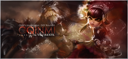
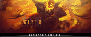
A. Athdenald

B. AttorraRu

C. treefrog88 (win)

D. Grimmhawk

voting will end in about 48hrs
Veteran


Posted 21 May 2012 - 14:44

Posted 21 May 2012 - 14:46

Posted 21 May 2012 - 15:48

Posted 21 May 2012 - 15:52

Posted 21 May 2012 - 15:57
Posted 21 May 2012 - 16:58
Posted 21 May 2012 - 17:16
Posted 21 May 2012 - 17:54

So who wants to buy me Zombie Brand on League of Legends?
Posted 21 May 2012 - 21:51
Posted 21 May 2012 - 21:55
There's just something about B that makes it stand out from the rest xD
A-2
B-1
C-4
D-3
Veteran
Posted 21 May 2012 - 23:39
Posted 21 May 2012 - 23:53

Posted 22 May 2012 - 01:21

Posted 22 May 2012 - 01:44

^ SAHARDY ^
<><><><><><><><><><><><><><><><><><><><>< Selling Stuff ><><><><><><><><><><><><><><><><><><><><>
Posted 22 May 2012 - 03:24
 by Zeder
"Surrender is NOT an option" - Tamra Dragonstar - Lord Command of the Dnulian Army. (Queen)
Posted 22 May 2012 - 03:42
~ ~ ~ ~ ~ ~ ~ ~ ~ ~ ~ ~ ~ Live. Love. Learn. Die. ~ ~ ~ ~ ~ ~ ~ ~ ~ ~ ~ ~ ~
Are you an artist? Want to be listed as one under the Artist Directory; click here
Posted 22 May 2012 - 04:22
Posted 22 May 2012 - 05:40
0 members, 0 guests, 0 anonymous users