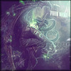
Group 1
A: 5/10, very nice animation, but other than that there isn't much that's special about it, I'm sorry

B: 10/10, can't say anything negative, it looks great. I think Scorpion is toast though, lol!
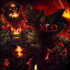
Group 2
A: 6/10, this looks cool, but there's almost too many characters in it. It would be better if there were fewer people, and the renders/stocks were used more creatively, rather than just lining them up. It makes a great banner, though.
B: 9/10, really awesome, although something about the text bothers me (maybe the sharpness?), but everything else is amazing. Again, Scorpion is so owned, lol!
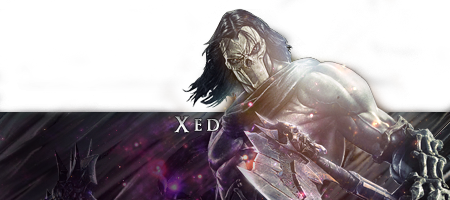
Group 3
A: 9/10, the colors in this are amazing. The placement of the characters seems a little strange, they don't seem to be related to each other, but everything else is great. Is that Scorpion again, because if it is, he's so dead yet again!
B: 7/10, awesome background, great colors, good pairing of characters, but there needs to be a lot more blending, a border, and some text maybe to polish it off.
Group 4
A: 9/10, really well done, nothing negative to say.
B: 9/10, really awesome again, only thing that's missing is a border, I think it would just finish it off nicely.