Jump to content

Photo

Fallen Sword App Feedback (v0.1)


  • Please log in to reply
88 replies to this topic

Poll: Fallen Sword App (39 member(s) have cast votes)

What are your initial thoughts on the Fallen Sword App

  1. Awesome (18 votes [46.15%] - View)

    Percentage of vote: 46.15%

  2. Very Good (4 votes [10.26%] - View)

    Percentage of vote: 10.26%

  3. Good (10 votes [25.64%] - View)

    Percentage of vote: 25.64%

  4. Average (2 votes [5.13%] - View)

    Percentage of vote: 5.13%

  5. Poor (4 votes [10.26%] - View)

    Percentage of vote: 10.26%

  6. :( (1 votes [2.56%] - View)

    Percentage of vote: 2.56%

Vote Guests cannot vote

#21 Badomun

Badomun

    New Member

  • Members
  • Pip
  • 18 posts
  • Badge

Posted 23 March 2017 - 19:43

Using the Android version:

 1. I don't notice a bar for  Stamina.

2. Also When sitting on the portal at Cathedral of ways you can NOT see the portal.

3.The Backpack button also doesn't bring anything up for me.

4. Being able to tap the stairways and see where they lead would be a nice feature so you dont have to walk over to see where they go.

Other then that it is looking good so far and Im excited for for more functionality to be implemented. 


Edited by Badomun, 23 March 2017 - 19:53.


#22 Tinky

Tinky

    New Member

  • Members
  • Pip
  • 4 posts

Posted 23 March 2017 - 20:41

I would love to be able to kill all creatures in the creature list in one click and... I see myself squinting to see some small words in my screen. Oh, yeah... I would love to also be able to click on an area in the map and my character to be able to walk to it without me using the walking pad.

Edited by Tinky, 23 March 2017 - 20:44.


#23 Davros81

Davros81

    Veteran

  • Members
  • PipPipPip
  • 950 posts
  • United Kingdom

Posted 23 March 2017 - 20:43

Is this a sign the game will be transferring to being an app and no longer a browser based game?


#24 Hoofmaster

Hoofmaster

    Company Director

  • Administrators
  • PipPipPip
  • 8,357 posts
  • Badge
  • United Kingdom

Posted 23 March 2017 - 22:02

Is this a sign the game will be transferring to being an app and no longer a browser based game?


Nope! :)


#25 Hoofmaster

Hoofmaster

    Company Director

  • Administrators
  • PipPipPip
  • 8,357 posts
  • Badge
  • United Kingdom

Posted 23 March 2017 - 22:03

I would love to be able to kill all creatures in the creature list in one click and... I see myself squinting to see some small words in my screen. Oh, yeah... I would love to also be able to click on an area in the map and my character to be able to walk to it without me using the walking pad.


I was thinking maybe once you attack a creature it should maybe automatically move along and select the next one? Also the creatures are going to each have an overlay with symbols to show the rarity, class etc. in a clear way :)


#26 Hoofmaster

Hoofmaster

    Company Director

  • Administrators
  • PipPipPip
  • 8,357 posts
  • Badge
  • United Kingdom

Posted 23 March 2017 - 22:07

Using the Android version:

 1. I don't notice a bar for  Stamina.

2. Also When sitting on the portal at Cathedral of ways you can NOT see the portal.

3.The Backpack button also doesn't bring anything up for me.

4. Being able to tap the stairways and see where they lead would be a nice feature so you dont have to walk over to see where they go.

Other then that it is looking good so far and Im excited for for more functionality to be implemented. 


1) The blue circle inside the d-pad shows your stamina remaining (the number inside the actual stamina amount).


2) As in the action doesn't appear for it? That just isn't implemented yet.


3) Sounds like a bug! Could be to do with one of your backpack items causing it to not load correctly - I'll take a look.


4) Good idea!


Love the layout. Looks great and interface is also amazing. Cant wait to play a lot more from my Iphone 6 Plus. (5,5" lovely) :-) keep up the good work!

Dan


Pleased to hear you like it! :D


Me Like it  :P you can login to the App without being booted from laptop


:D


Note we are going to make a change tho so that if you do anything action on the browser version it likely require a reload on the app. Its pretty fast though so shouldn't be an issue - you'll still be able to stay logged in on both :)


#27 Hoofmaster

Hoofmaster

    Company Director

  • Administrators
  • PipPipPip
  • 8,357 posts
  • Badge
  • United Kingdom

Posted 23 March 2017 - 22:16

Not clear/ intuitive:

  • The Icons above the white bar are creatures on that tile.
  • That you can endlessly press the sword for some action but which wont happen till you select the creature
  • How the combat happens since you just see the result. The button for combat log is very hard to click ( Iphone 7 Plus) and you don't know what its for until you discover.
  • That there is a concept of stamina, it should be middle top for players to understand moving consumes stam etc.


1) The creatures icons are going to get an overlay to show clearly what type they are and most likely have their level on there too.


2) Noted - will see if this can be made clearer.


3) Noted - would likely be sorted with a simple tutorial after the first creature kill.


4) Aye the placement within the d-pad maybe isn't great right now :)


Profile menu:

  • The right side doesnt feel right at all, if i could suggest keep the name level guild etc on the left but switch the right and left side. So that medals and general stats and bio are on the left. 
  • There is no [X] button but at the same time people will click outside the box to exit eventually and then they will with the rest of the menus too, it was pretty intuitve since most games work that way and I didn't check for a exit button so can't comment on that.

Settings wheel/Menu feels like its just a temporary thing so w/e.


1) I'm thinking maybe moving all the stats to the left might be an idea, then the panel at the right could be used for combat sets and any profile actions (such as changing your bio etc?)


2) Aye all the windows are going to get an [X] on them - but you'll also still be able to top outside them too.


And yeah the settings menu is temp - it's where you'll access many of the other features such as AH, blacksmith etc. though.


  • Moving on the map feels slow but not due to lag.
  • Since it is already quick combat, can there be an option to multi select creatures.


1) Can probably speed this up a bit :)


2) I was thinking maybe it could auto-select the next in the list once the combat action is sent?


Many thanks for all the feedback - I've just commented on the suggestions.


#28 Hoofmaster

Hoofmaster

    Company Director

  • Administrators
  • PipPipPip
  • 8,357 posts
  • Badge
  • United Kingdom

Posted 23 March 2017 - 22:17

Now that im out in the real world,


1. The attack feature is easy to use just select your target from the scrolling list and use the sword icon to initiate combat, (it should automaticly select the first creature on the list for you though, a single kill is a two click process right now)


2. Combat log is working perfectly.


3.Movement is seemless can seem a bit slow but its not bad i apreciate the diagnal movement. 


4. The only annoyance i have is only having vertical movement of the map there is no horizonatal movement wheather zoomed out or in you can only move the map up and down. id like to be able to zoom in and out and move the map along horizontal lines aswell


5. from ap to site movement is recorded with a simple refresh of the site but with site to app a full shut down of the app is required. is there a way to get a map refresh feature on the app? 


6. backpack is running smooth the sort feature is awesome! ( all i can do is drop items at this point)


7. Charecter tab doesnt work 


Good job guys! 


4) This sounds like a bug  :)


5) In the future the app will automatically refresh by reloading if this happens.


7) Does it show anything at all? Can you see your backpack?


#29 Foggafilly

Foggafilly

    New Member

  • Members
  • Pip
  • 21 posts

Posted 23 March 2017 - 22:55

I was thinking maybe once you attack a creature it should maybe automatically move along and select the next one? Also the creatures are going to each have an overlay with symbols to show the rarity, class etc. in a clear way :)


Move on to the next one of the same creature or the next creature of any type on the tile? Because I would like to vote for the next one of the same creature, pretty please.


One small critique: It feels kind of unresponsive when I try to scroll around the map and on bigger maps I have to zoom out to be able to scroll to the opposite side of the map, which strikes me as a bit unnecessary.


Awesome job so far, it looks and feels fantastic. 


#30 EJames2100

EJames2100

    Veteran

  • Members
  • PipPipPip
  • 2,387 posts

Posted 23 March 2017 - 22:58

Everything seems to work as describe.


If this app goes as planned, I'll definitely be back as a player!


Edited by JamesEshelby20, 23 March 2017 - 22:58.


#31 mickabooth

mickabooth

    Member

  • Members
  • PipPip
  • 472 posts
  • Badge
  • United Kingdom

Posted 23 March 2017 - 23:25

I don't know if i am on the same page as everyone else as all I can see is the basic battle ground
Which looks great the movement control is very easy to use on my iPhone good zoom in/out and nice atack button I would like to see the ability to select all creatures and atack all with one press of the button also a repair all button possible to the right and above the attack button

#32 Glaucous

Glaucous

    Member

  • Members
  • PipPip
  • 101 posts

Posted 23 March 2017 - 23:42

4) This sounds like a bug  :)


5) In the future the app will automatically refresh by reloading if this happens.


7) Does it show anything at all? Can you see your backpack?

I can see my backpack and items but if i go to the charecter tab instead of the backpack tab it doesnt show me anything 


#33 Hoofmaster

Hoofmaster

    Company Director

  • Administrators
  • PipPipPip
  • 8,357 posts
  • Badge
  • United Kingdom

Posted 24 March 2017 - 00:04

I can see my backpack and items but if i go to the charecter tab instead of the backpack tab it doesnt show me anything 


Ok thanks - will do some testing on it :D


#34 Hoofmaster

Hoofmaster

    Company Director

  • Administrators
  • PipPipPip
  • 8,357 posts
  • Badge
  • United Kingdom

Posted 24 March 2017 - 00:12

Just over 140 characters linked to the Fallen Sword App now - thanks for taking the time to give it a try! :)


#35 BadPenny

BadPenny

    Veteran

  • Members
  • PipPipPip
  • 5,287 posts
  • United States of America

Posted 24 March 2017 - 00:54

I downloaded both to phone and tablet. (Android version​)

On the tablet, except for moving quite slowly, so far so food.  I agree we need some kind of indicator for which stairways are what.  I actually had to open the guide to find my way back to Mountain Path from where I was.   Then I went into the cathedral, but there is nothing there to use the portal.  


On the phone, everything is so tiny.  These old decrepit eyes couldn't see my guy on the map.


On both, navigation of my profile is great, all that is needed is combat sets.


I do agree that stats, medals, etc, should appear on the left side similarly to how our browser profiles are managed.  


Other than that I'm ecstatic that the app is finally here, and I can't wait to see what is to come.


Edit:

One more thing, on "snow" realms, the d-pad disappears.  You can only find it because the stamina is there.  And we need durability stats for equipment prominently displayed as well as backpack count...


Edited by BadPenny, 24 March 2017 - 01:02.

Just one old lady's opinion


krQtqDH.jpg

~Love, Penny


Have you hugged your Quango lately?


#36 Hoofmaster

Hoofmaster

    Company Director

  • Administrators
  • PipPipPip
  • 8,357 posts
  • Badge
  • United Kingdom

Posted 24 March 2017 - 01:20

By the way - if you tap and hold on an item you can get more info on it :)


#37 mirage646

mirage646

    New Member

  • New Members
  • Pip
  • 19 posts
  • Badge
  • United States of America

Posted 24 March 2017 - 02:33

i like it a lot, its a great place for HCS to get the bugs worked out and start getting every thing working properly with it


#38 Nindrix

Nindrix

    New Member

  • Members
  • Pip
  • 5 posts

Posted 24 March 2017 - 03:06

Loving it so far keep it coming guys great job.

1. Movement d-pad should be a little more bigger, I keep missclicking.

2. I would love to have a option to kill all enemies in my location

#39 NewLufie97

NewLufie97

    New Member

  • Members
  • Pip
  • 2 posts

Posted 24 March 2017 - 06:40

Two problems

1. This one solved itself.
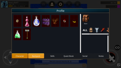
2. I am not able to use potions.Screenshot_2017-03-24-12-02-43-343_com.huntedcow.fallensword.png

Edited by NewLufie97, 24 March 2017 - 06:44.


#40 Hoofmaster

Hoofmaster

    Company Director

  • Administrators
  • PipPipPip
  • 8,357 posts
  • Badge
  • United Kingdom

Posted 24 March 2017 - 11:01


That's just not implemented yet :)


1 user(s) are reading this topic

0 members, 1 guests, 0 anonymous users

Font:
Arial | Calibri | Lucida Console | Verdana
 
Font Size:
9px | 10px | 11px | 12px | 10pt | 12pt
 
Color: