

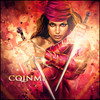
Group 1
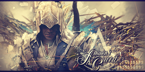
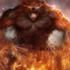
A ) 7 - Would have liked to have seen the source links. At first glance, I loved the overall feel and render selection but as I reviewed the layout, there were a few areas that bothered me. I like the text but the problem was that it is hard to read with the background being a bit distracting. There is a super focused area seems to be on the right side which is dead space and should be moor on the render. Lastly I agree with a few others on the numbers that draws my eyes away from the design but just my opinion.
B ) 8 - I like the blending and how the render explodes out of the fire. I can feel the emotion behind the design. The color of the background works well with render used. Great job!
Group 2
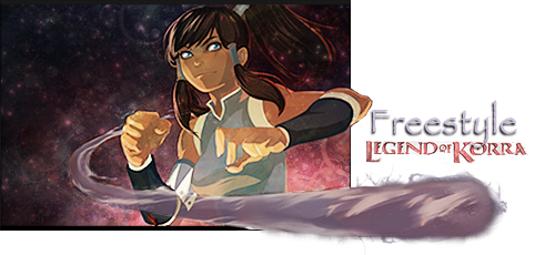
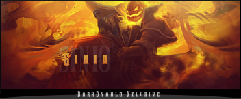
A ) 6 - I like the idea to make this more 3D but it somewhat falls short for me with the background not supporting the render. I would have like something swirling to tie into the motion or the flow of her hair. I still like the idea!
B ) 6 - Personally I feel you are using too many renders and too many elements to be focused. I admire the courage you have to blend all of them in and commend you on a good job but way too busy for me and the contrast seems to be off. The text also seems a bit hidden and could pop more.
GGT Voting Round 5 -- Freestyle
#21

Posted 14 December 2013 - 16:52


Made by Chagryn
#22
Posted 14 December 2013 - 20:35
I will although offer 2 FREE avatars for the voters!! 
Sig By DMR > Thx Dear, i love it!
#23

Posted 15 December 2013 - 01:53
BUMP, come on people VOTE!
 by Zeder
"Surrender is NOT an option" - Tamra Dragonstar - Lord Command of the Dnulian Army. (Queen)
#24
Posted 15 December 2013 - 06:15
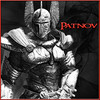
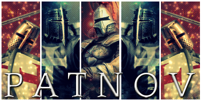
Group 1
A. Not bad, text could use some work, and depth/lighting is lacking. Numbers at the bottom right are a cool touch but draw away from the focal.
Solid 7/10
B. When I see a render like this I expect the artist to really make the character pop. The colors aren't vibrant enough, the focal isn't sharp enough, the depth really just isn't up to par. Effects aren't properly used. Text could use a lot of work.
I'd give it a 5/10
Group 2
A. Not sure where to begin on this one. I guess the artist shows some creativity, trying to make a popout sig. That being said, it's executed pretty poorly. Text is bad,(Papyrus really?) overall could just use a lot of work.
4/10
B. Kind of an eyesore. The contrast is off the charts, colors don't work, text is bad and strangely placed. Not much done right here, and really chaotic.
2/10
#25
Posted 15 December 2013 - 07:46
Group 1
A - 8 - I don't like the scan lines, the random numbers in the bottom right aswell as the font used. I like the blending, the depth and the C4D use.
B - 7 - I don't fancy the font once again. It seems like they erased half the render to the right of the text.
Group 2
A - 4 - There's no blending, no depth, Korra is oversharpened and I don't like the fact that it's a pop out. I feel like it could have been better if it didn't pop out and it was cropped instead with the text on the dead space on the left.
B - 6 - I think it's a tad too dark. I feel like the main character isn't very well blended and the text is really bad.
#26
Posted 15 December 2013 - 18:57
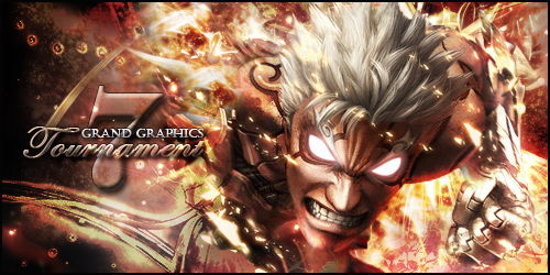
G1 a. 7 I like both
G1 b. 7
G2 a. 9 Love it
G2 b. 8 Almost as good as a
#27
Posted 15 December 2013 - 20:48
Group 1
A: 10 love it one of my favorite games :3
B: 7.8 not sure if he only has one hand or two but i can't see the other
Group 2
A: 7.9 really good but why is the text outside of the box ?[Picture]
B: 9 nice work
![]()
I am a merchant. If I'm not ripping you off, then I'm not doing my job! ~Gomezkilla
#28

Posted 16 December 2013 - 03:36
Thanks to all who voted. 
Will be added up the votes in the morning.
#29
Posted 16 December 2013 - 15:36
Tally sheet has been updated. Have to say there was some pretty tight voting going on! Thought there were going to be a tie a couple of times.
Thanks to everyone who voted! I hope you return again to vote on the upcoming FINAL ROUND!
The 3 people who will receive a free avatar from me are.... *drumroll*...
cordio
BraveKath
BeastBoy95
#30
Posted 16 December 2013 - 17:16
Thx everyone that voted!!!
The winners of my 2 avis are.............
AttorraRu
j3k
Sig By DMR > Thx Dear, i love it!
#31
Posted 16 December 2013 - 22:48
group 2 B i like the which it ispaers me evilnes and i like whe a player puts resurces so u can se the diference whit the img i give 9 points
and i like group 2 A the wather domination girl it remains me the avatar the cartoon i give 5 points
and i like group 1 b i give 4 points no particolar reson i like fighters =)
#32

Posted 17 December 2013 - 00:33
Good luck guys! I'll miss y'all 
~ ~ ~ ~ ~ ~ ~ ~ ~ ~ ~ ~ ~ Live. Love. Learn. Die. ~ ~ ~ ~ ~ ~ ~ ~ ~ ~ ~ ~ ~
Are you an artist? Want to be listed as one under the Artist Directory; click here
0 user(s) are reading this topic
0 members, 0 guests, 0 anonymous users