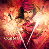


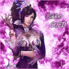
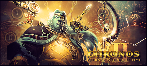
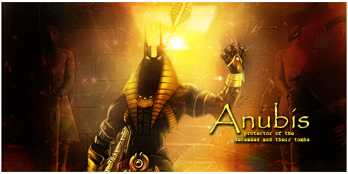
G1
A - 7/10 Nice piece, good detail. The text needs work and the light source over his neck is unnecessary
B - 7/10 Another nice piece, could do more with the depth on this one
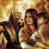
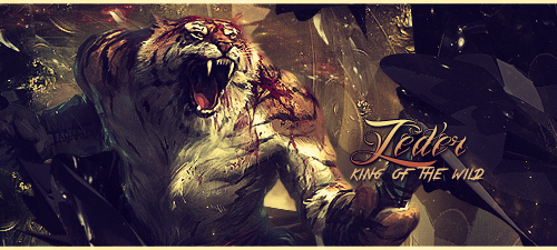
G2
A - 10/10
B - 8/10 Best 2 of the bunch!
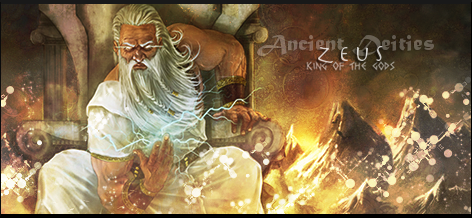
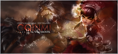
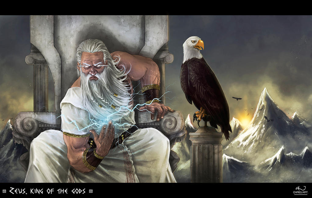
G3
A - 4/10 I like that the artist tried to be original (not use a typical "Zeus" image) but it's too blurry, not enough detail and is just not up to par with the other entries.
B - 8/10 Well executed and an excellent use of resources
Tough voting this week. Good job everyone!
Edited by SlntScream, 02 December 2013 - 03:07.


 (pun intended)


