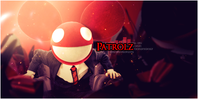
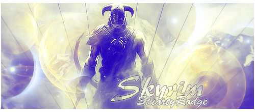
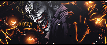
This has always been one of my fave renders.
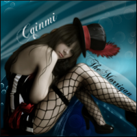
Could you move the 'cqinmi' text closer to the render? Maybe under the hilt/hand and above the breast.
Also, maybe use a more purple less pink color on the text on the 'RA' and 'cqinmi' to make it easier to read?
These work a little better?


