I like how varied the responses are to this. It bodes well to how close it may be in the end. You are all the best of what FS has to offer without question. This fantastic theme helps alot also. :wink:
Grand Graphics Tournament Round 5 Voting
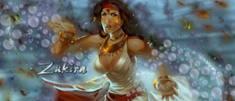
Started by Zukira, Aug 07 2012 03:01
41 replies to this topic
#22
 fs_anvy
fs_anvy
-

- Guests
Posted 10 August 2012 - 19:48
1a 8/10 - I don't really know what the ice is doing there.
1b 6/10 - It's too colorless, and quite simple, i just didn't like it.
2a 7/10 - Man, spider-man?! I think it really doesn't look good, however you had a little imagination.
2b 10/10 - Well, i really liked it. The blue imagination and the tatoo's were perfect. ^~
3a 7.5/10 - I don't like it, the same thing with the 2a. ''Poseidon'' or anything like it doesn't look good with this type of image.
3b 6.5/10 - Really really simple, i don't like it. However, the image remembers me a peacock, directly. And that's why the avy don't get a 3 or 4 rate. So much simple.
#23
Posted 10 August 2012 - 20:02
I just wanted to praise all of the artists involved in this competition. These pieces are astounding, really great quality indeed. I'm not going to vote because I don't have the graphic terminology to give you a fair judgement on your piece. Just well done to all of these artists though.
#24
Posted 10 August 2012 - 20:26
1a 7/10 - I don't really know what the ice is doing there.
I would assume it's Salt crystals as the theme the artist is going for is Ocean.
Good luck to everyone and may the odds be ever in your favor

#25
Zukira
-
- New Members
-

- 1,991 posts
Veteran

- United States of America
Posted 11 August 2012 - 15:41
*bump*
|| signature rotates, artists varied ||
Fan my art on Facebook || Deviant Art || Chat on Irc
When in doubt, lean to the side of mercy.
- Cevantes
#26
Cassafras
-

- Members
-
- 1,414 posts
Veteran
- United States of America
Posted 11 August 2012 - 17:59
Group 1
A 7/10-Looks nice but a couple of the effects look a little flat to me and I find that there is too much contrast around the eye (stock at fault?). Really like where you went with your theme
B 9/10-Love what's going on in the eye! Just a bit bothered with the two contrasting flows. (Top right and bottom c4ds I believe)
Group 2
A 8/10-Interesting take on this theme, just not a big fan of the two pen toolings. Maybe get rid of the smaller one?
B 6/10-Definitely different from other entries. Not liking the bubble c4d on the left. Maybe better to leave that space blank for negative space? Also a bit disappointed that the eye isn't really the focal here. Perhaps if the tribal tattoos originated from the eye then spread out to the rest of the face it would achieve your original theme but keep the eye as the focal.
Group 3
A 9/10-This is pretty awesome! Unique theme and well presented. Could've done without all the water towards the bottom as it looks like the person is drowning in their own tears or something =P
B 7/10-Overall nice look but it isn't wowing me.

#27
Posted 12 August 2012 - 03:45
Group 1
A – 7/10 – the work around the eye is gorgeous and has beautiful flow. But the actual eye doesn’t really draw my attention.
B – 8/10 – very beautiful, lovely detailing inside the eye. I wish the text didn’t get a little lost on the right side.
Group 2
A – 9/10 – favorite of the bunch. Very imaginative, and what the text says is perfect
B – 7/10 – love the colors. I’m drawn to look at the hair and tattoos though, not the eye.
Group 3
A – 7/10 – the “tear man” doesn’t seem to match the eye for some reason, I’m sorry
but the concept is very creative.
B – 6/10 – the coloring and details are lovely (especially like the eyelashes), very tastefully done, but I don’t like all the space around the edges, it seems too empty to me.

#28
Posted 12 August 2012 - 12:15
Bring this up!
Seems that we have two entries tied fighting for the 3rd place now, we need your vote!
Seems that we have two entries tied fighting for the 3rd place now, we need your vote!

#29
fs_anvy
fs_anvy
-
- Guests
Posted 12 August 2012 - 16:23
1a 7/10 - I don't really know what the ice is doing there.
I would assume it's Salt crystals as the theme the artist is going for is Ocean.
Good luck to everyone and may the odds be ever in your favor
Well, you're right. I misunderstood the symbols used. I reviewed that and the others entries, and updated some ratings. Good luck to everyone.
#30
JBKing89
-

- Members
-
- 419 posts
Member
- United States of America
Posted 12 August 2012 - 20:39
Great work overall....
1A - 5/10 - elements don't blend together very well
1B - 7/10 - good work, but the monochrome makes is a little dull to look at, and text is hard to read.
2A - 9/10 - great piece, only deducted one point because 2B is just a bit better
2B - 10/10 - awesome, what else is there to say?
3A - 5/10 - the water figure just doesn't look right in an eyeball, doesn't blend well enough
3B - 6/10 - good, just not that interesting
#31
Posted 13 August 2012 - 03:17
Looks like this is over, I can't wait to see which artists made it to the finals!

#32
Posted 13 August 2012 - 03:22
1st apologies to the artists for not voting in the earlier rounds. Been slightly out of the loop lately. From the looks of the graphics submitted for this round, I have been missing out! Didn't even look to see who was participating, but had to vote!
Group 1
a. 7/10 - I appreciate the color and concept here. I like the aquarium-like view the eye offers, but I am not fond of the text as it tends to draw my attention from the focal.
b. 6/10 - good work here as well... I like the theme, the white subtext tends to fade into the bright white of the lower right-hand side which bothers me. Maybe a 1 pixel outline as on the main text or a gradual shade shift from white to black on the text only.
Excellent work on both!
Group 2
a. 8/10 - WOW! I think what I like the best out of this piece is the fact that, true to the title, you cant really tell where the real eye ends and the fantasy Spidey starts though there are definitely 2 distinct images here with the color/black and white contrast. Not so keen on the lines on the far right though.
b. 6/10 - I can appreciate the artists work here. Time was taken for quality shading and lighting effects. The piece does not really appeal to me though.
Group 3
a. 9/10 - Again WOW! This one is my favorite out of all the pieces submitted for this round! Well laid out, well executed, from the spray below the eye to the background image within the eye... the only thing that keeps me from giving this a 10/10 is the color of the "tear" and the color of the water below the eye. could be my monitor, could even be the intention of the artist, but they seem slightly different shades.
b. 8/10 - I give this piece high marks for quality work. the blending is amazing, you would never know that this piece was made up of more than 1 picture. It looks as if the artist painted it from scratch as opposed to selecting several stock images and blending them. This was executed expertly!
If I win an auction, please notify me in-game
#33
Posted 13 August 2012 - 03:26
Looks like this is over, I can't wait to see which artists made it to the finals!
I don't think the vote above will influence the eliminations if counted but just in case...
Voting closes at 23:00 Server Time on Sunday August 12th
#34
Posted 13 August 2012 - 03:29
yeah, realized I was late when I went to post and assassin's post was there But I posted anyways... wanted the artists to know how I felt about their work... (and it took me freakin' 30 minutes to write it, LOL!)
But I posted anyways... wanted the artists to know how I felt about their work... (and it took me freakin' 30 minutes to write it, LOL!)
If I win an auction, please notify me in-game
#35
Posted 13 August 2012 - 03:33
It should be fine since if everything is added up correctly, the same artists will be moving on to the next round.
Congrats to Athdenald, Wes and Grimm for making it to the finals.
*If the math is right*
Congrats to Athdenald, Wes and Grimm for making it to the finals.
*If the math is right*
#36
Posted 13 August 2012 - 03:38
Since this is over, and it doesn't matter anyways... the artists that are active are allowed to vote? Just curious, because we were not allowed to vote in previous GGT's until we had been eliminated.
If I win an auction, please notify me in-game
#37
Posted 13 August 2012 - 03:43
This GGT: round 1, round 2, and round 3 all artists were allowed to vote even if they were participating.
Round 4 was an exception due to 2 factors:
1. The votes wouldnt have influenced the elimination
2. Only 2 artists voted and they were in the same group
According to my poor math the artists votes this round doesn't influence the eliminations if counted
Round 4 was an exception due to 2 factors:
1. The votes wouldnt have influenced the elimination
2. Only 2 artists voted and they were in the same group
According to my poor math the artists votes this round doesn't influence the eliminations if counted
#38
Zukira
-
- New Members
-
- 1,991 posts
Veteran
- United States of America
Posted 13 August 2012 - 20:55
So hard to see anyone eliminated after this round with all these mind blowing entries but GGT cannot continue forever for one particular event.
Congrats to Ath, Wes and Grimm!
I have all of your entries but there is still an couple of hours so if you have any final adjustments please make them and submit them.
Congrats to Ath, Wes and Grimm!
I have all of your entries but there is still an couple of hours so if you have any final adjustments please make them and submit them.
|| signature rotates, artists varied ||
Fan my art on Facebook || Deviant Art || Chat on Irc
When in doubt, lean to the side of mercy.
- Cevantes
#39
Posted 13 August 2012 - 21:06
Congratz to all the others as well. This was very close
Well, I'm not gonna make any final adjustment and seems that grimm won't too
Grimmhawk says: lol, one of us should tell her to post them now since I'm sure neither of us is gonna do changes
Well, I'm not gonna make any final adjustment and seems that grimm won't too
Grimmhawk says: lol, one of us should tell her to post them now since I'm sure neither of us is gonna do changes
0 user(s) are reading this topic
0 members, 0 guests, 0 anonymous users