Jump to content

Photo

Grand Graphics Tournament 6 Semifinals Voting **CLOSED**


  • Please log in to reply
40 replies to this topic

#21 TreeFrog

TreeFrog

    Veteran

  • Members
  • PipPipPip
  • 2,739 posts
  • Badge

Posted 22 February 2013 - 03:54

How many go through this round Mr frog?


Sorry, that information is confidential. 8)

#22 Kayesha

Kayesha

    Veteran

  • New Members
  • PipPipPip
  • 2,030 posts
  • United States of America

Posted 22 February 2013 - 15:42

This is really Hard

I choose:

C: Has a very 3D look to it. Like the lighting.

D: I like the effects and use of render

#23 Noeni

Noeni

    Veteran

  • New Members
  • PipPipPip
  • 566 posts
  • Badge

Posted 22 February 2013 - 17:18

B. my first choice the colors and lighting and general reminds me of the final scene in Romeo must die,I like the text it's just perfect to me, the dragon effects brings a nice touch. it's "kaboom!! awesome". I can picture that on a DvD cover.

C. my 2nd choice would have tie with B if it wasn't for the bright lighting too much light by the elbow out, I like it though it's pretty cool.

bannerfans_6199711.png


#24 Wesleysdf

Wesleysdf

    Veteran

  • Members
  • PipPipPip
  • 4,011 posts

Posted 23 February 2013 - 13:26

I vote for

B - Better concept art and colour scheme

and

D - Border SUCKS but the lighting, flow and depth is awesome!

#25 aa0007

aa0007

    Veteran

  • New Members
  • PipPipPip
  • 4,379 posts
  • United States of America

Posted 23 February 2013 - 14:08

Yay, nice amount of voting this time. Lets keep it coming! :D

#26 zeder

zeder

    Veteran

  • Members
  • PipPipPip
  • 1,098 posts
  • Badge
  • United States of America

Posted 23 February 2013 - 14:12

Liked all of them for different reasons, But B get my top vote & C is the runner up

ZederGift_zpsa47e7c25.png by Chagryn


#27 chianty

chianty

    Veteran

  • Members
  • PipPipPip
  • 553 posts

Posted 23 February 2013 - 15:59

My vote goes to B: I really like the combination of the elements used there.Its a piece that catches your eye from first time you see it.Congrats to the author.
And second vote goes to D.Unlike everyone I actually do like the border and the general feeling of the piece.

Also I would like to congratulate the rest of the people that got so far in this GGT.Your work is amazing!!! :mrgreen:

chibdsig.png


#28 Kayesha

Kayesha

    Veteran

  • New Members
  • PipPipPip
  • 2,030 posts
  • United States of America

Posted 23 February 2013 - 16:26

Totals:

A - 2
B - 16
C - 9
D - 7

#29 aa0007

aa0007

    Veteran

  • New Members
  • PipPipPip
  • 4,379 posts
  • United States of America

Posted 24 February 2013 - 00:32

Bump.

Come on, we can do better.

#30 DragonLord

DragonLord

    Veteran

  • New Members
  • PipPipPip
  • 3,081 posts
  • Australia

Posted 24 February 2013 - 00:40

B followed by D for me


Both of those 2 'cos far more visually striking than the other two alternatives.

#31 aa0007

aa0007

    Veteran

  • New Members
  • PipPipPip
  • 4,379 posts
  • United States of America

Posted 24 February 2013 - 01:16

B followed by D for me


Both of those 2 'cos far more visually striking than the other two alternatives.


Thanks for voting :D.

#32 Crzy

Crzy

    Member

  • Members
  • PipPip
  • 303 posts
  • United States of America

Posted 24 February 2013 - 01:20

My picks are B followed by A.

B. As everyone else has said, great color and concept. The dragon was placed in a good spot that didn't overpower the render. The added shadow effect behind the right side of the head/elbow gave it a cool touch as if it were in motion. The only thing I didn't like about this piece was the white text over Lee Sin, it seemed unnecessary.

A. At first the borders were killing it for me but then as I looked at it more, it gave me a comic book vibe and I liked that. The lighter colors also helped to give it the comic book feel, which I feel was intentional and a nice touch. The green effect around the leg was also cool and made it look as if his kicking was supercharged. If you moved the text a little over to the Sin, it might have given all of the extra border frames a purpose of flow that way all of the shirt lines would have "pointed" to the Text.


Hope the vote helps. :)

qu29_zpsff77e35f.png

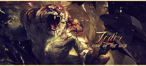
^^Sig by the awesome ArtistGorn!^^^


#33 spyders

spyders

    Member

  • Members
  • PipPip
  • 304 posts
  • Badge
  • Italy

Posted 24 February 2013 - 11:07

A.it shows the kick in slow motion
D.here u can see the speed and colors are better

Nice work all 4 :)

#34 aa0007

aa0007

    Veteran

  • New Members
  • PipPipPip
  • 4,379 posts
  • United States of America

Posted 24 February 2013 - 18:26

Thanks for voting!

#35 Kayesha

Kayesha

    Veteran

  • New Members
  • PipPipPip
  • 2,030 posts
  • United States of America

Posted 24 February 2013 - 23:38

Totals:

A - 4
B - 18
C - 9
D - 9

#36 jsustin212

jsustin212

    Veteran

  • Members
  • PipPipPip
  • 3,554 posts

Posted 25 February 2013 - 02:13

B. the concept, the colours, the blending, all amazing on this one

C. ditto lol,

love both of these pieces, all were very well done but these are my favourites

jsus_zpsa8d5d247.png


#37 mimdala

mimdala

    Member

  • Members
  • PipPip
  • 390 posts

Posted 25 February 2013 - 16:03

A: Great sense of movement, I like it.

C: Amazing lighting and background.

mimdala_zps719aa5bc.png


#38 TreeFrog

TreeFrog

    Veteran

  • Members
  • PipPipPip
  • 2,739 posts
  • Badge

Posted 26 February 2013 - 01:12

This round has ended. Final Tally:
A - 5
B - 19
C - 11
D - 9

And guess what? You're all going through!! Thats right, to win this, we will be totaling the scores from this and the next round, with the 3 highest votes taking 1st 2nd and 3rd. So suck it up, cause you all have more work to do!!

#39 ghetoghost

ghetoghost

    Veteran

  • Members
  • PipPipPip
  • 1,564 posts

Posted 26 February 2013 - 01:45

This round has ended. Final Tally:
A - 5
B - 19
C - 11
D - 9

And guess what? You're all going through!! Thats right, to win this, we will be totaling the scores from this and the next round, with the 3 highest votes taking 1st 2nd and 3rd. So suck it up, cause you all have more work to do!!


Didn't see that coming

~ ~ ~ ~ ~ ~ ~ ~ ~ ~ ~ ~ ~ Live. Love. Learn. Die. ~ ~ ~ ~ ~ ~ ~ ~ ~ ~ ~ ~ ~


Are you an artist? Want to be listed as one under the Artist Directory; click here


#40 TreeFrog

TreeFrog

    Veteran

  • Members
  • PipPipPip
  • 2,739 posts
  • Badge

Posted 26 February 2013 - 01:53

That was my intention. :wink:


0 user(s) are reading this topic

0 members, 0 guests, 0 anonymous users

Font:
Arial | Calibri | Lucida Console | Verdana
 
Font Size:
9px | 10px | 11px | 12px | 10pt | 12pt
 
Color: