

I really dont have any experience about signatures. I am a poor critiq on that manner, but I can tell what I see. :-)
Edit: I see many wrong word choices in many places, but it took almost 2 hours to do this so I wont be fixing them. So just so you get confused. 
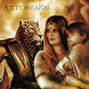
Group 1
A: This is interesting one. Its as if we were looking inside her mind. We have lot of peace and harmony via the shapes in this picture and this is all working verywell for the character, but we have a conflict delivered by the text. It make's you wonder, and clearly, makes the character the struggle. Since travelling back to past is alright for her, but can cause catastrophy for someone else.
The scale and angle match and the general back ground theme is nice. 1 thing bothers me is we have clashing color themes. We have blue and red. Blue delieverd by space stock and red delivered in many places. It clashes cause they belong to different category of realistic colours and fantasy colours. 6/10.
B: The character is travelling in time at the very moment. Its a nice bonus for the theme. The character is clearly looking for something and clearly going back in time as if perhaps going to change something, some detail to correct the wrong done to him. By this, the images general shapes clash strongly with the theme and colour choice. The "Flames" (not sure if they are flames), are bit too overpowering. The eiffel tower. Its in the air like the clock's, but the pyramids are standing in the ground, wich makes me think, that he is headed to somewhere in egypt sometime while the pyramids are being made. So, the eiffel tower gives me that idea and is nescessary for me to read the image. 5/10.
Group 2
A: This image is in big conflict of its theme and the actual execution. Very unclear image, but after lot of squinting at it, it seem to tell a story. The character has a "rock"/"some device" in her right hand and she has opened some sort of hole in time I suppose. The image shows lot of harmony and contrast. The rain and shapes create harmony and her deft look shows no fear, but the splashing of water, bolts of lightning and shockwave of air and the movement of the image should cause fear. So I say the character is too mesmerized and fascinated to care and she is heading for it pushing her hand in. It's like a snapshot of a scene you could see when the lightning strikes. Colors match creating no conflict. 6/10.
B: 3 Characters at the scene. A man and 2 dinosaurs. Its looks like the man is wearing fur clothing, so I would say that he is present while this mysterious portal openend next to him and dinosaurs started coming through. The T-Rex looks like aggresing towards the man and the Triceratops is coming to the scene. The shapes are in conflict with each other, so are the lines. The movement of the image aswell. The effect to blend the triceratops to the portal fits well in and I like it. But all of the characters have blending issue to the whole image. None cast shadow wich gives feeling that there has been done quite little work. I was going to give bonus credit for the depth of the back ground, but it looks like it was there before creating the image. Also the colors of harmony and contrast clashes in this image aswell. Red doesnt go with blue. 4/10.
Group 3
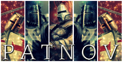
A: All I can think right now are mooloks. And Dr.Sheldon Cooper, although, that isnt the origin of this device. The back lightning creates the illusion as if the object was on a counter ready to be sold. The background movement gives the illusion that its travelling in time. While I am not familiar with the original device and its use, I believe it requires a driver nonetheless. Colours do not match, while the shapes do I just dont like this image. If there was Dr.Cooper I would have given extra credit. 1/10
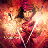
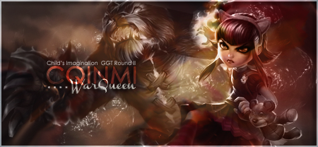
B: I am not familiar with the character, but according to other entries he is a timetraveller. That is enough to match the theme for those who are familiar with the character. The character is throwing the viewer a challenge. I wonder what it could be. If I was familiar with the character, I might gues it. By the image, I would not gues the theme, but there is a text that does that for me. Everything in the images shapes, lines and colours do match. Its a good image, but the character is poorly rendered and the text does not blend in at all. 6/10.
Group 4
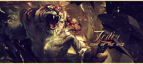
A: This image is the reason why I connect time traveling to lightning. :-) The image gets a comedic look for the alarmed watch check. The image tells a story of real concern how ever and that there is an adventure. The image has green, red, blue it kind of fits for the theme and the text matches that theme and is btw, bad ass, (but could be in line with the main line of the image wich is created by the car).I do not understand the special effects around the car at all. It makes it look as if the car was time traveling by itself since the character is at front. The scaling of the objects and characters are matching. 6/10.
B: This image impressed me a lot. I am not familiar with the particular story. These characters present the image so that there is no choice in between safety and danger. What has to be done, has to be done no matter the conditions. The effects illustrate to me, (if there was no text) that these guys are somewhere north, at night and came from indoors from warmth and light to dark and cold. But there are added sharpened sprinkles wich truns it as if they are building from bits to the scene they travelled to and are on guard what might be there for them. This adjustment then turns the world of shape bit off from the theme of this image. Colours are matching decently and the text has 3 lines wich all are in different font, make no sense to me at all. How ever the general look of the image is so that one could honestly use it as a movie poster. 7/10. (Also lens flare on Bruce Willis's arm does not belong there.)
Group 5
A: This character clearly shows that he is in control of time and is posed as if curious to ask the viewer for maybe a drink? (I would go!) The character fits the theme and and colours match to each other. The movement fits the theme. Lighting creates first issue of the image. While the gears that he has taken apart to show off are on certain layer type it creates unpredictable effects and it has over lighted few of the gears, completely erased few of them, but works well for the rest, although the line of light does go bit of from the gears of the back ground or then there is a mystery layer wich creates illusion of the line of light. The depth and smoothnes of the image and on top of that the very fitting text makes this image propably one of the best images of the contest. 9/10.
B: Well, this image is not my style. I dont care to say much of it, but the characters do not fit the background theme or blend in it at anyway. 1/10.
Group 6
A: This character is as if he was floating on the time. He clearly has the power to travel in time by himself. The images shapes clash by themselves, the lines promises something wonderfull and the colours are in absolute war, but that does fit the strong fantasy theme. The image is peppered with lot of visual effects and stocks and the positioning create the effect of floating. The movement goes against the characters look, but that can be explained if the character is experienced time traveller. I think the clock table does not fit in the picture. And there are some unwanted colourings via layer styles. 4/10.
B: This image is simply the best. 10/10. It has only 1 issue with anything, but the good on this image overwhelms it. I personally can not relate this image to time traveling at anyway cause im not familiar with the sands of time, but that would be changed if I figured it out. The lines of this matches the characters defiant look. The shapes match all together. The colours are bit of, but it would be hard to make it any othe way. The blending and effects are amazing. The only 1 issue I had is with the blur line left to dagger. It is visible to the eye very clearly, and it could be illusion caused by the flame stock, nonetheless it could have been fixed. 10/10.
Group 7
A: This is fantastic image. We have the quite familiar player in the image. ;-) (On his way to party travel!) The image in itself is well made, colours match, lines match, shapes clash and scale matches. My only issue is the somewhat empty feeling I get from this image. Nonetheless succesfull blending of the character. 7/10.
B: This image seems to include the phone booth from the character of the image A. While there is that, it still leaves the image out of character and I think it makes it kind of weird signature. Lines create harmony so does the horrible bubble effect wich makes it match, but still. The movement of the image makes it seems that as if the start was at the future. Now I do not know this sequel, but I highly doubt that is the actual case while logically ofcourse the time traveller comes from the future. The phoneboot at the right side is of the size of a sky scraper, and it is because of the depth that it makes this illusion. The colours clash only a little, as we can think of this image 2 separate images. The first one is night harmony and the next is dawn of new day. Yet the green and red is visible on opposite side via the buble stock. You can clearly see how ever that this is of time traveling and this is maybe the clearest of all of the entries. 5/10.
Edit: I see many wrong word choices in many places, but it took almost 2 hours to do this so I wont be fixing them. So just so you get confused.
Edited by MindyN5, 26 October 2013 - 18:35.


 .
.