Jump to content

Photo

BUYING AVATARS ... for as long as I have fsp!! (CLOSED)


  • Please log in to reply
168 replies to this topic

#41 WarQueen

WarQueen

    Veteran

  • Members
  • PipPipPip
  • 2,185 posts
  • Badge

Posted 13 June 2012 - 21:06

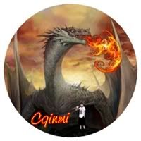
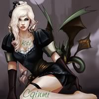
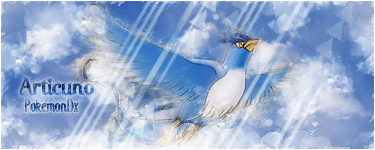
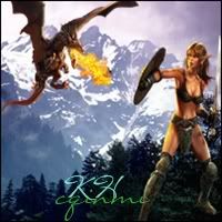
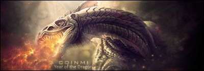
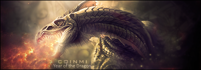
here is an entry from my CQ


Posted Image

Its on your list of likes i looked through the Topic and you said that you wanted a dragon breathing fire. I hope you like it :D

To do the background i got an orange background to start with then a got a medium brush i put the colour black on it put a few lines across the orange and smudged it to make it look like fire :P


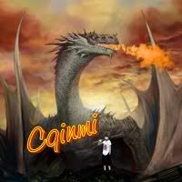
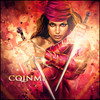
Cqinmi I hope you don't mind if I give some CnC? :?: Harvey I'm not sure if you're aware of gradient maps, but they can be your best friend. As long as you don't overuse them, they can help blend the picture together. Not sure if you have GIMP or PS but I suggest start experimenting with them. They really can make all the difference


CnC is good anytime. :)

harvey, sorry to say this but I think you still need to practice practice practice before attempting to sell people your 'art'. Go back to every topic you have ever made and reread every CnC that I and other people have repeatedly given you. Get some tuts and follow them step by step.

WarQueenSig1_zpsfe2b03d4.png


#42 WarQueen

WarQueen

    Veteran

  • Members
  • PipPipPip
  • 2,185 posts
  • Badge

Posted 13 June 2012 - 21:10

v1
Posted Image

v2
Posted Image


Beautiful!! 7 fsp?

WarQueenSig1_zpsfe2b03d4.png


#43 WarQueen

WarQueen

    Veteran

  • Members
  • PipPipPip
  • 2,185 posts
  • Badge

Posted 13 June 2012 - 21:14

i know u dont like blondes but it is a superhero too :P

Posted Image

and heres another

Posted Image


Being honest, I don't really like either one. :( I'm sorry.

WarQueenSig1_zpsfe2b03d4.png


#44 WarQueen

WarQueen

    Veteran

  • Members
  • PipPipPip
  • 2,185 posts
  • Badge

Posted 13 June 2012 - 21:21

argh I couldn't find the right dragon in my inventory , here is what i have for you & yes 1 is a blonde :P :oops: :(
Plus some of the stocks used elsewhere.
Posted ImagePosted Image

Posted Image Posted Image Posted Image
I completely understand if you don't want any of them.


I like the dragon but not the background, person standing, or the fire (maybe have 2 flame layers, 1 with lower opacity and 1 smudged). :(

Tip: Keep text simple. Don't make it to large or to small. Fancy text styles distract the eyes from the whole picture, especially from the focal. (Text is hard to perfect so dont get discouraged if you have to try different fonts, positions, etc.)

WarQueenSig1_zpsfe2b03d4.png


#45 WarQueen

WarQueen

    Veteran

  • Members
  • PipPipPip
  • 2,185 posts
  • Badge

Posted 13 June 2012 - 21:24

And ladies/gents, I was dead serious when I said I DO NOT want blonde avatars/signature. The chance of me buying a blonde avatar/sig is 1 in 10,000...

WarQueenSig1_zpsfe2b03d4.png


#46 Ca1bas

Ca1bas

    Member

  • Members
  • PipPip
  • 249 posts
  • United Kingdom

Posted 13 June 2012 - 21:56

Here's A Sig From Me

Posted Image

g5ymoD.png


#47 WarQueen

WarQueen

    Veteran

  • Members
  • PipPipPip
  • 2,185 posts
  • Badge

Posted 14 June 2012 - 00:33

Here's A Sig From Me

Posted Image


ooo I like! But maybe some changes?
1) Unsharpen the girl?
2) Remove the border stuff? (Or change to a 1px all sides, not just top and bottom)
3) Simpler text? (i.e. smaller, not so bold a font). Move text to under left wing?
4) Subtext 'Year of the Dragon'

I'd offer 10 fsp after changes :)

WarQueenSig1_zpsfe2b03d4.png


#48 zeder

zeder

    Veteran

  • Members
  • PipPipPip
  • 1,098 posts
  • Badge
  • United States of America

Posted 14 June 2012 - 00:53

then i will have to submit 99,999 more blonde's :twisted:

ZederGift_zpsa47e7c25.png by Chagryn


#49 vincent96

vincent96

    Veteran

  • Members
  • PipPipPip
  • 618 posts

Posted 14 June 2012 - 01:18


v1
Posted Image

v2
Posted Image


Beautiful!! 7 fsp?


sure :)

and 1 more

Posted Image

any C&C would be greatly appreciated

oh i was going to forget do you like vectors ?

viny.gif

Various Artists


#50 WarQueen

WarQueen

    Veteran

  • Members
  • PipPipPip
  • 2,185 posts
  • Badge

Posted 14 June 2012 - 03:14


v1
Posted Image

v2
Posted Image


Beautiful!! 7 fsp?


sure :)

and 1 more

Posted Image

any C&C would be greatly appreciated

oh i was going to forget do you like vectors ?


CnC: Hmm, TBH, this isn't your best piece. The background appears jumbled and lacks a sense of depth. Looks like you might have overblended? (shoulder). Nice border, clean and simple. Good light source, not overpowering. Text is good but might look better higher up (like where her hair meets her shoulder/chest on left).

I'm not sure how I feel about vectors. I think it depends on the piece and how well the vectors fit the piece.
Your mention of vectors reminded me of the piece I did a looooong time ago. Probably my first and last time I used vector brushes.

Posted Image

WarQueenSig1_zpsfe2b03d4.png


#51 zeder

zeder

    Veteran

  • Members
  • PipPipPip
  • 1,098 posts
  • Badge
  • United States of America

Posted 14 June 2012 - 04:01

Posted Image

Posted Image

ZederGift_zpsa47e7c25.png by Chagryn


#52 Ca1bas

Ca1bas

    Member

  • Members
  • PipPip
  • 249 posts
  • United Kingdom

Posted 14 June 2012 - 11:30

Here's A Sig From Me

Posted Image


ooo I like! But maybe some changes?
1) Unsharpen the girl?
2) Remove the border stuff? (Or change to a 1px all sides, not just top and bottom)
3) Simpler text? (i.e. smaller, not so bold a font). Move text to under left wing?
4) Subtext 'Year of the Dragon'

I'd offer 10 fsp after changes :)


Is This Better?

Posted Image

g5ymoD.png


#53 WarQueen

WarQueen

    Veteran

  • Members
  • PipPipPip
  • 2,185 posts
  • Badge

Posted 14 June 2012 - 11:45

Posted Image

Posted Image


Not quite there but getting better :)
CnC: Gorgeous background! The placement of the elf makes her appear to be a giant (towering above the tree tops) and makes her appear to be flying (right foot isn't on the ground). I am still uncertain about how I feel about fighting a baby dragon. XD

To make the avatar look better (imo), you might bring the elf closer to the front (show her from the waist up only) then sharpen her (just a little!) with a sharpening mask/layer and blur the background a bit more. Don't sharpen/blur the dragon though. These changes will give it more depth as if she is standing right next to you while the trees and mountains are many miles away, waiting for an oncoming dragon. :)

Both the elf and dragon are warm hued while the background is cold hued, you might try gradient maps and/or photo filters to help them blend with the background colors better.

Sorry for the long CnC! I hope I come across as helpful instead of picky. :oops:

On the forum avatar, very cute! You seem to have made an opposite one for the one I made. Yours is water (blue and calm) and mine is a storm (red and wild). :D
But at this time, I'm not buying forum avatars. Sorry, zed.

WarQueenSig1_zpsfe2b03d4.png


#54 WarQueen

WarQueen

    Veteran

  • Members
  • PipPipPip
  • 2,185 posts
  • Badge

Posted 14 June 2012 - 12:00

Here's A Sig From Me

Posted Image


ooo I like! But maybe some changes?
1) Unsharpen the girl?
2) Remove the border stuff? (Or change to a 1px all sides, not just top and bottom)
3) Simpler text? (i.e. smaller, not so bold a font). Move text to under left wing?
4) Subtext 'Year of the Dragon'

I'd offer 10 fsp after changes :)


Is This Better?

Posted Image


:D Almost there! Text is still a bit big, maybe try a smaller px? Raise the text higher (approximately next to where that round thing is on the dragons cheek on the left) and add the subtext 'Year of the Dragon'?

Examples of smaller text with subtext:

Posted Image
Posted Image
Posted Image

WarQueenSig1_zpsfe2b03d4.png


#55 Ca1bas

Ca1bas

    Member

  • Members
  • PipPip
  • 249 posts
  • United Kingdom

Posted 14 June 2012 - 12:16

Sorry, I Really Suck At Text Lol
Any Better?

Posted Image

g5ymoD.png


#56 WarQueen

WarQueen

    Veteran

  • Members
  • PipPipPip
  • 2,185 posts
  • Badge

Posted 14 June 2012 - 12:28

Sorry, I Really Suck At Text Lol
Any Better?

Posted Image


We all do at one point or another :)
Thank you for changing the text and stuff for me.

WarQueenSig1_zpsfe2b03d4.png


#57 PeterOwnz

PeterOwnz

    Veteran

  • Members
  • PipPipPip
  • 1,126 posts

Posted 14 June 2012 - 16:03

I'd like to try a simple forum avi for you. I'll submit it soon
ezgif-com-gif-maker-20.png

#58 WarQueen

WarQueen

    Veteran

  • Members
  • PipPipPip
  • 2,185 posts
  • Badge

Posted 14 June 2012 - 19:32

I'd like to try a simple forum avi for you. I'll submit it soon


I'm not interested in forum avatars but thank you for the offer...

WarQueenSig1_zpsfe2b03d4.png


#59 PeterOwnz

PeterOwnz

    Veteran

  • Members
  • PipPipPip
  • 1,126 posts

Posted 14 June 2012 - 20:01

I'd like to try a simple forum avi for you. I'll submit it soon


I'm not interested in forum avatars but thank you for the offer...

Well then how about one of my abstract art signatures?
ezgif-com-gif-maker-20.png

#60 WarQueen

WarQueen

    Veteran

  • Members
  • PipPipPip
  • 2,185 posts
  • Badge

Posted 14 June 2012 - 20:06

I'd like to try a simple forum avi for you. I'll submit it soon


I'm not interested in forum avatars but thank you for the offer...

Well then how about one of my abstract art signatures?


Not interested. Thanks anyway.

WarQueenSig1_zpsfe2b03d4.png


0 user(s) are reading this topic

0 members, 0 guests, 0 anonymous users

Font:
Arial | Calibri | Lucida Console | Verdana
 
Font Size:
9px | 10px | 11px | 12px | 10pt | 12pt
 
Color: