@Near123
You need to vote for each piece, not just those two.
Posted 28 October 2013 - 20:14
@Near123
You need to vote for each piece, not just those two.
~ ~ ~ ~ ~ ~ ~ ~ ~ ~ ~ ~ ~ Live. Love. Learn. Die. ~ ~ ~ ~ ~ ~ ~ ~ ~ ~ ~ ~ ~
Are you an artist? Want to be listed as one under the Artist Directory; click here
Posted 28 October 2013 - 20:33
G1
A - 7/10
Nice piece like the way the clock and the letter are faded into the background but too bright for my liking.
B - 8/10
I love how everything is blended into the background and you have stuck to the theme of your piece and render placing is perfect.
G2
A - 3/10
It is hard to make out what is what in this piece and I can barely see GGT and I don't get what this has to do with Time Travel
B - 4/10
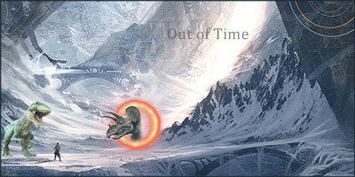
Not the best ive seen but I like the dinosaurs in the snow the thinking there was clever. But as an overall piece it looks plain like something I would find on google images.
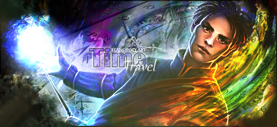
G3
A - 5/10
Like the slay with a pocket watch there but it looks a bit boring it needs to have a lot more colour like a time and space background with some C4d's in their
B - 2/10
It looks like a text slap really  I think what you have don't their is got a background and stuck a render of Matt Smith on there
G4
A - 7/10
Love the car in the background there I love the thinking of this piece the colours just come together and make it look so good looking (this sounds like im talking about food lol)
B - 5/10
This does not look like time travel (unless those guns were time travel guns lol). It looks like a zombie apocalypse is happening.
G5
A - 9/10
Love this piece the best part is the cogs that are in a pocket watch in the background. The render fits perfect into it and the colour is OMG.
B - 7/10
This sig wont get out of my head the colours are so attractive and the blue prints for a time travel car in the background is genius
G6
A - 7/10
Like the colour and text in this one but their is a bit too much colour in there for my liking.
B - 7/10
This one is nice but the render seems a bit blurred to fit in
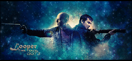
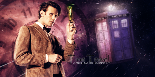
G7
A - 7/10
Not the best render pick out it is a bad cut I like the colour it fits the docter who theme.
B - 8/10
I guess whoever made this watches docter who lol I like on the left side where the TARDIS is left because The Docter always leaves his TARDIS in the allyways lol (he sucks at parking lol)
Posted 28 October 2013 - 20:40

Eldevin
drdoom123 - lvl EOC
AWhiteGuy - lvl EOC
Lowko - lvl 18 Ranger
Fallensword: drdoom123 lvl 824
Posted 28 October 2013 - 20:43
G1
A. 5. This is just unappealing to me.
B. 7. This is definitely the more appealing of the two.
G2.
A. 5. Just a bit to blurry.
B. 6. Better, but the dinosaurs make it a bit weird.
G3.
A. 3. I simply dislike this piece.
B. 4. Better, but not by much.
G4.
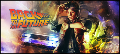
A. 7. Can't go wrong with back to the future.
B. 6. Nice piece pertaining to one of the better time travel movies out there.
G5.
A. 7.5. This is a good piece plain and simple.
B. 7.5. This gives a cooky twist to a series of great movies.
G6.
A. 6. It's good, but it could be better.
B. 7. This is a good piece more so because it depicts images from a movie based on a good series of games.
G7.
A. 5. Don't get me wrong it's great work, but B deserves a 10.
B. 10. You saved the best for last because this is the best piece out of the lot of them.
Posted 28 October 2013 - 20:44
G1
A) 9 Love the color integration and the background with the old clock
 6 Also great integration but the flames seem a bit too bright and hide the background a little bit
G2
A) 5 It looks a bit blurry so the detail on the left is not that visible. But great color selection
10 Love the landscape and colors
G3
A)15
0
A lot of actual work on the first image, love the background, didnt give any points to the second because its a star of a movie with terrible hair
G4
A) 7
8
Excellent work on the second one, but back to the future is a classic! So i kind of split the points.
G5
A) 7
8
Both great cartoon concept approaches, second one is funnier though 
G6
A) 6
9
A has both warm and white colors, B's left portin with the sand is just excellent
G7
A) 5
10
London before and then is an awesome antithesis, lovely colors as well. I also like A but B is just too good to hand out points differently.
In general, great efforts by everyone, best of luck to the contestants!
Posted 28 October 2013 - 20:51
1a. 9 i really like this one
b. 5
2a. 2
b. 3 i dont really get either
3a. 6 kinda funny
b. 2
4a. 10 this is the best one of them all i think
b. 5
5a. 6
b. 7 both ok but i like b best
6a. 7
b. 6 again both ok but i like a best
7a. 2
b. 4 dont really like either but b is best
Posted 28 October 2013 - 21:09
for those of you who voted today, be sure to PM me ingame (cqinmi) if you want a free avatar
Posted 28 October 2013 - 21:26
@Near123
You need to vote for each piece, not just those two.
Yeah, i fixed that, lol i misread the post lol
Posted 28 October 2013 - 21:45
Posted 28 October 2013 - 22:25
G1
A. 6 - Very Nice. I like it. However it is a bit plain.
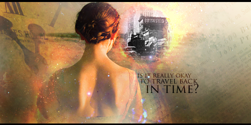
B. 8 - Wow. The girl on fire actually looks like a time traveler (although I know who she really is). Love the floating clocks and Eiffel tower, the pyramids and the bright colors. One of my favorites in this round.
G2
A. 5 - Interesting but a bit too blurry for my taste. The right side of the picture could use some more detail. other than the woman it is empty.
B. 3 - Nothing in this picture stands out very much. The writing is not very noticeable. Doesn't seem like very much work was put into this, Sorry :/
G3
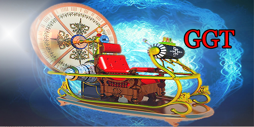
A. 4 - Interesting... ahem .... contraption. However, the surrounding picture is a bit plain and if I hadn't already known the theme, I would've guessed that it's Santa's new sleigh 
B. 1 - Again, this picture does not really make me think of time travel...
G4
A. 5 - Interesting, however, nothing really captivates me...
B. 7 - Very nice. I like how their bodies are partly dissolves and the starry/ partically (is that a word?) background. Really goes with the whole time travel theme. Well done!
G5
A. 8 - I love it! My favorite work in this round. Love the pieces of a dissembled clock between his hands. It was hard to choose whether to give this an 8 or a 9. In the end it came down to simple gut instinct rather than anything in the picture that I didn't like. I like it so much, in fact, that if the artist who created it is selling, please contact me as I would be interested in buying it
B. 5 - Interesting but doesn't captivate me like the one above does...
G6
A. 6 - Interesting. I like the multicolored thing (Don't know what to call it :/) on the right.
B. 7 - Great! The person dissolving into sand looks really good and fits into the time travel theme. I would be interested in buying it if the artist is selling!
G7
A. 5 - Not bad but it seems like the person is not photo-shopped into the picture very well.
B. 6 - Very interesting. I like it, however, I do not see very much photo-shop work in the picture. I could be wrong though...
Edited by Hic242, 28 October 2013 - 22:27.
'Think of how stupid the average person is, and realize half of them are stupider than that.'
Posted 28 October 2013 - 22:28
1st...i would like to apologize to any of the artists whose feelings I end up hurting due to my votes..just know its nothing personal and I am sure that u have done at least 1 piece of work that i would give a 10/10 for
Group 1:
A - 8/10
B - 8/10
I thought both where very well done, and couldn't decide which one i liked more.
Group 2:
A - 4/10 - its alright...i just done like how the womans hair is all flying back like that, theres also a guy (i think its a human) about 1 pinky to the top left of the girl which i cant seem to figure out if its supposed to be a person or what.
B - 3/10 - i find it to simple, and doesn't seem like a whole lot of work was done on this other than the circle that is around the triceratops head...the render it self has potential just need more practice on making dem avatars
Group 3:
A - 3/10 looks to much like text slapped.
B - 3/10 text slapped.
Group 4:
A - 3/10 - don't care to much for it, the guy himself doesn't look all the special neither does the background.
B - 5/10 - i couldn't decide if i like this enough to give it a 7+ or not...so here's a 5 haha..the font could have been nicer, also the brush that was used to make the bottom half of the 2 guys starting to disappear wasn't done all that nicely (that's m opinion)
Group 5:
A - 1 0/10 look at the rating i gave it....need i say more? lols
B - 9/10 i really enjoyed looking at this one....the 2 guys made me laugh a lot
Group 6:
A - 8/10
B - 8/10
nice job on both
Group 7:
A - 4/10 eh. this ones doesn't catch my attention or anything
B - 8/10 I especially like the color contrast of this avatar
________________________________________________________________________
One thing I noticed was that nobody really did an avatar where part of the character(s) body is like broken up into little squares....there's a movie called "The One" where the characters in the movie time dravel from 1 earth to another earth dimension and thats how it goes...a beam of light comes covers them from the sky and they start to break down into little squares and poof they are gone...i thought it would b really nice if some1 could have done that hahaha
Edited by abdullah89, 28 October 2013 - 23:04.
Posted 28 October 2013 - 22:35
Group 1
A: 7 - This one seems to have a story and meaning behind it.
B: 4 - Lack of creativity.
Group 2
A: 6 - Blends a little too much for me. Clarity isn't the best.
B: 3 - This one is just too plain.
Group 3
A: 3 - Not striking to me at all.
B: 2 - This does not interest me at all. Seems like a lack of effort.
Group 4
A: 8 - Great blending and great variation. This looks very good.
B: 6 - Good, but could use some detail around the rest of the picture.
Group 5
A: 9 - Great creativity. I like this one the most in group 5.
B: 6 - This one is good, but just can't beat picture A.
Group 6
A: 8 - Good creativity and blend. Very attractive to the eye.
B: 7 - Great detail, but could use a couple more additions to the outer parts.
Group 7
A: 3 - Good, but simple.
B: 12 - Amazing work. This is the best one overall, hands down.
Posted 28 October 2013 - 23:09
G1
A- 5/10 - makes me think
B- 7/10 - reminds me of Magic the gathering, and im a pyro
G2
A - 4/10 - kind of blurry, but looks cool all the same
B - 5/10 - looks fairly realistic except for the dino coming out of the portal
G3
A - 3/10 - too cartoon like for me - prefer this one
B - 3/10 - not sure what this has to do with time travel, i might understand better if i knew who the guy in it is
G4
A - 6/10 - well put together and i love the BTTF movies - prefer this one
B - 6/10 - nice effects going on around the actors
G5
A - 5/10 - the gears and stuff adds a cool effect but not a fan of the anime look
B - 6/10 - BTTF, the delorian blueprint and the look on their faces...need i say more
G6
A - 4/10 - nice colors but again too cartoon like for me
B - 7/10 - looks great, could have come from the films digital artists (not saying it did, but looks like something they would make...compliment not accusation)
G7
A - 4/10 - still dont know who the guy is but i can see how this one is related to time travel
B - 8/10 - great art work, i love the comparison - if i was to pay for any avis i saw here it would be this one.
i think that all the artist here deserve some props, i tried making avis before and know how much time and effort goes into it. all the artwork here looks cool, and im glad i took the time to look. hats off to you all
Posted 28 October 2013 - 23:35
G1.
A. 10 Totally love it.
B. 5
G2.
A. 8 Love the colors
B. 5 Dinosaurs are a bit small.
G3.
A. 7 Santa:)
B. 1 I dont understand what it have to do with time travel?
G4.
A. 7
B. 7 I like both
G5.
A. 5
B. 9 Gave me a laugh
G6.
A. 10. Adore it.
B. 5 Good as well but adore the other.
G7.
A. 4
B. 8 Dr Who is cool, but last is way better.
Posted 28 October 2013 - 23:39
wow lol glad to see the free avatar was a popular way to bring in the votes!
Voting ends in 30 mins. Will take a bit for me to tally up. Might be tomorrow morning before the winners of Round 1 are announced.
Posted 29 October 2013 - 00:04
wow lol glad to see the free avatar was a popular way to bring in the votes!
Voting ends in 30 mins. Will take a bit for me to tally up. Might be tomorrow morning before the winners of Round 1 are announced.
Whatever you did CQ it worked. Seeing this much participation is amazing! Thanks everyone who voted and be sure to check out round 2.

So who wants to buy me Zombie Brand on League of Legends?
New Member

Posted 29 October 2013 - 00:13
Posted 26 October 2013 - 01:47
GROUP 1
A ) 6/10
B ) 9/10

GROUP 2
A ) 7/10

B ) 7/10
GROUP 3
A ) 5/10
B ) 3/10

GROUP 4
A ) 2/10
B ) 5/10
GROUP 5
A ) 7/10

B ) 8/10
GROUP 6
A ) 9/10
B ) 6/10

GROUP 7
A ) 3/10
B ) 5/10

Posted 29 October 2013 - 00:28
Great! My Idea worked CQ!!! Great participation! 
Sig By DMR > Thx Dear, i love it!
Posted 29 October 2013 - 00:38
G1 -
a - 6 - It gets the idea of the theme across, but I'm not really feeling the effects used to blend the images together, they still seem like separate images to me. Text could be better, and possibly positioned differently.
b - 7 - Theme is represented well, I like the colors and the blending... I'm not real keen on the Eiffel Tower image swirling around with the clocks. Text fits well
G2 -
a - 5 - very blurry, I get the point, but it would not be apparent without knowing the theme... no comment on the text
b - 5 - very simple, text is very plain and poorly positioned.
G3 -
a - 2 - looks like a render slapped on a background with text slapped on it... I know what it is, and where it is from, but I'm still looking for the reindeer (I think it is the text that is causing that though).
b - 1 - wow wow... wow... yeah, so I used tineye on this one and my fears were well founded... 1 image faded over another with the main character erased around and text slapped on it. If you are going to do that, at least do some tutorials for the text from youtube and make the text look good.
- I'm feel bad for giving marks so low in this group, and I'm sorry if I have offended either of the artists here
G4 -
a - 9 - big Back to the Future fan... very good representation and love the effects... the text speak for itself! Cudos!
b - 6 - nice effects, but the background lighting should be higher (when looking at the lighting on the characters). probably would have given higher marks if I could give more than 15 per group.
G5 -
a - 8 - Nice lighting, nice text... very clean and very clear! (Just wish I could read the little stuff lol)
b - 7 - Very well done, love how you added the car in the back! too bad you had to be in the same group you two... very hard to split the 15 here.
G6 -
a - 6 - nice effects... not feeling the colors as much, but well blended... nice text!
b - 6 not sure if this has to do with time travel or not, I like the effects though.
G7 - (how many groups are there!?)
a - 6 - The theme is clearly represented here, My only issue is the character doesn't blend in with the image itself... looks too much like a render pasted on a background. Text is good and background is very well done
b - 7 - I have to say that the only thing I don't like about this one is year of the future side... 31,440 my head is spinning lol!
2 notes to the artists...
1. I read the voting and understand that I have 15 pts to distribute between the 2 entries and that there is a max of 10 pts to be awarded to an individual image so if I didn't distribute the 15 pts its because I'm old school and am awarding pts based solely on the 1-10 scale.
2. My votes are not an attack on you personally and are merely my opinion (as uneducated as it may be)... please don't take offense.
If I win an auction, please notify me in-game
0 members, 0 guests, 0 anonymous users