6/10 image is blurry...
*Rate the Signature above you*
Started by
fs_briggzy
, Feb 06 2008 00:33
3797 replies to this topic
#62
 fs_briggzy
fs_briggzy
-

- Guests
Posted 10 February 2008 - 17:00
7/10, i like the actual sig, but the text doesnt go with it imo
#64
fs_brishu
fs_brishu
-
- Guests
Posted 11 February 2008 - 06:40
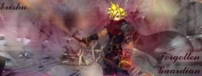
8/10 ...... there are some empty spots that just seem to pop out to me ...... nice alien .......
#65
fs_briggzy
fs_briggzy
-
- Guests
Posted 12 February 2008 - 00:29
7/10, getting alot better brishu, keep it up :wink:
#66
fs_brishu
fs_brishu
-
- Guests
Posted 12 February 2008 - 00:32
thnx ...
u is the getty a 9 & 10 ....
....
u is the getty a 9 & 10
....
#67
fs_tawniteamo
fs_tawniteamo
-
- Guests
Posted 12 February 2008 - 05:55
thnx ...
u is the getty a 9 & 10
hm...6/10 definitely improved since the last of yours I saw.
#68
fs_brishu
fs_brishu
-
- Guests
Posted 12 February 2008 - 06:22
(lookin at ur forum avi) ... it might be the effect you are going for ... but .... just doesnt look right ..... especially the blue (sword???) bar ..... too much ligjt ... cut down a bit on the light sources
7/10
7/10
#69
fs_briggzy
fs_briggzy
-
- Guests
Posted 18 February 2008 - 20:36
6/10, too big for me, and too plain.
#70


Posted 18 February 2008 - 21:04
nice I like them...
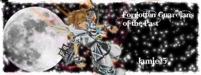
9/10 on the top one
10/10 on the bottom...
the top one is just a bit too big heightwise for my taste
I hope one day my stuff all looks that good though
9/10 on the top one
10/10 on the bottom...
the top one is just a bit too big heightwise for my taste
I hope one day my stuff all looks that good though
#71
fs_yukio
fs_yukio
-
- Guests
Posted 20 February 2008 - 17:42
8/10
Pretty good.
Needs some depth though...and flow. :wink:
The lighting in the bottom covers some of the focal a bit...You should have tried to lower the lightings opacity and used a darkblue soft brush over it and set it to dodge at 70-80% :roll:
Also, i "hate" that neg space in the right
Colors are pretty good, nice use of C4Ds, also a good text right there.
#72
fs_briggzy
fs_briggzy
-
- Guests
Posted 20 February 2008 - 17:49
8/10, atleast someone on this forum other than me knows how to smudge properly 
#73
fs_yukio
fs_yukio
-
- Guests
Posted 20 February 2008 - 17:55
8/10, atleast someone on this forum other than me knows how to smudge properly
lol
To your surprise, nothing in that sig was smudged
. Its C4Ds over C4Ds over C4Ds over a lot of teeny tiny clipmasks lol Anyway you sigs 9/10 both. Second one is better imo.
#74
fs_briggzy
fs_briggzy
-
- Guests
Posted 20 February 2008 - 19:00
8/10, atleast someone on this forum other than me knows how to smudge properly
lol
To your surprise, nothing in that sig was smudged
Anyway you sigs 9/10 both. Second one is better imo.
oh lol, it looks a bit like it was smudged with a spatter brush
#75
fs_deemer
fs_deemer
-
- Guests
Posted 20 February 2008 - 21:09
9/10 for both of them, truly well done
#76
fs_brishu
fs_brishu
-
- Guests
Posted 21 February 2008 - 03:26
dang it ... i thought i posted my reply here .....
anyway faramir ... you a get an 8/10 mostly cause its too bright for my taste ......
Rocksta ..... you get a 1 ...... i can see neither the render nor the background properly or at all ...... the text is a too obvious there no indication taht work was actaully done ... i suggest increasing the opacity to make it more visible (yes i KNOW he doesnt have a sig ... but since he decided to be wise&*$ ... i decided to be one as well)
any way ......
#77
fs_cheetos185
fs_cheetos185
-
- Guests
Posted 21 February 2008 - 18:55
Brishu gets a 7/10...the character needs to blend in with the background
#78
fs_brishu
fs_brishu
-
- Guests
Posted 22 February 2008 - 03:44
8 outta 10 .... the hair needs to be lightened a bit more ....
\/\/\/\/\/\/\/ ......... ........ either or .... preferably both plz

\/\/\/\/\/\/\/ .........
........ either or .... preferably both plz
#79
fs_rathalos9
fs_rathalos9
-
- Guests
Posted 22 February 2008 - 14:41
Both get 6/10
not youre best follow a TUT
i dont like the smuding or text
not youre best follow a TUT
i dont like the smuding or text
0 user(s) are reading this topic
0 members, 0 guests, 0 anonymous users