

Welcome to the voting thread of Graphic of the Week September 2013.
This week, contestants had to create an avatar with the following theme:
The Autumn Feeling.
This time of year is such a wonderful one in my opinion and with so many different aspects of it going on such as the Harvest, Migration, Caching for the winter, The colour of the leaves. There is a magic to it all. Design an avatar to show the wonder of this time of year.
To vote, please tell which avatar is your favourite with a short reason. Please don't only say which one you chose as I will not consider your vote if there is no reason with it!
Those who participated to this week can vote, but can only vote for somebody else's avatar.
Voting will be open for a week unless there is a clear winner within a few days.
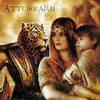
A - SlntScream

B - Chagryn

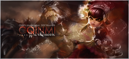
C - ArtistGorn

D - Crzy

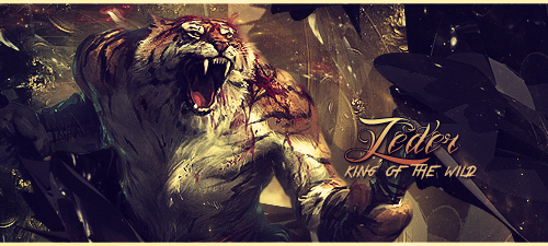
E - Zeder

F - Ghetoghost


 She's my woman crush!