Group 1
B 9/10 ... -1 for tornado

GGT 6 Round 3 Voting ***OVER***
Started by TreeFrog, Feb 06 2013 03:00
37 replies to this topic
#22

Posted 08 February 2013 - 04:25
Group 1
B 9/10 ... -1 for tornado
Please take the time to read how the voting works.


^ SAHARDY ^
<><><><><><><><><><><><><><><><><><><><>< Selling Stuff ><><><><><><><><><><><><><><><><><><><><>
#23
Posted 08 February 2013 - 12:37
Group 1
A. 6 Disasters are chaotic and I'm just not feeling it. A wave hitting the shore at all points at the same time is too unnatural, it's more like a Hollywood movie, too scripted. The 2 identical box looking things in the upper right of the wave crest are a distraction to me.
B. 9 I like the black and white (sepia might have been better?) because it's like an old time picture, which pairs well with the old house.
Group 2
A. 6 I can't figure out if that is a planet exploding or getting hit by an enormous meteor. The planet is all chard on the outside, but I would think that the flames from an explosion would burst from several locations and wouldn't be as large as is shown. If it's being hit by a meteor of the size that the flames suggest, I think that the body of the meteor would be seen. I do like the fissures on that planet, it reminds me of a volcano.
B. 5 Although the flames and creek look realistic, I would think that there would be trees in the background ablaze and the flames in the brush much higher (I've seen too many brush and forest fires here in Cali.). Some embers raining down would have been a nice touch. The upper left is rather void of anything, perhaps the text could have been placed there?
Group 3
A. 4 A volcano erupting I believe would have a crater at least if the top weren't being blown off. And the surface looks much too smooth. The explosion is much too fine, as I read earlier, like fireworks. The flames encircling everything is a bit too much of a distraction.
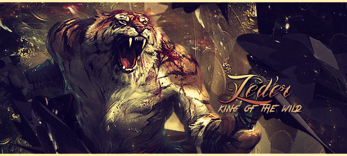
B. 6 The face is a nice concept but wasn't successful, especially the lack of emotion. The tornado is too rough along it's edges. If you were using the road meeting the tornado as a metaphor as the path of destruction, I applaud you for that.
(I claim little knowledge as to the making of an avatar, so please forgive me for the lack of comments pertaining to the creation process. I only know what I like. I hope.)
A. 6 Disasters are chaotic and I'm just not feeling it. A wave hitting the shore at all points at the same time is too unnatural, it's more like a Hollywood movie, too scripted. The 2 identical box looking things in the upper right of the wave crest are a distraction to me.
B. 9 I like the black and white (sepia might have been better?) because it's like an old time picture, which pairs well with the old house.
Group 2
A. 6 I can't figure out if that is a planet exploding or getting hit by an enormous meteor. The planet is all chard on the outside, but I would think that the flames from an explosion would burst from several locations and wouldn't be as large as is shown. If it's being hit by a meteor of the size that the flames suggest, I think that the body of the meteor would be seen. I do like the fissures on that planet, it reminds me of a volcano.
B. 5 Although the flames and creek look realistic, I would think that there would be trees in the background ablaze and the flames in the brush much higher (I've seen too many brush and forest fires here in Cali.). Some embers raining down would have been a nice touch. The upper left is rather void of anything, perhaps the text could have been placed there?
Group 3
A. 4 A volcano erupting I believe would have a crater at least if the top weren't being blown off. And the surface looks much too smooth. The explosion is much too fine, as I read earlier, like fireworks. The flames encircling everything is a bit too much of a distraction.
B. 6 The face is a nice concept but wasn't successful, especially the lack of emotion. The tornado is too rough along it's edges. If you were using the road meeting the tornado as a metaphor as the path of destruction, I applaud you for that.
(I claim little knowledge as to the making of an avatar, so please forgive me for the lack of comments pertaining to the creation process. I only know what I like. I hope.)
#24

Posted 08 February 2013 - 14:05
No worries, thanks for the input mate(I claim little knowledge as to the making of an avatar, so please forgive me for the lack of comments pertaining to the creation process. I only know what I like. I hope.)

#25


Posted 08 February 2013 - 19:57
Group 1
A: 7/10 - the wave is nice but the city is unclear:/
B: 10/10 - love it everything fits so well
Group 2
A: 6/10 - looks nice but feels like more could be made
B: 6/10 - looks nice but just not my taste
group 3
A: 7/10 - well made
B: 5/10 - the face dosen't fit with the rest of the picture IMO
A: 7/10 - the wave is nice but the city is unclear:/
B: 10/10 - love it everything fits so well
Group 2
A: 6/10 - looks nice but feels like more could be made
B: 6/10 - looks nice but just not my taste
group 3
A: 7/10 - well made
B: 5/10 - the face dosen't fit with the rest of the picture IMO

#26
aa0007
-
- New Members
-

- 4,379 posts
Veteran
- United States of America
Posted 09 February 2013 - 02:46
No worries, thanks for the income mate(I claim little knowledge as to the making of an avatar, so please forgive me for the lack of comments pertaining to the creation process. I only know what I like. I hope.)
You mean input?
 .
.
#27
Kayesha
-

- New Members
-
- 2,030 posts
Veteran
- United States of America
Posted 09 February 2013 - 17:54
Group 1
A - 78
B - 91
Group 2
A - 75
B - 80
Group 3
A - 69
B - 64
A - 78
B - 91
Group 2
A - 75
B - 80
Group 3
A - 69
B - 64
#28
aa0007
-
- New Members
-
- 4,379 posts
Veteran
- United States of America
Posted 10 February 2013 - 02:39
Bump. I think this needs some advertising.
#29
Posted 10 February 2013 - 02:55
Group 1
A: Pretty cool but the colour scheme/blending is bugging me
8.5/10
B: Blending is good but B&W kinda takes away the fierce feels of a tornado
8.2/10
Group 2:
A: Placement, Too much gray on colour scheme, Smudged smudged but it looks unfinished
7.1/10
B: Nice idea, background is pretty cool, horrible render choice. Seems like the animal inst givin a s*** to whats going on Maybe a diferent one expressing some concert about the flames aroud would be better
7.6/10
Group 3:
A: pretty good, just not feeling the colour scheme. Too much white and undersaturated. Maybe a stronger/darker red/orange would be better
7.8/10
B: If the render choice was bad on 2b, this one probably ruins it. The face doesnt belong there, plus I dont see an angry face or even mother nature.
5/10
If you have any complaints please go yell at aa0007, thanks.
A: Pretty cool but the colour scheme/blending is bugging me
8.5/10
B: Blending is good but B&W kinda takes away the fierce feels of a tornado
8.2/10
Group 2:
A: Placement, Too much gray on colour scheme, Smudged smudged but it looks unfinished
7.1/10
B: Nice idea, background is pretty cool, horrible render choice. Seems like the animal inst givin a s*** to whats going on
Maybe a diferent one expressing some concert about the flames aroud would be better7.6/10
Group 3:
A: pretty good, just not feeling the colour scheme. Too much white and undersaturated. Maybe a stronger/darker red/orange would be better
7.8/10
B: If the render choice was bad on 2b, this one probably ruins it. The face doesnt belong there, plus I dont see an angry face or even mother nature.
5/10
If you have any complaints please go yell at aa0007, thanks.
#30
aa0007
-
- New Members
-
- 4,379 posts
Veteran
- United States of America
Posted 11 February 2013 - 01:38
I wanna see EVERY ARTIST IN FS responding to this thread  . So going by everyone that's made a thread on the graphics forum recently ..
ghetoghost
senira
sustortias
peterownz
hbklives
darkdyablo
neil7887
kaliwyn
chagryn
subject1
mycurse
haloartist
clearxwing
kaboooom
roan
dragon1314
impurity
flucht
patnov
mini100
sahardy
athdenald
and others.
Some of you might have voted already, I'm too lazy to check. The rest of you,get voting.
. So going by everyone that's made a thread on the graphics forum recently ..ghetoghost
senira
sustortias
peterownz
hbklives
darkdyablo
neil7887
kaliwyn
chagryn
subject1
mycurse
haloartist
clearxwing
kaboooom
roan
dragon1314
impurity
flucht
patnov
mini100
sahardy
athdenald
and others
.Some of you might have voted already, I'm too lazy to check. The rest of you,get voting
.
#31

Posted 11 February 2013 - 01:40
He's to lazy to check whose posted but has enough energy to find all the names of artists
~ ~ ~ ~ ~ ~ ~ ~ ~ ~ ~ ~ ~ Live. Love. Learn. Die. ~ ~ ~ ~ ~ ~ ~ ~ ~ ~ ~ ~ ~
Are you an artist? Want to be listed as one under the Artist Directory; click here
#32
aa0007
-
- New Members
-
- 4,379 posts
Veteran
- United States of America
Posted 11 February 2013 - 01:41
He's to lazy to check whose posted but has enough energy to find all the names of artists
Yup. I just had to open the graphics forum to see the recent posters, eliminating is extra work
.
#33
zeder
-
- Members
-
- 1,098 posts
Veteran

- United States of America
Posted 11 February 2013 - 16:30
Group 1
A - 7 Feels like a poster for the SyFy channel
B - 10 What no cow?
Group 2
A - 6 Some stars in the background behind the text would have made it better
B - 9 Maybe the deer on fire?
Group 3
A - 8 Not sure what to say, just doesn't feel right
B - 10 What no cow?
A - 7 Feels like a poster for the SyFy channel
B - 10 What no cow?
Group 2
A - 6 Some stars in the background behind the text would have made it better
B - 9 Maybe the deer on fire?
Group 3
A - 8 Not sure what to say, just doesn't feel right
B - 10 What no cow?
 by Chagryn
#34
Posted 11 February 2013 - 19:19
Group 1
A, 9/10: Really great, the only thing that bugs me is that the water looks like it's coming out of nowhere. Other than that, it's beaut
B, 8/10: I don't really like the black and white, but the cloud and rain effects are great
Group 2
A, 8/10: Really cool, just think that "planetary disaster" should be depicted on a larger scale, with even more destruction, lol!
B, 10/10: This one is my favorite. Scary and beautiful at the same time.
Group 3
A, 9/10: Awesome! I feel like it could have some more dark parts around the edges to increase the dramatic impact.
B, 8/10: I like this, the mother nature thing is a neat idea

#35
Kayesha
-
- New Members
-
- 2,030 posts
Veteran
- United States of America
Posted 11 February 2013 - 22:01
Group 1
A - 102.5
B - 117.2
Group 2
A - 96.1
B - 106.6
Group 3
A - 93.8
B - 87
A - 102.5
B - 117.2
Group 2
A - 96.1
B - 106.6
Group 3
A - 93.8
B - 87
#36
Posted 12 February 2013 - 00:51
This has ended. Names are posted and I'll get the theme up for the next round soon. Congrats to those moving on.
^ SAHARDY ^
<><><><><><><><><><><><><><><><><><><><>< Selling Stuff ><><><><><><><><><><><><><><><><><><><><>
#37

Posted 12 February 2013 - 03:56
Group 3, the weak group lol!
Good job to others! Was fun competing!
Good job to others! Was fun competing!
#38
Posted 12 February 2013 - 04:37
As always, I love you all!
Don't hate me afterwards. <3
Don't hate me afterwards. <3

good photographyer. great drawer. but im most best at photoshop.
0 user(s) are reading this topic
0 members, 0 guests, 0 anonymous users