Hi, was wondering if I could get some CnC on the following piece, this is my first ever Signature. :oops:
NOTE: Edited the text a bit afterward and am using it as my own Sig now. Also added another piece.
First Signature CnC
Started by
fs_kyransky
, Jul 30 2012 21:20
5 replies to this topic
#1 fs_kyransky
Posted 30 July 2012 - 21:20
#2 fs_kyransky
Posted 01 August 2012 - 18:42
Bump-itty Bump Bump.
#3
Posted 01 August 2012 - 21:22
Its better than my first attempt :wink: ,but i really dislike the grains in the background
#4 fs_kyransky
Posted 02 August 2012 - 00:01
New piece added with and without border. Bump
#5
Posted 02 August 2012 - 00:14
It really isn't bad for a starter but when dealing with renders you have to focus on a few things: Placement, Focal, Depth, Lighting, etc. This just looks like a background with a render on top. I see you used colors from your render and that is good! But if I were to work with this I would pick 2 colors from the render(one light and one dark) then gradient it as my background. That you can establish lighting (which comes from above her head) and darken the areas that naturally would be. Text placement isn't bad at all but I usually prefer smaller text so you aren't distracted from the focal.
Other than that not bad!!! :mrgreen:
Edit: This is for the second sig btw
Other than that not bad!!! :mrgreen:
Edit: This is for the second sig btw
#6
Posted 06 August 2012 - 11:34
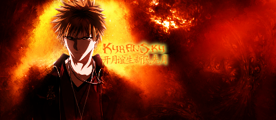
First one = awesome, text placement should be following/referencing with the 9-squares rule (<=don't say anything regarding on that as i can't remember the name). In addition, the focus, I presume, is the character. Thus, it will be a good idea to establish some lighting (use dodge/burn tool). For this type of signature (smudging style), I will suggest don't focus too much on depth but instead of blending and other effects (flow).
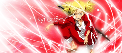
As for the next one, it isn't too bad at all but overly used brushing tool. Gradient for the background and then set opacity to around 75% or a little bit higher should work. Overall GJ and KIU
0 user(s) are reading this topic
0 members, 0 guests, 0 anonymous users