Jump to content

Photo

GOTW September 2013. Week 1 Voting!


  • Please log in to reply
43 replies to this topic

#1 AttorraRu

AttorraRu

    Veteran

  • Members
  • PipPipPip
  • 920 posts
  • Badge
  • United Kingdom

Posted 02 September 2013 - 00:54

Welcome to the voting thread of Graphic of the Week September 2013.

This week, contestants had to create a signature and avatar with the following theme:


This week's theme is: A Fallen Sword Adventure, combine at least TWO aspects of the game in a signature and avatar. Aspects of the game include Levelling, PVP, Titans, Medals, Questing, SEs, Chests etc.

To vote, please tell which signature and Avatar combination are your favourite with a short reason. Please don't only say which one you chose as I will not consider your vote if there is no reason with it.

Those who participated to this week can vote, but can only vote for somebody else's signature.

Voting will be open for a week!


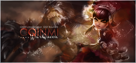
A-  Super Elites and Titans - Lerijs13


Sig-A_zps3cdefbbe.png


Avi-A_zps4db8c762.png


B- "Frozen Flats Merchant" Merchant and Titan Hunting. -Crzy


sig-B_zps4b13f707.png


Avi-B_zps2b575919.png


C-  Glory Seeker, Potion Maker, Elite Hunter and Fragmenter & Leveller, PvPer - Yahtzeee


Sig-C_zpsadb294bb.jpg


Avi-C_zps92664366.jpg


D- SE hunting and Titan hunting - Jzaz


Sig-D_zpsa74ee2d2.png


Avi-D_zps203423c7.png


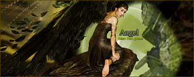
E- Theme - Temple of the Gods and FSP - PvP ladder - Ghetoghost


Sig-E_zpsfcb35c6b.png


Avi-E_zpsa7af9b60.png


F- Theme – Auction House and Market Place - Zeder


Sig-F_zps48f1ce9e.png


Avi-F_zps4176528b.png


G – Theme – Recipes and Questing - Noeni


Sig-G_zps016e941f.png


Avi-G_zpscfd73558.png


H- Theme – Levelling and SE hunting - Owlzz


Sig-H_zps84e4aca0.png


Avi-H_zps3ae44a9d.png


Sig16avi703-Ru2_zps6167231b.png by Zeder


"Surrender is NOT an option" - Tamra Dragonstar - Lord Command of the Dnulian Army. (Queen)


#2 ghetoghost

ghetoghost

    Veteran

  • Members
  • PipPipPip
  • 1,564 posts

Posted 02 September 2013 - 01:04

A.)
B.)
C.) 1
D.)
E.)
F.)
G.)
H.)
 
A,C,D were my favorites. A has topaz which is my weakness. C captures the theme perfectly. D is awesome looking. My vote goes to C though

~ ~ ~ ~ ~ ~ ~ ~ ~ ~ ~ ~ ~ Live. Love. Learn. Die. ~ ~ ~ ~ ~ ~ ~ ~ ~ ~ ~ ~ ~


Are you an artist? Want to be listed as one under the Artist Directory; click here


#3 kingkillz

kingkillz

    Member

  • Members
  • PipPip
  • 64 posts
  • Badge

Posted 02 September 2013 - 01:14

my vote goes to C as well


#4 ghetoghost

ghetoghost

    Veteran

  • Members
  • PipPipPip
  • 1,564 posts

Posted 02 September 2013 - 01:16


my vote goes to C as well


A.)
B.)
C.) 2
D.)
E.)
F.)
G.)
H.)

~ ~ ~ ~ ~ ~ ~ ~ ~ ~ ~ ~ ~ Live. Love. Learn. Die. ~ ~ ~ ~ ~ ~ ~ ~ ~ ~ ~ ~ ~


Are you an artist? Want to be listed as one under the Artist Directory; click here


#5 harute

harute

    New Member

  • Members
  • Pip
  • 2 posts

Posted 02 September 2013 - 01:19

My vote is to D just because i has what i think is the best feel to it. Sure C fit the theme but it doesn't really draw you in. I was stuck between A and D but A i feel might look too flashy. It's my personal opinion don't jump on me because i don't feel the same way as you. You may have some valid points but i'm sticking to D.


#6 jzaz

jzaz

    Veteran

  • Members
  • PipPipPip
  • 659 posts
  • Badge

Posted 02 September 2013 - 01:21

A.) 1 

B.)

C.) 2

D.) 1

E.)

F.)

G.)

H.)


My favorites were A, C, and E. The problem with C is that the background was just cut from the FS background, with few effects to it, which was the only thing that prevented me from choosing this one. I like the bloody look to E's signature (because the gods are cruel never choose me  :( ) and how it portrays the ladder as unreachable, something I can relate to as well LOL. What prevented me from choosing it was that the theme of "FSP" seems a tad improvised and it could be incorporated into the signature a bit more (hint: one of the gods gives fsp as a reward.) 


I chose A because it perfectly exemplifies the ferocity that titans and super-elites should have, like to the point where they actually clash. Although it is a bit over topaz-ed, I settled with A out of the three because of the reason stated earlier.


#7 KuRaPiKa12

KuRaPiKa12

    Member

  • Members
  • PipPip
  • 111 posts
  • Badge

Posted 02 September 2013 - 01:22

My vote goes to C


5d8f9cc963c31f1be5f8bb87ccced8a3.png


#8 jzaz

jzaz

    Veteran

  • Members
  • PipPipPip
  • 659 posts
  • Badge

Posted 02 September 2013 - 01:26

my vote goes to C as well


My vote goes to C

To future voters, please provide a reason next time ;) as stated in the original post


#9 jzaz

jzaz

    Veteran

  • Members
  • PipPipPip
  • 659 posts
  • Badge

Posted 02 September 2013 - 01:27

My vote goes to C

A.) 1

B.)

C.) 3

D.) 1

E.)

F.)

G.)

H.)


#10 ghetoghost

ghetoghost

    Veteran

  • Members
  • PipPipPip
  • 1,564 posts

Posted 02 September 2013 - 01:27

*edit - jzaz beat me to it*  :angry: haha


I can tell who made what for some of the graphics but the others i have no clue to who made it. It will be fun finding out who made those pieces


~ ~ ~ ~ ~ ~ ~ ~ ~ ~ ~ ~ ~ Live. Love. Learn. Die. ~ ~ ~ ~ ~ ~ ~ ~ ~ ~ ~ ~ ~


Are you an artist? Want to be listed as one under the Artist Directory; click here


#11 Hadley12

Hadley12

    New Member

  • New Members
  • Pip
  • 6 posts
  • Badge
  • United States of America

Posted 02 September 2013 - 04:26

I love A, B, and C. But my vote goes to C because it hits the topic right on the head for the most part. A and B just are really cool graphics :)


#12 lerijs13

lerijs13

    Member

  • Members
  • PipPip
  • 73 posts

Posted 02 September 2013 - 05:34

My vote goes to D just because it looks the best out of them all.. Sure, the themes in C are amazing, but alltogether it just doesn`t look that very good. 


A.) 1

B.)

C.) 4

D.) 2

E.)

F.)

G.)

H.)


#13 crow88

crow88

    New Member

  • New Members
  • Pip
  • 22 posts
  • Badge

Posted 02 September 2013 - 05:45

It's between c and d, but I'll have to go with d. C is great and all, but in the theme is says..


[Omitted] combine at least TWO aspects of the game in a signature and avatar. Aspects of the game include Levelling, PVP, Titans, Medals, Questing, SEs, Chests etc.


C looks like the aspects are just listed instead of combined, combine being the key word there.

D looks as if Kratos is battling both titans and super elites at once in one epic battle. That's what I was looking for


A.) 1

B.)

C.) 4

D.) 3

E.)

F.)

G.)

H.)


#14 Dragoonale

Dragoonale

    Member

  • Members
  • PipPip
  • 67 posts
  • Badge
  • United States of America

Posted 02 September 2013 - 08:36

These all look very creative and great. Incredibly done everyone who entered in. A lot of talent on here :D


#15 AttorraRu

AttorraRu

    Veteran

  • Members
  • PipPipPip
  • 920 posts
  • Badge
  • United Kingdom

Posted 02 September 2013 - 11:58

These all look very creative and great. Incredibly done everyone who entered in. A lot of talent on here :D


do you have a favourite?


Sig16avi703-Ru2_zps6167231b.png by Zeder


"Surrender is NOT an option" - Tamra Dragonstar - Lord Command of the Dnulian Army. (Queen)


#16 Noeni

Noeni

    Veteran

  • New Members
  • PipPipPip
  • 566 posts
  • Badge

Posted 02 September 2013 - 12:08

Great art work everyone and great theme Attorraru you all are great artist you all am sure put a lot into your work, all aspect of Fallen Sword  is present .shows that fallen sword is an awesome game.It's a tough choice but I give my vote to D.Why?  I like the feel of  the hunter  ready to fight his way through.


A.) 1

B.)

C.) 4

D.) 4

E.)

F.)

G.)

H.)


bannerfans_6199711.png


#17 Owlzz

Owlzz

    New Member

  • New Members
  • Pip
  • 39 posts

Posted 02 September 2013 - 15:18

I give my vote to A. I think that while we had to incorporate 2 fallen sword themes, the main idea was to try to make something that would be desirable as an Avi or Sig. That being said, A and D achieve this the best,  and my decision goes to A according to taste. 


A.) 2

B.)

C.) 4

D.) 4

E.)

F.)

G.)

H.)


#18 ghetoghost

ghetoghost

    Veteran

  • Members
  • PipPipPip
  • 1,564 posts

Posted 02 September 2013 - 16:33

Bump


~ ~ ~ ~ ~ ~ ~ ~ ~ ~ ~ ~ ~ Live. Love. Learn. Die. ~ ~ ~ ~ ~ ~ ~ ~ ~ ~ ~ ~ ~


Are you an artist? Want to be listed as one under the Artist Directory; click here


#19 WarQueen

WarQueen

    Veteran

  • Members
  • PipPipPip
  • 2,185 posts
  • Badge

Posted 02 September 2013 - 17:38

Tough decision...


C - like the signature and how it includes more than 1 aspect of the game. Not liking the avatar and how the focal seems to float in limbo (what happened to his waist?)  or the bland, super blurry, background.
D - love the avatar but the signature's shortness kinda ruins the combo


Can I split my vote between the two? Give .5 to both?


WarQueenSig1_zpsfe2b03d4.png


#20 AttorraRu

AttorraRu

    Veteran

  • Members
  • PipPipPip
  • 920 posts
  • Badge
  • United Kingdom

Posted 02 September 2013 - 18:44

A.) 2

B.)

C.) 4.5

D.) 4.5

E.)

F.)

G.)

H.)


Sig16avi703-Ru2_zps6167231b.png by Zeder


"Surrender is NOT an option" - Tamra Dragonstar - Lord Command of the Dnulian Army. (Queen)


0 user(s) are reading this topic

0 members, 0 guests, 0 anonymous users

Font:
Arial | Calibri | Lucida Console | Verdana
 
Font Size:
9px | 10px | 11px | 12px | 10pt | 12pt
 
Color: