Jump to content

Photo

I would just love your cnc! Added Another


  • Please log in to reply
12 replies to this topic

#1 mini100

mini100

    Veteran

  • Members
  • PipPipPip
  • 684 posts

Posted 18 July 2012 - 05:43

Well i threw together this piece and i really like the outcome. At the beginning of it, it looked good but during the middle i didnt think it would pull through luckily it turned out pretty nice. Though text needs a ton of work.....
Posted Image

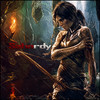
Second one really like this one. Think text is better and its smaller.
Posted Image

Tried to use a little different style for this piece not sure if it worked
Posted Image
V2
Posted Image

Sorry but Photobucket decided to take down my Signature.


#2 mini100

mini100

    Veteran

  • Members
  • PipPipPip
  • 684 posts

Posted 18 July 2012 - 22:06

bump

Sorry but Photobucket decided to take down my Signature.


#3 Sahardy

Sahardy

    Veteran

  • Members
  • PipPipPip
  • 1,399 posts

Posted 20 July 2012 - 03:53

It would look better without the text.

Sahardy.gif
good photographyer. great drawer. but im most best at photoshop.


#4 koenvdv

koenvdv

    Veteran

  • Members
  • PipPipPip
  • 1,327 posts
  • Badge
  • Belgium

Posted 20 July 2012 - 08:10

Looks good ... only text looks horrible

#5 stormfury3

stormfury3

    Veteran

  • New Members
  • PipPipPip
  • 597 posts

Posted 20 July 2012 - 10:59

other then text...

Posted Image

#6 vincent96

vincent96

    Veteran

  • Members
  • PipPipPip
  • 618 posts

Posted 20 July 2012 - 15:26

It would look better without the text.


:shock: :shock: :shock: :shock: :shock: :shock: :shock:

its a really good one but i spent 5 mints looking for the text till i put my eyes 1 inch from the screen to see it :lol:
so imo drop the text or try making it better :)

viny.gif

Various Artists


#7 Chagryn

Chagryn

    Veteran

  • Members
  • PipPipPip
  • 995 posts
  • Badge

Posted 20 July 2012 - 17:35

again, just my personal preference they should be smaller. I know you hear it from me all the time lol.

Other than that it looks great! You have really improved grass hopper

BrandSig_zpsf2e5098b.png

So who wants to buy me Zombie Brand on League of Legends? 


#8 mini100

mini100

    Veteran

  • Members
  • PipPipPip
  • 684 posts

Posted 21 July 2012 - 03:51

thanks guys :D 
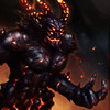
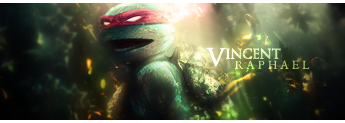
and yeah i know text is terrifyingly horrible on this piece

Sorry but Photobucket decided to take down my Signature.


#9 mini100

mini100

    Veteran

  • Members
  • PipPipPip
  • 684 posts

Posted 21 July 2012 - 06:06

added another piece with better text i think and its smaller just for you chag

Sorry but Photobucket decided to take down my Signature.


#10 stormfury3

stormfury3

    Veteran

  • New Members
  • PipPipPip
  • 597 posts

Posted 21 July 2012 - 06:14

don't do it, it's a trap... Posted Image
almost all of you work is the same style you should do more tuts learn other styles.

#11 mini100

mini100

    Veteran

  • Members
  • PipPipPip
  • 684 posts

Posted 21 July 2012 - 06:18

yeah i know it is i just figure that i should get good at one style before i start expanding you know? I think i have started to get good enough where i can try new styles the next piece ill have you guys cnc ill try and go a different style. :D With that be warned it might be terrible :mrgreen:

Sorry but Photobucket decided to take down my Signature.


#12 mini100

mini100

    Veteran

  • Members
  • PipPipPip
  • 684 posts

Posted 22 July 2012 - 19:29

added another not sure if its any different style though

Sorry but Photobucket decided to take down my Signature.


#13 ratslayer

ratslayer

    Member

  • New Members
  • PipPip
  • 73 posts

Posted 22 July 2012 - 19:35

the text on most are hard to read but yourr clipping masks are well placed and done :D love it bro!


0 user(s) are reading this topic

0 members, 0 guests, 0 anonymous users

Font:
Arial | Calibri | Lucida Console | Verdana
 
Font Size:
9px | 10px | 11px | 12px | 10pt | 12pt
 
Color: