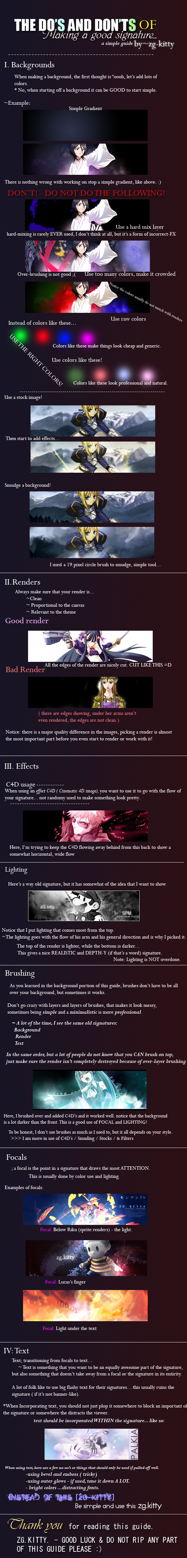
[Tips]Coloring...First you wanna find a good color scheme/harmony...
You can use a site like this to get that down at first...
http://kuler.adobe.com/ It is a pretty neat tool... Just go to the 'Create' section... choose a rule and move the slider til you find something you like...
Eventually you will know your harmonies in your head and can just picture the wheel...
Now when you go to color your image... try finding an existing harmony from the image... and using that... if you want to re color it I recommend using a soft brush to recolor it...
Then what you want to do is use your new color schemes as gradient maps on the image... and set these to a blending option such as soft light / overlay / vivid light / (sometimes even luminosity / screen / multiply)...
NOTE: To make a gradient map in adobe photoshop go to layer > new adjustment layer > gradient map... or in the layers palette, click on the icon for adjustment layers, and select gradient map...
To do the same in GIMP, make a new layer... and paste or apply the whole image here, now desaturate this layer.... layers > colors > desaturate... after that, set your foreground color to the 'darker' of the 2 colors you want to use in your gradient map... and your background color to the 'lighter' of the 2 colors in your gradient map... now you are almost ready to make your gradient map... go to filters > colors > map > gradient map... and voila, here is your gradient map...
The goal here is to saturate the colors that are already there a bit... and to do so I find the best results are with many maps used at low capacities... each change should be just barely noticeable... not overpowering...
In the end the colors will look more rich then they did before... but not over saturated... now you have an image with a good use of color manip...

Here is a basic tag which only has color enchancement...

And here is the *.psd for it...
http://www.megaupload.com/?d=24SZ0F0PJust digest it layer by layer... even change the layer modes back to normal and back again to see what the coloring layers looked like...
I don't use GIMP, but I have seen GIMP tuts where they mention making gradient maps and photofilters and I have seen people who use GIMP saying that they are doable there too...
The file format is also a *.psd, but from what I get GIMP can open those too...
Depth...For fairly good easy depth follow this rule:
Objects that are close are more sharp, and objects which are far away are more blurry... to create a simple bit of depth apply your image once, sharpen it, then erase all but the focal... now apply your image again, but this time use a gaussian blur of low radius (0.1 - 0.3) and erase over the focal... I find using a soft brush to erase the bg and focal in both of these layers helps...
Lighting...Good lighting in tags shows that you know where lighting is coming from...
The 3 big aspects to lighting is a good light source, and good light flow...
Wherever there is light, there is a source for it... say if you look in the sky there will be the sun or the moon, in your room most likely a light...
So now when you are making your tag, you can make a very easy light source by selecting a soft brush and brushing white or a very light color there... to follow this same method you can make a radical gradient of a light color and the same color... but an opacity of 0 on one side of the gradient...
Another way to make good lighting, at least in photoshop, is to apply image on a new layer, then go add in a lighting effects filter... filters > render > lighting effects... omni and spotlight are too great ways to add in a light source... but don't set the lighting effects layer on 100% opacity... I tend to use 30% opacity myself... and sometimes 2 layers...
Also there are plugins you can get for photoshop if you use that which add wonderful lighting effects... I'm sure there are script-fu's you can get for gimp which do the same thing... I don't know if gimp has photoshop's lighting effects though... I do know though that there is a plugin for gimp which will let you use photoshop filters in gimp...
The next thing about lighting is that it is consistent throughout the image... if your lightsource is on the middle of the image, then the ends of the image should be darker, and any object that hits the light should be followed by a darker shadow area... If your light source comes from the left then have all light that you add in from stocks or c4ds or w.e match that... if all the light in your image is shining down, don't include one blotch of light shining up...
Also most stocks/renders have a light scheme already, follow that scheme when applying your lighting techniques to the image...


