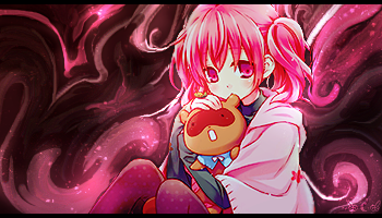
A. 
B. 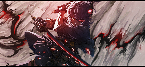

Posted 30 June 2015 - 12:34
B GMV,
A just seems to be too bright for my tastes and if I'm honest it hurts my eyes to look at.
B I like the smudging and it just flows better
 by Zeder
"Surrender is NOT an option" - Tamra Dragonstar - Lord Command of the Dnulian Army. (Queen)
Posted 30 June 2015 - 18:04
A:
B: 2
B gets my vote. The smudge effect is pretty wicked and the colors match perfectly
~ ~ ~ ~ ~ ~ ~ ~ ~ ~ ~ ~ ~ Live. Love. Learn. Die. ~ ~ ~ ~ ~ ~ ~ ~ ~ ~ ~ ~ ~
Are you an artist? Want to be listed as one under the Artist Directory; click here
Posted 08 July 2015 - 20:39
I like them both but in A i think that the 3 stripes in right upperside ruind it for me... it woulda been better with like 1 or something...
Givining my vote for B its pretty simple but looks nice.
A - 0
B - 3

Want a signature or avi like mine? If yes, than visit my shop! 
My avi/signature shop: http://tinyurl.com/oqr6cqr
Posted 09 July 2015 - 04:12
A - 0
B - 4. +
A: Maybe cut the bottom half, darken the edges of the character a bit, blur the background and see where from there.
B: Smudges are v pretty and the contrast is nice. Something feels missing but that just be text.
good photographyer. great drawer. but im most best at photoshop.
0 members, 0 guests, 0 anonymous users