Version 2

Version 3

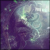
Tried something new. I know my smudging needs a lotta' work and so does text. Other than that though, how is it?

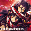
Training for SOTW. Need some CnC on this piece please

Don't judge my text work, i know it needs help haha

Posted 27 March 2013 - 01:18
~ ~ ~ ~ ~ ~ ~ ~ ~ ~ ~ ~ ~ Live. Love. Learn. Die. ~ ~ ~ ~ ~ ~ ~ ~ ~ ~ ~ ~ ~
Are you an artist? Want to be listed as one under the Artist Directory; click here
Posted 27 March 2013 - 01:34

^ SAHARDY ^
<><><><><><><><><><><><><><><><><><><><>< Selling Stuff ><><><><><><><><><><><><><><><><><><><><>
Posted 27 March 2013 - 01:45
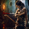
Dont use Papyrus for your font. Ever. The lighting doesnt make sense. Shadows suggest it should be from above but it looks like you added another light source bellow him. Maybe add some directional splatters so its not as static?
~ ~ ~ ~ ~ ~ ~ ~ ~ ~ ~ ~ ~ Live. Love. Learn. Die. ~ ~ ~ ~ ~ ~ ~ ~ ~ ~ ~ ~ ~
Are you an artist? Want to be listed as one under the Artist Directory; click here
Posted 27 March 2013 - 02:43
^ SAHARDY ^
<><><><><><><><><><><><><><><><><><><><>< Selling Stuff ><><><><><><><><><><><><><><><><><><><><>
Posted 27 March 2013 - 03:08

~ ~ ~ ~ ~ ~ ~ ~ ~ ~ ~ ~ ~ Live. Love. Learn. Die. ~ ~ ~ ~ ~ ~ ~ ~ ~ ~ ~ ~ ~
Are you an artist? Want to be listed as one under the Artist Directory; click here
Posted 27 March 2013 - 05:02
:shock: Say what? Looks good to me the way he's posing it looks like there could be more effects added in then again that might make it too messy keep it upI think i nailed it on V3 except for the bottom right corner. Too much blackness? I don't know, signatures aren't my strength. Neither are avatars or other graphics


Posted 27 March 2013 - 11:37
By any chance, did you use this tut?
http://ffadicted.dev... ... -105186122

~ ~ ~ ~ ~ ~ ~ ~ ~ ~ ~ ~ ~ Live. Love. Learn. Die. ~ ~ ~ ~ ~ ~ ~ ~ ~ ~ ~ ~ ~
Are you an artist? Want to be listed as one under the Artist Directory; click here
Member


Posted 27 March 2013 - 21:59

Posted 29 March 2013 - 04:02

Posted 29 March 2013 - 05:09

Posted 29 March 2013 - 22:38
Added a new sig so if y'all could CnC that, that would be nice
~ ~ ~ ~ ~ ~ ~ ~ ~ ~ ~ ~ ~ Live. Love. Learn. Die. ~ ~ ~ ~ ~ ~ ~ ~ ~ ~ ~ ~ ~
Are you an artist? Want to be listed as one under the Artist Directory; click here
Posted 30 March 2013 - 13:38

Posted 30 March 2013 - 14:56
good photographyer. great drawer. but im most best at photoshop.
0 members, 1 guests, 0 anonymous users