UhSword: 7/10. The image has many small details to be admired, makes me want to take a second glance at it. I rather think the font choice is a bit dull however, and the image could do with being larger to appreciate the details lost due to its size.
*Rate the Signature above you*
Started by
fs_briggzy
, Feb 06 2008 00:33
3797 replies to this topic
#3781

Anialator
-

- Members
-

- 74 posts
Member

- Lao People's Democratic Republic
Posted 11 May 2013 - 21:40

Anialator - (War Master of The Chapter - Legacy Online)
#3782

Posted 11 May 2013 - 22:02
6/10
Text is massive
~ ~ ~ ~ ~ ~ ~ ~ ~ ~ ~ ~ ~ Live. Love. Learn. Die. ~ ~ ~ ~ ~ ~ ~ ~ ~ ~ ~ ~ ~
Are you an artist? Want to be listed as one under the Artist Directory; click here
#3783

Posted 12 May 2013 - 05:07
still 10/10 looks sweet
Sorry but Photobucket decided to take down my Signature.
#3784
Posted 12 May 2013 - 20:22
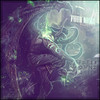
7.5/10 hard to make out the face and the text is pretty big. Nice color lighting and details though

#3785
Posted 14 May 2013 - 07:15
10/10 i love the smudging and the render fits perfect wih the smudging and the blending with the purple OMG
#3786
Posted 08 September 2013 - 18:21
Bringing this topic back!!!
9/10
~ ~ ~ ~ ~ ~ ~ ~ ~ ~ ~ ~ ~ Live. Love. Learn. Die. ~ ~ ~ ~ ~ ~ ~ ~ ~ ~ ~ ~ ~
Are you an artist? Want to be listed as one under the Artist Directory; click here
#3787
Posted 08 September 2013 - 19:38
yay !
7.5..owh wait ! 8.5...wait wait ! 9..errrr...10 !
damn sig rotater @@
Sig made by me XD
#3788
Posted 08 September 2013 - 22:03
yay !
7.5..owh wait ! 8.5...wait wait ! 9..errrr...10 !
damn sig rotater @@
You can thank jzaz for letting me know about it  haha
haha
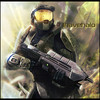
9/10! Looks like he's about to party and kill someone at the same time!
~ ~ ~ ~ ~ ~ ~ ~ ~ ~ ~ ~ ~ Live. Love. Learn. Die. ~ ~ ~ ~ ~ ~ ~ ~ ~ ~ ~ ~ ~
Are you an artist? Want to be listed as one under the Artist Directory; click here
#3790
Posted 01 February 2015 - 02:50
Holy crap, i forgot about this!
10/10 for superb artwork!
~ ~ ~ ~ ~ ~ ~ ~ ~ ~ ~ ~ ~ Live. Love. Learn. Die. ~ ~ ~ ~ ~ ~ ~ ~ ~ ~ ~ ~ ~
Are you an artist? Want to be listed as one under the Artist Directory; click here

#3792
Posted 01 February 2015 - 18:57
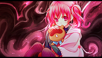
9/10
.the smudging colors and everything look pretty wonderful, but i think it could still use just a bit more blending.
Seriously one of the best smudge tags i have seen on fs though 
#3793

Posted 03 February 2015 - 01:33
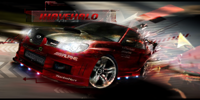
7.5/10 Colour and contrast is fine, but that intentional break of flow annoys maybe it would be better just to go for the "sun flow"


#3794
Posted 12 May 2015 - 05:12
6/10
Orbs on the right side look sort of out of place and render looks sort of weird. A little to bright for my taste but I like some of the effects.
Sorry but Photobucket decided to take down my Signature.
#3795

Posted 12 May 2015 - 07:55
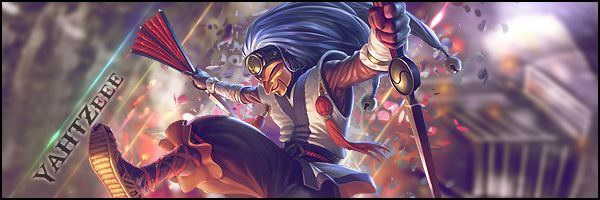
8.5/10 I love the character, The colors and the theme. the only complaints i have is i can't read the font very well. and some reason the white sword/staff can't remember what tobi uses that looks like that unless its a spine or something but it just seems awkward could possibly use some smudging to flow with the rest on the edges.
^.^ Overall great sig.

#3796
Posted 14 June 2015 - 21:21
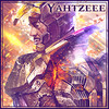
8/10
C4D's are tough for the fact that you can end up using too much or too few of them in a sig, but this one has enough to make the siggy look nice. My only complaints are that the flow is vague and that I'm not a fan of the text.
#3797
Posted 27 June 2015 - 22:24
9/10
Love it, but the blending is off a tad...
 by Zeder
"Surrender is NOT an option" - Tamra Dragonstar - Lord Command of the Dnulian Army. (Queen)
#3798
Posted 09 July 2015 - 04:24
6/10.
I don't know which sources were used and how much modifying was involved, but it looks sparse.
Signature is on rotation, someone can do this one instead. (One of my fondest signatures to date.)
good photographyer. great drawer. but im most best at photoshop.
0 user(s) are reading this topic
0 members, 0 guests, 0 anonymous users