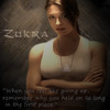
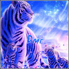
Jump to content

Photo

Grand Graphics Tournament Round 1 Voting


  • Please log in to reply
117 replies to this topic

#21 stormfury3

stormfury3

    Veteran

  • New Members
  • PipPipPip
  • 597 posts

Posted 10 July 2012 - 02:17

Is there a place where we can tell who's is whos. I am pretty curious to see storms.


lol i'm sure you are, and i can't wait for you to flame...
sadly though you will have to wait till the voting is over to find out who made what.

so make sure you don't vote because you don't want to look stupid if you pick mine, but i doubt you will because mine isn't very good at all imho, i didn't want many votes in this round.


aww <3 I love you man. I really do. Your so cute. I wanted to vote a 10 for you.


seems legit...

#22 Zukira

Zukira

    Veteran

  • New Members
  • PipPipPip
  • 1,991 posts
  • Badge
  • United States of America

Posted 10 July 2012 - 02:19

You can do a cnc vote - which will count only if the actual turnout from non entry players is too low.

Also is all voting gonna be takin seriousley. Like can i just 1/10 everyone.


If it looks like someone is trolling, it will be considered void. If I void a vote from the count I will be noting it has been left out of the count and let the person know why. If I'm convinced afterwards that it was valid, it will go in.

zukira.gif

|| signature rotates, artists varied ||

Fan my art on Facebook  || Deviant Art || Chat on Irc


When in doubt, lean to the side of mercy.

                                                                               - Cevantes


#23 Kayesha

Kayesha

    Veteran

  • New Members
  • PipPipPip
  • 2,030 posts
  • United States of America

Posted 10 July 2012 - 02:19

Group 1
A - 7/10 Has a good portion of the symbolism and is nicely put together. I am not liking the font at all.
B - 5/10 Font needs work. The graphics are good. I would drop the border. I really think you missed a lot of the symoblism in that tarot card basics are there but there could be more detail.
C - 2/10 Again missing so much of the symoblism. I like the render you chose.

Group 2
A- 2/10 I see none of the symbolism. The corner is too bright. I feel like this person has a good ee for renders but forgot to research the theme.
B- 9/10 Love the use of the tarot card to make it your own. I can see this being a tarot card. very nicely done
C- 10/10 Again love the detail. The way this was put together and the details of the tarot card weav ed into this card. The work is VERY well done. Awesomeness!

Group 3
A- 2/10 Again I feel like the missed the boat on this. I see none of the symbolism of the tarot.
B- 10/10 - could be a tarot card. I love the tradition detail. Very well done!
C- 5/10 -Has caught the main character but, has missed the detail of this card. Not bad. Could be better.

Group 4
A-8/10. I see the detail you have added to this. I can see the work put into this. There is something "off" that I can not explain
B- 1/10 - I just have no words for this.
C- 9/10 - I can see the detail and hard work put into this. Nicely done.

Group 5-
A- 10/10 - LOVE the way this is put together. Very nicely done and a Great twist to the Card. LOVE it!
B- 9/10 This was Fantastic work. I had trouble judging this. You missed some of the symbolism but, OMG what wonderfull work. Nice.
C- 1/10 - I think this person missed the mark

Group 6
A- 9/10 - Classic look with all the symbolism. Nicely done
B- 7/10 - I like it but, the detail is hard to pick out in places. Nice work though.
C- 10/10 - VERY Nice. I see everything I would look for.

Group 7
A- 10/10 - Could be a Tarot card. Fantastic work!
B- 6/10 - Work was nice but, I think that is slightly missed the mark.
C- 4/10 - The work is not bad. But I do not see the connection to Tarot


(this took so long to judge...)

#24 fs_raisins

fs_raisins
  • Guests

Posted 10 July 2012 - 02:25

1A - 6/10. Text is bad, the piece looks like a slap done in 30 seconds.
1B - 7/10. Bit better than A. The pentool looks nice. But the blur and the colours are not good, and the white ruins it.
1C - 7/10. Pretty good, actually. But nothing interesting going on.

2A - 8/10. Lighting and brushes are nice but it lacks detail.
2B - 6/10. Looks like a slap.
2C - 6/10. Colour scheme is okay I guess. The text is not blended in well at all, and it looks horrible. Plus the piece of over-sharpened and looks bad. Not that much effort put into it.

3A - 8/10. Flow is nice, text is nice, everything is nice. The more you look at the render though, the more dislocated the render looks. But otherwise it looks great.
3B - 9/10. Looks very smooth and beautiful.
3C - 7/10. Contrast is waaay too high. Lighting is messed up.

4A - 10/10. Beautiful. Lighting. Flow. Smudging. Text. All is beautiful, my friend.
4B - 4/10. Looks so bad. Render does not blend. Looks like a text slap.
4C - 10/10. The lighting is bad but the 3D-ness and the realism of the thing looks amazing. That bumps it up from a 9 to a 10. :)

5A - 9/10. Colour scheme and stuff capture the theme 'Death' nicely.
5B - 7/10. Lighting is bad, and I don't know why the big white stuff is there on the bottom.
5C - 4/10. Looks like a background + render. Pathetic.

6A - 9/10. Picture looks great. The text and border match well.
6B - 8/10. Text and effects make it fancy but it lacks the professionalism.
6C - 8/10. Everything doesn't blend in perfectly but the idea is great.

7A - 10/10. Looks great. The card theme is really expressed well.
7B - 9/10. Lighting and everything is great but colour scheme could be better.
7C - 6/10. Contrasted too much, not really interesting at all.

#25 TreeFrog

TreeFrog

    Veteran

  • Members
  • PipPipPip
  • 2,739 posts
  • Badge

Posted 10 July 2012 - 03:06

There's way to many people in this thing. It may just be my opinion, but I dont think the casual voter wants to go through reasons for 21 pieces. In retrospect we probably should have had some preliminary rounds to thin out the number of competitors.

#26 stormfury3

stormfury3

    Veteran

  • New Members
  • PipPipPip
  • 597 posts

Posted 10 July 2012 - 08:10

if you think about it, with 21 entry's there isn't many others that usually come here so there won't be many votes unless the ppl that did enter vote. especially when the votes consist of writing a wall of text :?

#27 Kontiki

Kontiki

    Member

  • Members
  • PipPip
  • 471 posts

Posted 10 July 2012 - 11:09

Considering that most potential voters you'd want for this is probably not a part of the graphics community, and maybe dont know too much about graphics, perhaps more would be inclined to vote if they didnt have to give CnC for their vote to count... but you could still encourage it? :)

#28 fs_kyotenshi

fs_kyotenshi
  • Guests

Posted 10 July 2012 - 11:34

wow I never knew so many people participated in this :shock:

I absolutely love some of the entries, too bad I can't vote :(

#29 Cassafras

Cassafras

    Veteran

  • Members
  • PipPipPip
  • 1,414 posts
  • United States of America

Posted 10 July 2012 - 15:36

Group 1
a 8:10-Really like the colors and the overall picture goes along with the theme. Would've liked a little more depth but it's nice in general.
b 5:10-I find the pen tooling a bit distracting and the characters a bit too well blended. Adding depth might help with popping the characters out. Larger range of color can help with the overall picture, maybe some shades of purple? Minor thing for me is that I would've liked a more authentic background than the plain white.
c 7:10-I find there is too much sharpening and burning in this one for me. Especially am not digging the burning around the eyes. Can't really give much more besides my personal opinion. Sorry artist!
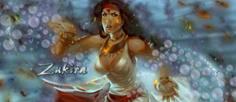
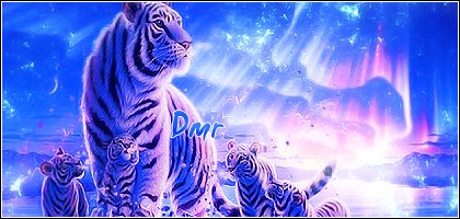
Group 2
a 5:10-Honestly I find this very plain. I find there isn't much besides the lighting and the line brushes. Color very monotone as well. A bit too much red. I suggest fractals and gradient maps for coloring and maybe use some smudge brushes on some copies of the render to make the background more exciting as well as some other effects to help guide the eye. This simply just needs some more done to it.
b 7:10-This is pretty cool, but I keep getting distracted by various things in the picture. I actually thought it had to do with the wolves before I read the text! Also I'm just confused and amused at the same time by the lobster in the river. Perhaps blending them somehow more into the background using colors from the overall pic might help focus the eye on the moon first.
c 10:10-Nothing to say technicalwise. I just find it cool and appealing and fits the theme well.
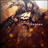
Group 3
a 9:10-Almost there! Just needs some depth to make him pop out more as I find the background is nearly swallowing him.
b 10:10-Looks like it can be a legit card to me.
c 8:10-I'm not really sure what I find wrong with this one. There is something but I don't really know what it physically is nor how to explain it.

Group 4
a 7:10-I find they are blending into the background a little too much. Clearing some effects or adding more depth might help.
b 1:10-I'm sorry this isn't appealing at all and doesn't look like much was done to it. I suggest to this artist to read up on some tutorials and maybe get some help from fellow artists before entering your next piece. Maybe even make a few practice pieces as well. In my honest opinion, this artist is going to need to step it up a little if they want to win this competition.
c 7:10-The blurring is good but I find he is fading away into the background. Radial b&w or even b&gray gradients on soft light or overlay could help. Liking the color scheme though, I find it pretty cool to look at.

Group 5
a 10:10-Like the other one, this looks like a legit card as well. Liking the female Death a lot. Don't suppose I could ask for an avi and:or sig of this after the voting of this round is over? Will pay of course. :)
b 9:10-All awesome except for the white bit at the bottom. I find it completely unnecessary.
c 1:10-I will copy what I said:I'm sorry this isn't appealing at all and doesn't look like much was done to it. I suggest to this artist to read up on some tutorials and maybe get some help from fellow artists before entering your next piece. Maybe even make a few practice pieces as well. In my honest opinion, this artist is going to need to step it up a little if they want to win this competition.

Group 6
a 10:10-Legit looking card again. I think I know who made this based on the style so kudos to you!
b 10:10-I was gonna say it's messy and has no flow, but I think that actually goes well with this theme lol. Good job mate.
c 8:10- I actually didn't know what the picture was for a minute or two. I would say get rid of the dead people and make Death bigger and pop out more. Actually looks cool once I realized what it was.

Group 7
a 6:10-I find I'm looking at the cards more than the magician. I dunno otherwise, I just don't like it. Sorry about the lack of explanation.
b 9:10-Looks awesome, but a lot of blurring on the render that I sorta found unnecessary.
c 10:10-It's the world. It is awesome.

Geez that only took me half an hour :P if any of the competing artists have questions about my numbers feel free to message me (in game or forum). Really wish there was a shorter way to this voting stuff XD

2f0eb4bc-fcdc-4cba-b9e6-1926ea12abae_zps

By Me

Looking for a new sig or avi but don't know how to ask? Stop by the Directory!


#30 rebtex

rebtex

    Veteran

  • New Members
  • PipPipPip
  • 1,487 posts
  • United States of America

Posted 10 July 2012 - 16:23

My voting may be kind of harsh, but it is what it is.

Group 1
A-5/10 The piece isn't all that bad, except for the fact that it is dreadfully blurry, and the text is bland.
B-3/10 I hate the white border. The text is boring and doesn't really compliment the piece. The blue swirl is the only eye popping effect in the piece and it seems forced onto the piece instead of fitting seamlessly.
C-6/10 This piece would receive a higher rating if not for the dreadful border. It totally subtracts from the piece.

Group 2
A-7/10 The lighting is a bit much at the top and fades too fast towards the bottom making it near impossible to see the arrows down there.
B-9/10 This piece isn't exactly to my taste, but it is beautifully put together and in this case the border compliments the piece well.
C-8/10 Altogether this is a good piece, but for some reason I just can't picture this being a tarot card.

Group 3
A-9/10 I love the text and the border on this piece.
B-7/10 The piece seems a little plain, but I could very well see it being an actual tarot card.
C-9/10 This piece is beautiful. The colors all work together well. The only problem is the text is a little plain.

Group 4
A-7/10 The piece is pretty well done, but as others say, they don't look like lovers.
B-0/10 I won't even waste my time with this one.
C-6/10 I'm just really not feeling this one. The text is beautiful but the blue effects look very out of place.

Group 5
A-10/10 This piece is absolutely stunning. From the border to the image to the text, it is all just beautifully done.
B-8/10 Nothing wrong with this piece really, just isn't that attention grabbing.
C- 0/10 Again, I won't waste my time.

Group 6
A-10/10 This piece is everything I could imagine a tarot card to be. It is just amazing.
B-9/10 This piece is well done, though I think the text could be toned down a bit, my attention went to the text before the image in this piece.
C-8/10 This piece may not graphically be the best, but it presents the theme well and legitimately looks like a tarot card.

Group 7
A-9/10 This piece is great, though something about the border bothers me...
B-8/10 The text placement isn't the greatest. And I could see this being Strength or Justice before I would guess Empress.
C-10/10 While I'm not sure this would make the best tarot card, this is just so beautifully done I have no choice but to give it a 10.

There's way to many people in this thing. It may just be my opinion, but I dont think the casual voter wants to go through reasons for 21 pieces. In retrospect we probably should have had some preliminary rounds to thin out the number of competitors.


This.

I usually try to CnC every piece, but I can't see myself typing more than a line for each person with this many entries.

alonesig_lafuria-1.png


#31 fs_j4ckoliver

fs_j4ckoliver
  • Guests

Posted 10 July 2012 - 16:28

a little idea to make it easier to vote, you put all of the same cards together, so all deaths. all empresses etc, and then people vote for the best ones, after a few days you then have the best pieces for each card and then they are voted on, and maybe there is not every card and it maybe easier for some (not me for sure!) but that's just the luck of the draw :)) and it rewards people for going for the harder designs!

Just an idea, don't hate on me ;)

#32 xkingx

xkingx

    New Member

  • New Members
  • Pip
  • 47 posts

Posted 10 July 2012 - 16:33

Do I have to give a Cnc? I don't want to get flamed by storm. Can I just give ratings?

#33 YouNoSeeMe

YouNoSeeMe

    Veteran

  • Members
  • PipPipPip
  • 1,900 posts

Posted 10 July 2012 - 18:18

Zukira you can pull my entry if you want :D 3 pages of gibberjabber and only 3 votes :? to much spam including myself :oops:

11ilrurjpg_zps06178485.png


#34 xkingx

xkingx

    New Member

  • New Members
  • Pip
  • 47 posts

Posted 10 July 2012 - 20:33

Zukira you can pull my entry if you want :D 3 pages of gibberjabber and only 3 votes :? to much spam including myself :oops:


Dont listen to her please. She thinks she did bad.

#35 Zukira

Zukira

    Veteran

  • New Members
  • PipPipPip
  • 1,991 posts
  • Badge
  • United States of America

Posted 10 July 2012 - 20:51

I would be happy with someone saying "I liked Group blah letter meh best because (yadda yadda yadda)" with their scoring. I just don't want to see just naked numbers.

zukira.gif

|| signature rotates, artists varied ||

Fan my art on Facebook  || Deviant Art || Chat on Irc


When in doubt, lean to the side of mercy.

                                                                               - Cevantes


#36 xkingx

xkingx

    New Member

  • New Members
  • Pip
  • 47 posts

Posted 10 July 2012 - 21:25

hmm So much writing. Also only 3 votes whaaat. More advertising maybe zukira :P

#37 Savanc

Savanc

    Veteran

  • Members
  • PipPipPip
  • 1,631 posts
  • Badge
  • Netherlands

Posted 10 July 2012 - 21:54

Group 1
(a) 6.5 - It has a good contrast of colours, but it feels like it's missing something.
(B) 9 - Great depth, good lighting. Foreground and background match well.
© 3 - It looks rather flat and the colours somehow look wrong.

Group 2
(a) 5 - It's nicely made, but the lighting could be better on the top and bottom.
(B) 7.5 - Decent contrast. Elements in the picture complete each other. Could have had a little bit more contrasting colours.
© 4 - Lighting is too much. Background feels odd considering the subject.

Group 3
(a) 4.5 - The background is too much, it draws the attention away from the foreground. The colours increase that even.
(B) 7.5 - Nice style of design and colouring. Border fits the graphics well.
© 8 - Colours are good; contrasting and complementing at the same time. Lighting is a bit odd though.

Group 4
(a) 6.5 - Looks like much effort is put into blending the subjects into the background, but with limited results. Lighting could be better; colours match each other rather well.
(B) 2.5 - Foreground and background don't go well together.
© 2.5 - Colours are a bit off. Not many visual effects. Doesn't appeal to me...

Group 5
(a) 6.5 - Not enough lighting. Colours are well (though not visible enough). Good overall style.
(B) 8 - Nice colours; fits the style very well. Would have liked to see the different background elements fit more together.
© 3 - Looks like a copy paste picture. The various elements have nothing together.

Group 6
(a) 9 - Lighting is very good. Colours are nice too. Subject, background and border fit well together. Graphics show the neutral stance of justice between good and evil; though evil (dark) is too prominent.
(B) 8 - Lighting is good (though slightly too much on the top). I like the style. Background and foreground go well together.
© 4 - Lighting is a bit odd. The style is a bit too "blurry" (for lack of a better word) for my taste. Graphics fit the meaning well.

Group 7
(a) 9.5 - Great colors. Lighting is good too. Elements fit well together and it fits the theme well.
(B) 5.5 - Too much lighting. Colours are reasonably well, but not great.
© 7.5 - Nice lighting and colouring. Elements fit well together. Feels like it's missing something though.

#38 Noeni

Noeni

    Veteran

  • New Members
  • PipPipPip
  • 566 posts
  • Badge

Posted 11 July 2012 - 02:48

I would be happy with someone saying "I liked Group blah letter meh best because (yadda yadda yadda)" with their scoring. I just don't want to see just naked numbers.


+1 :)

bannerfans_6199711.png


#39 zeder

zeder

    Veteran

  • Members
  • PipPipPip
  • 1,098 posts
  • Badge
  • United States of America

Posted 11 July 2012 - 04:26

Zukira you can pull my entry if you want :D 3 pages of gibberjabber and only 3 votes :? to much spam including myself :oops:

If I have to suffer with my mistake( s ) that I made on my entry........so do you. And your a far better artist than I am.

ZederGift_zpsa47e7c25.png by Chagryn


#40 athdenald

athdenald

    Veteran

  • Members
  • PipPipPip
  • 985 posts

Posted 11 July 2012 - 08:38

I believe we need to let the artists vote in the GGT or the whole thing will just flop. We can still vote on our own pieces so it doesn't reveal who made what, but the vote can just be disregarded at the end, when the tally is being counted.

I realise this will involve a little more work but I'm happy to help if that's what's needed?


0 user(s) are reading this topic

0 members, 0 guests, 0 anonymous users

Font:
Arial | Calibri | Lucida Console | Verdana
 
Font Size:
9px | 10px | 11px | 12px | 10pt | 12pt
 
Color: