All criticism is welcome.
--V1--

-------
--V2--

-------

Posted 28 March 2013 - 17:40
Posted 28 March 2013 - 21:10
~ ~ ~ ~ ~ ~ ~ ~ ~ ~ ~ ~ ~ Live. Love. Learn. Die. ~ ~ ~ ~ ~ ~ ~ ~ ~ ~ ~ ~ ~
Are you an artist? Want to be listed as one under the Artist Directory; click here
Posted 28 March 2013 - 21:16
Posted 28 March 2013 - 22:35

Posted 28 March 2013 - 23:27

^ SAHARDY ^
<><><><><><><><><><><><><><><><><><><><>< Selling Stuff ><><><><><><><><><><><><><><><><><><><><>
Posted 29 March 2013 - 08:09

Posted 29 March 2013 - 09:53

Posted 30 March 2013 - 20:30
Was gonna cc this before but you'd just cc'd mine and it didn't seem proper to cc straight back at that time.
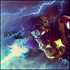
I respect you as an artist and when your good your really good but this tbh is by no means your best.
The flow (especially the right hand side) just seems chaotic to me which is why i didn't cc back before cos you'd just mentioned my anime background (and i agree the initial one sucked cos the red was outta place with the theme).
The blue dots to the right drag the eye away too much and looking to the left of tag, the blue 'blocks' top left are pretty sharp then just below you have this blurred version of kinda same thing so the perceptions thrown off.
Like i said before, you do make great works, but just not feelin this one.

Posted 30 March 2013 - 20:59
~ ~ ~ ~ ~ ~ ~ ~ ~ ~ ~ ~ ~ Live. Love. Learn. Die. ~ ~ ~ ~ ~ ~ ~ ~ ~ ~ ~ ~ ~
Are you an artist? Want to be listed as one under the Artist Directory; click here
Posted 30 March 2013 - 21:08
You'll have to get it in the auction.I like v2 a lot more. It feels more smooth and cleaned up but you still got the text wrong. It should say "ghetoghost"

Posted 30 March 2013 - 22:52
^ SAHARDY ^
<><><><><><><><><><><><><><><><><><><><>< Selling Stuff ><><><><><><><><><><><><><><><><><><><><>
Posted 30 March 2013 - 23:05
Now ya' see I changed it first to make sust happy. That's why I didn't blur it before, because to me. It looked like the blue C4D was on the same level as my render so to help the depth I didn't blur it.One extreme to the other, the blue stuff seems too blurred while also looking like its on the same plane as the guy and it kind of messes up the depth. I like that you got rid of those blue lines or whatever they were. Text placement was better in V1.
Posted 30 March 2013 - 23:12
Now ya' see I changed it first to make sust happy. That's why I didn't blur it before, because to me. It looked like the blue C4D was on the same level as my render so to help the depth I didn't blur it.One extreme to the other, the blue stuff seems too blurred while also looking like its on the same plane as the guy and it kind of messes up the depth. I like that you got rid of those blue lines or whatever they were. Text placement was better in V1.
 Yeah if this was a contest I would have a hard time choosing which version to pick looking at the both of them ever since you blurred the original one out.. maybe have no text and keep it for yourself?

Posted 30 March 2013 - 23:31
lol nah I need the fsp.Now ya' see I changed it first to make sust happy. That's why I didn't blur it before, because to me. It looked like the blue C4D was on the same level as my render so to help the depth I didn't blur it.One extreme to the other, the blue stuff seems too blurred while also looking like its on the same plane as the guy and it kind of messes up the depth. I like that you got rid of those blue lines or whatever they were. Text placement was better in V1.
Posted 30 March 2013 - 23:43
Posted 31 March 2013 - 03:43
Now ya' see I changed it first to make sust happy. That's why I didn't blur it before, because to me. It looked like the blue C4D was on the same level as my render so to help the depth I didn't blur it.One extreme to the other, the blue stuff seems too blurred while also looking like its on the same plane as the guy and it kind of messes up the depth. I like that you got rid of those blue lines or whatever they were. Text placement was better in V1.
^ SAHARDY ^
<><><><><><><><><><><><><><><><><><><><>< Selling Stuff ><><><><><><><><><><><><><><><><><><><><>
Posted 01 April 2013 - 03:46
Sorry but Photobucket decided to take down my Signature.
0 members, 0 guests, 0 anonymous users