Jump to content

Photo

GGT FINAL Voting Round -- Futuristic New Years Day.


  • Please log in to reply
43 replies to this topic

#1 WarQueen

WarQueen

    Veteran

  • Members
  • PipPipPip
  • 2,185 posts
  • Badge

Posted 30 December 2013 - 19:36

Welcome to the 7th Grand Graphics Tournament -- FINAL ROUND! The best Artists of GGT 7 are gathered together to do a battle royal for top 3 bragging rights and a sweet sweet prize totaling 1260 fsp. Who will be #1, #2, and #3 this time?

Well, that my fellow players is up to you!

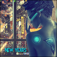
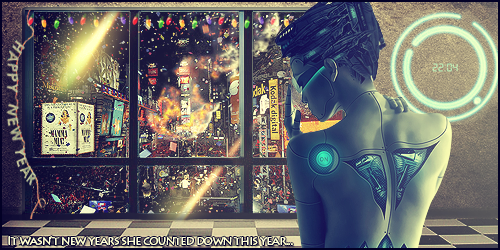
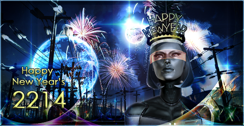
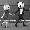
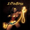
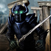
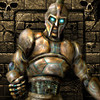
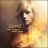
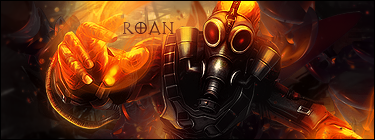
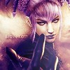
The theme you're voting on is 'Futuristic New Years Day'.

Freestyle is where the artist has free reign to create any type of graphics he/she chooses (so long as it's not animated).
 

What is  a 'Futuristic New Year's Day'?

New Years Day has dawned in the far future. How does it look?

That's up to the Artists. What do they see for a far, far future New Year's Day?
Is the population 1/2 human 1/2 alien? 1/2 human 1/2 robot? Are there flying cars? Superhuman abilities? Or has the world been wiped out by one huge New Years Eve Party?

Below you'll find the entries. Please take a moment and look them over, vote for the avatar-signature set that you find most appealing and give a bit of a reason for your rating.

Please rate each entry set on a scale of 1 to 10 with a vote of 10 being 'this blows my mind it is so good' and 1 being 'this is phale'.

You have up to 25 points to distribute between the two entries in each grouping.

You DO NOT need to give out all 25 points. The MAX you can give is 10 points on 1 piece per group.

(Note: 10 points = +1, 5/10 = +.5, etc etc on tally sheet)

Please include a reason with your votes - you only have to give a reason for one per set. It doesn't have to be technical. You can just say I liked this one best, or something along those lines but we all know an artist thrives on feedback so don't hesitate to really say what you think.

If your vote looks like you're trolling or joking I will contact you about it, and it won't count unless I'm satisfied that you weren't trolling.


Voting closes at 23:59 Server Time on Wednesday, January 1st

Votes that do not have a reason will not be counted.

*artists, you may vote, but do not skip your own group, votes will be adjusted when tallied.

Please vote for every grouping.

On behalf of my fellow artists, thank you for taking the time to vote and I hope you enjoy the bounty of art that is being laid before you.

NOTE: Everyone who votes will be entered into a drawing for a FREE avatar!!  Several people will be randomly selected after the voting.

Free avatars to be given out by random will be done by the following artists:

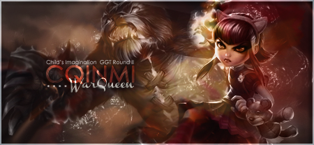
2 by cqinmi  (note: due to a large list of avatars needing to be completed, it may take awhile for you to receive your free avatar. Please have patience but feel free to contact the artist in game.)
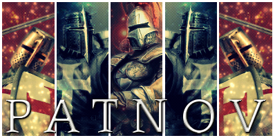
 

2 by patnov


That's 4 chances to win an avatar!
Tell your friends, tell your guildmates!


Edited by WarQueen, 30 December 2013 - 20:00.

WarQueenSig1_zpsfe2b03d4.png


#2 WarQueen

WarQueen

    Veteran

  • Members
  • PipPipPip
  • 2,185 posts
  • Badge

Posted 30 December 2013 - 19:49

Set 1 by Chagryn


GGTFinal2_zps79290732.png


GGTFinal_zps4feffe79.png


^ Resources: 1) http://tinyurl.com/mabslz6 2) http://tinyurl.com/kcpmsx9 3) http://tinyurl.com/k6d8el2 4) http://tinyurl.com/lyr569f


Set 2 by beanopoly


NewYears_ggt_finalround_avatar1_zps815b6


NewYears_ggt_finalround_zpse485a34c.png


^Resources: 1) http://us.123rf.com/...n-fireworks.jpg 2) http://www.fanpop.co...llpaper?ir=true 3) http://www.wallpaper...0-13141703.html 4) http://www.oneinhund...foi-4982834.jpg 5) http://www.ign.com/w...e:Me_3_0585.jpg


Set 3 by patnov


oomr.png


vgqo.png


^Resources: 1) http://imageshack.us...9/2821/ce33.jpg 2) http://imageshack.us...5/6440/i84w.jpg 3) http://imageshack.us...7/3590/kfku.jpg 4) http://imageshack.us...89/218/9id5.jpg 5) http://imageshack.us...5/8262/pj8a.jpg 6) http://imageshack.us...8/6520/qkuo.jpg 7) http://imageshack.us...1/9448/luvg.png


Edited by WarQueen, 02 January 2014 - 19:20.

WarQueenSig1_zpsfe2b03d4.png


#3 WarQueen

WarQueen

    Veteran

  • Members
  • PipPipPip
  • 2,185 posts
  • Badge

Posted 30 December 2013 - 19:50

Tally Sheet


Set 1) - 20.4


Set 2) - 18.6


Set 3) - 11


Edited by WarQueen, 02 January 2014 - 19:19.

WarQueenSig1_zpsfe2b03d4.png


#4 Patnov

Patnov

    Member

  • Members
  • PipPip
  • 382 posts

Posted 30 December 2013 - 19:56

The GREAT Finale!!!


I will offer 2 free avatars for the voters!


Edited by Patnov, 30 December 2013 - 20:01.

Patnovsig.png


Sig By DMR > Thx Dear, i love it!


#5 ghetoghost

ghetoghost

    Veteran

  • Members
  • PipPipPip
  • 1,564 posts

Posted 30 December 2013 - 20:19

Tally Sheet


Set 1) - 10

Perfection!!! 


Set 2) - 7

It's good but not as good as set 1


Set 3) - 5

Good concept but the other two blow this one away


~ ~ ~ ~ ~ ~ ~ ~ ~ ~ ~ ~ ~ Live. Love. Learn. Die. ~ ~ ~ ~ ~ ~ ~ ~ ~ ~ ~ ~ ~


Are you an artist? Want to be listed as one under the Artist Directory; click here


#6 Wiivja

Wiivja

    Veteran

  • Members
  • PipPipPip
  • 1,175 posts
  • Badge

Posted 30 December 2013 - 20:19


#7 WyldLibrarian

WyldLibrarian

    New Member

  • Members
  • Pip
  • 38 posts

Posted 30 December 2013 - 20:23

Set 1 - 10 points

I like this one the best. It has a feel of the type of future I think/hope we'll be around to see. Good use of color, lot of detail without getting super nit picky.


Set 2 - 5 points

Good color use, not sure what there is about the future in it though.


Set 3 - 3 points

Felt that it was a good setting for todays carriage ride in Central Park in NY - not so sure the future is going to include todays skyline though.


#8 gilby90813

gilby90813

    Member

  • Members
  • PipPip
  • 434 posts

Posted 30 December 2013 - 20:35

Set 1)  7/10 just felt it was missing color and i didnt get the feel for new years on it or futuristic feeling from it


GGTFinal2_zps79290732.png


GGTFinal_zps4feffe79.png


^ Resources: 1) http://tinyurl.com/mabslz6 2) http://tinyurl.com/kcpmsx9 3) http://tinyurl.com/k6d8el2 4) http://tinyurl.com/lyr569f


Set 2)  10/10  it feels like new years and the colors make it feel like a good new years is coming and all the lights and fireworks help give it the futuristic feeling to it of it only gets bigger and better


NewYears_ggt_finalround_avatar1_zps815b6


NewYears_ggt_finalround_zpse485a34c.png


^Resources: 1) http://us.123rf.com/...n-fireworks.jpg 2) http://www.fanpop.co...llpaper?ir=true 3) http://www.wallpaper...0-13141703.html 4) http://www.oneinhund...foi-4982834.jpg 5) http://www.ign.com/w...e:Me_3_0585.jpg


Set 3) 5/10 disappointed by this one u can see potential just wasnt executed right


oomr.png


vgqo.png


^Resources: 1) http://imageshack.us...9/2821/ce33.jpg 2) http://imageshack.us...5/6440/i84w.jpg 3) http://imageshack.us...7/3590/kfku.jpg 4) http://imageshack.us...89/218/9id5.jpg 5) http://imageshack.us...5/8262/pj8a.jpg 6) http://imageshack.us...8/6520/qkuo.jpg 7) http://imageshack.us...1/9448/luvg.png


#9 1daboss

1daboss

    Member

  • Members
  • PipPip
  • 169 posts
  • United States of America

Posted 30 December 2013 - 21:10

Set 1  I really liked it. Score 10

Set 2  It was nice.     Score 8

Set 3  It was ok.        Score 2


#10 Davros81

Davros81

    Veteran

  • Members
  • PipPipPip
  • 949 posts
  • United Kingdom

Posted 30 December 2013 - 21:14

Tally Sheet


Set 1) - 8 - excellent art work


Set 2) - 9 - love the futuristic face in the tower


Set 3) - 5 - just not my cup of tea but still very pretty


#11 TheMisfit

TheMisfit

    New Member

  • Members
  • Pip
  • 7 posts

Posted 30 December 2013 - 21:40

I feel like I am just regurgitating what other people have said, but here goes anyways.


Set 1- 10- it is the best just because it has the "awesome factor." The color and the detail are phenominal, which gives it a realistic feel that the other two don't quite compete with. You can see the confetti falling in Times Square as the New Year rings in, what could be more festive than that?!


Set 2- 8-  has a really good feel to it as well, but just doesn't compete with it's predecessor.


Set 3- 5- it is really well done, but it almost seems forced. The idea is a good one, but it doesn't really fit with the prompt.


Edited by TheMisfit, 30 December 2013 - 21:40.

I may be in Down with the Sickness, & I'm the one who is a schizophrenic psycho, but despite all my rage, I'm still just a rat in a cage because my songs know what you did in the dark. 


#12 nmc

nmc

    Member

  • Members
  • PipPip
  • 60 posts

Posted 30 December 2013 - 23:37

set 1 - 10/10

great effort! i love it.


set 2 - 7/10

it's nice.


set 3 - 3/10

people from 1880 and horse from 2025. huh?!?


#13 j3k

j3k

Posted 30 December 2013 - 23:41

set 1 -9 idk why people keep adding robots but still  a great piece of art


Set 2 - 10 like all the fireworks great coloring  


set 3 - 7.6 I like it but its old fashion  kinda new years imo and way to blurry 


Edited by j3k, 30 December 2013 - 23:41.

fallen-sword-logo.jpg


I am a merchant. If I'm not ripping you off, then I'm not doing my job! ~Gomezkilla


#14 Kedyn

Kedyn

    Veteran

  • Members
  • PipPipPip
  • 698 posts
  • Badge
  • United States of America

Posted 30 December 2013 - 23:58

Set 1) - 10 - I really like this one and how it blends the idea of humanity celebrating while mixing in the humanoid/robot aspect. It would be nice to see a day after follow up ;).


Set 2) - 8 - This one is nice, but the robot on it doesn't seem to exactly fit with the picture to me.


Set 3) - 5 - It's nice, but am not a fan of the backdrop with the fireworks. They just seem to be added for touch more than blended into the picture.


#15 aa0007

aa0007

    Veteran

  • New Members
  • PipPipPip
  • 4,379 posts
  • United States of America

Posted 31 December 2013 - 00:32

Set 1) - 8. I love the colors, and I think the "futuristic" aspect is captured really well in the clock and the character. However, because there's so much going on outside (through the window), it's a bit distracting and it's taking away from the creation on the right side of the piece. The text isn't particularly great on the bottom (sig), though the other text works fine. Also, I'm not sure how strict to be about this, but there's a few things in that sig that aren't in the resource links provided, just as a note.


Set 2) - 6. As I mentioned for the set above, I think that there's really too much going on here. The fireworks/sky effects are done well, but there's just SO many of them that you can't really focus on a couple of them and appreciate it. The concept is nice though. For the character I think it could've been blended a little bit more, right now it seems simply placed on top of the entire image (with a little blending modes).


Set 3) - 5. The biggest thing for me is that this feels a little oversaturated and a little blurry. Fireworks are always sharp in real life, no matter how far in the distance they are - if that was the kind of feel the artist was trying to go for here, I think it was a little lost. I do love the horse though, I think that was a nice touch and probably the more "futuristic" idea out of the entire set. Good job on that.


#16 WarQueen

WarQueen

    Veteran

  • Members
  • PipPipPip
  • 2,185 posts
  • Badge

Posted 31 December 2013 - 02:25

I'm not sure how strict to be about this, but there's a few things in that sig that aren't in the resource links provided, just as a note.


All resources do not need to be listed. Only enough to show how much work was put into the pieces.


WarQueenSig1_zpsfe2b03d4.png


#17 Roan

Roan

    Veteran

  • Members
  • PipPipPip
  • 6,278 posts
  • Badge

Posted 31 December 2013 - 04:14

Set 1: 9.5/10 --- Just didn't want to give any 10's. But this looks great, everything blends in perfectly. You feel the futuristic side of this and you feel the new year side of this.


Set 2: 7.5/10 --- This looks pretty good. Theme is perfectly respected. I just feel like too much is going on. Seems like they are unneeded C4Ds that don't bring anything to the piece.


Set 3: 4/10 --- Horse is futuristic but all the rest isn't. The piece looks good, but nothing blows my mind out of this for the final, sorry.


I want to congratulate every participants, this as been a great competition! Can't wait for the 8th one this summer!


Firesinged_zpsd6b00c6e.png


#18 SlntScream

SlntScream

    Member

  • Members
  • PipPip
  • 466 posts

Posted 31 December 2013 - 04:56

Set 1) - 7/10 Great idea, alot of detail. The colors seem a bit off to me. Also, a plain room contrasted with so much going on outside the window is very distracting.


Set 2) - 9/10 I like this one the best. While there is slightly less of the "futuristic" aspects than was in Set 1.. it still works. It's clever, festive, well executed and just overall more appealing.


Set 3) - 5/10 Aside from the horse, this doesn't really fit with the theme. Blending and saturation are a bit off. It is a pretty piece but I see alot of potential for it to be better.


Nice work everyone on a really tough theme (:


TluddMk.png


#19 BraveKath

BraveKath

    Veteran

  • Members
  • PipPipPip
  • 642 posts
  • United States of America

Posted 31 December 2013 - 11:31

#1 - 9 points .... I really love the feel of this one.  The colorful energy of NY is great and the flashes of light the artist added mesh well, but it's present day NY.  The room with its count down clock and the cyber-gal gives edge and "futuristic" quality to the scene. So perhaps she's time traveled :) 

#2 - 6 points .... the combination of images, especially the transparent "wave" in the foreground comes together wonderfully, but compared to #1 it seems a bit more straight forward and not as complex of an completed image.  I do find myself strongly put off by the telephone poles and how that's suppose to fit into the theme.  Truly the only nod to "future" is the robot gal.  While I like the feathered hat, seems strange to have a future robot wearing a hat that dates back to the 1920's in its style.

#3 - 3 points ... the fireworks are pasted in such a way as to not meld into the original NY (present day) skyline.  I'm not getting the couple in what going on with that.  The gal appears to be in a typical bridesmaid dress that would appear in any picture dating back to the 1990's - I'd say '80's, but her hair isn't big enough.  The cyber horse seems to be the only nod to the future.  The execution of the overall picture and the elements just don't work for me.  It's fun and colorful though.


- Sorry I seem to be focusing on the history of fashion with some of my comments, but it's what struck me.


Edited by BraveKath, 31 December 2013 - 11:32.


#20 zeder

zeder

    Veteran

  • Members
  • PipPipPip
  • 1,098 posts
  • Badge
  • United States of America

Posted 31 December 2013 - 13:03

Set #1

7/10      I like the future robot lady but the text & overall feel is off for me


Set #2

10/10    I liked everything about this one


Set #3

6/10   I like where this was going but, the futuristic horse just couldn't save it.


ZederGift_zpsa47e7c25.png by Chagryn


0 user(s) are reading this topic

0 members, 0 guests, 0 anonymous users

Font:
Arial | Calibri | Lucida Console | Verdana
 
Font Size:
9px | 10px | 11px | 12px | 10pt | 12pt
 
Color: