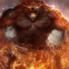
A.)

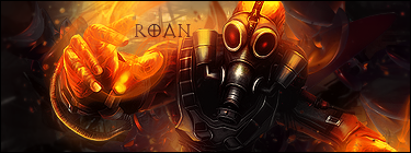
B.)

Voting ends in 24 hours.

Posted 12 May 2012 - 15:27

^ SAHARDY ^
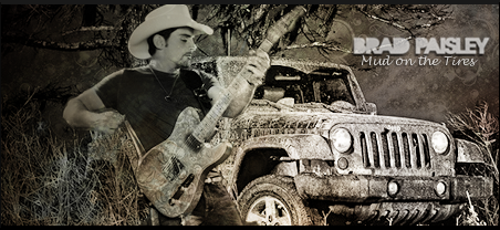
<><><><><><><><><><><><><><><><><><><><>< Selling Stuff ><><><><><><><><><><><><><><><><><><><><>

Posted 12 May 2012 - 15:31
Posted 12 May 2012 - 15:53
Posted 12 May 2012 - 15:59
Posted 12 May 2012 - 17:45

Posted 12 May 2012 - 18:42
Sorry but Photobucket decided to take down my Signature.
Veteran


Posted 12 May 2012 - 21:12
Posted 13 May 2012 - 01:01
Veteran


Posted 14 May 2012 - 03:59

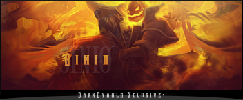
|| signature rotates, artists varied ||
Fan my art on Facebook || Deviant Art || Chat on Irc
When in doubt, lean to the side of mercy.
- Cevantes
Posted 14 May 2012 - 05:56
 ummmm, I like B the best. Both look great but I think A does not exhibit too much. B is good the render could have been places just a little further down and do without the black boarder.
So who wants to buy me Zombie Brand on League of Legends?
Posted 15 May 2012 - 14:46

 - 5
- 5
0 members, 0 guests, 0 anonymous users