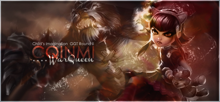
Jump to content

Photo

Sig Battle Voting: MyCurse v. Chagryn


  • Please log in to reply
9 replies to this topic

#1 TreeFrog

TreeFrog

    Veteran

  • Members
  • PipPipPip
  • 2,739 posts
  • Badge

Posted 14 May 2012 - 13:31

Please include a short reason with your vote, and keep the tally.


A.) Posted Image < MyCurse


B.) Posted Image < Chagryn


Voting ends in 24 hours.

#2 Roan

Roan

    Veteran

  • Members
  • PipPipPip
  • 6,278 posts
  • Badge

Posted 14 May 2012 - 13:34

Both look nice. But prefer the colors on A, so it gets my vote.

A-1
B-0

Firesinged_zpsd6b00c6e.png


#3 fs_harvey888

fs_harvey888
  • Guests

Posted 14 May 2012 - 14:46

B is my vote because its more clear and better colours

A)1
B)1

#4 Sustortias

Sustortias

    Veteran

  • New Members
  • PipPipPip
  • 2,214 posts

Posted 14 May 2012 - 16:30

'A' definitely has the edge in composition and colors.

Text could be better in both i think.

Graphically though:- 'A'

A)2
B)1

Ignition_Honda_410x200_zps03cc040c.png


#5 Kayesha

Kayesha

    Veteran

  • New Members
  • PipPipPip
  • 2,030 posts
  • United States of America

Posted 14 May 2012 - 23:48

Both are good. I like the work in A more but, it is simply too dark. I had to adjust my screen a couple times to really see the work. So my vote goes to B

A-2
B-2

#6 fs_narael

fs_narael
  • Guests

Posted 15 May 2012 - 00:20

I'll be voting for A as well... I love the changed colors, and the work done there... text looks nice, doesn't stand out... could certainly benefit from a bit more of lighting...
B has got some interesting lighting, and the green glows wor with this render well, but the background feels a bit sloppy...

A-3
B-2

#7 Chagryn

Chagryn

    Veteran

  • Members
  • PipPipPip
  • 995 posts
  • Badge

Posted 15 May 2012 - 19:30

ummm, *bump*

BrandSig_zpsf2e5098b.png

So who wants to buy me Zombie Brand on League of Legends? 


#8 ghetoghost

ghetoghost

    Veteran

  • Members
  • PipPipPip
  • 1,564 posts

Posted 15 May 2012 - 21:08

A. Im liking the darkness of the avi haha

A:4
B:2

~ ~ ~ ~ ~ ~ ~ ~ ~ ~ ~ ~ ~ Live. Love. Learn. Die. ~ ~ ~ ~ ~ ~ ~ ~ ~ ~ ~ ~ ~


Are you an artist? Want to be listed as one under the Artist Directory; click here


#9 WarQueen

WarQueen

    Veteran

  • Members
  • PipPipPip
  • 2,185 posts
  • Badge

Posted 16 May 2012 - 13:19

A's text could be better. I prefer the dark colors over the bright ones in B.

A gmv

A:5
B:2

WarQueenSig1_zpsfe2b03d4.png


#10 TreeFrog

TreeFrog

    Veteran

  • Members
  • PipPipPip
  • 2,739 posts
  • Badge

Posted 16 May 2012 - 16:01

Congratulations MyCurse. :)


1 user(s) are reading this topic

0 members, 1 guests, 0 anonymous users

Font:
Arial | Calibri | Lucida Console | Verdana
 
Font Size:
9px | 10px | 11px | 12px | 10pt | 12pt
 
Color: