
Seems like most of the critique I've got on the sig arena battles has revolved around 'not blended enough' and so on..
I'd like to know all your personal techniques of blending the render with the background. Do I need to smudge more? Would appreciate advice from all the artists, thanks. ^^,
Blending
Started by MyCurse, May 15 2012 03:34
13 replies to this topic
#2


Posted 15 May 2012 - 04:04
I have not received any CNC about blending but I don't think I am pro at it.
personally, I use a small blur brush @ 20% and go over every edge/outline. I also use the color selector to pick colors from the render to incorporate into the background. I smudge 3 layers with different effects on just about all my pieces that I believe help blend the render. Also pulling brush strokes/colors from the render and placing it onto a layer above the background and render help. I do this with some glowing dots.
You are better than me at graphics but I believe this is all I can offer. I think you blend fine personally.

So who wants to buy me Zombie Brand on League of Legends?
#3
Posted 15 May 2012 - 04:51
Thankyou for the tip Chagryn, I'll definitely try the blur brush technique. 
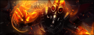
I'll assume that the sig arena battle between me and Narael is over since the 24 hours are up, since I've kinda started doubting myself after that and need some CnC...
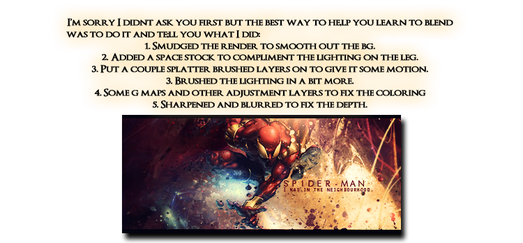
So this was my entry:

One of the artists (and a very good one at that) said that there is no blending and no depth in that...so I'd like to know what to do, since I wasn't (and I'm still not) keen on oversmudging the render to blend it a little more or overblurring the background to provide more depth..advice please?
What would YOU have done to make it blend and give it depth?
Thanks ^^
I'll assume that the sig arena battle between me and Narael is over since the 24 hours are up, since I've kinda started doubting myself after that and need some CnC...
So this was my entry:
One of the artists (and a very good one at that) said that there is no blending and no depth in that...so I'd like to know what to do, since I wasn't (and I'm still not) keen on oversmudging the render to blend it a little more or overblurring the background to provide more depth..advice please?
What would YOU have done to make it blend and give it depth?
Thanks ^^
#4

Posted 15 May 2012 - 05:39

^ SAHARDY ^
<><><><><><><><><><><><><><><><><><><><>< Selling Stuff ><><><><><><><><><><><><><><><><><><><><>
#6

Posted 15 May 2012 - 06:26
I take it my comment was what made you doubt yourself..? Sorry. >,<
But, anyways I think you are a great artist and you shouldn't doubt yourself.
But yeah. I usually smudge some of the outside of the render, whatever looks close to the color of the background I'll smudge so It kinda looks like it's coming out of the background.
imo, your render placement should have been more like the other entry, because it's easier to add effects the bigger the render. And, last thing sharpening is really important for the main part of the sig which you want to attract people with..
(I want to collab with you sometime. )
)
But, anyways I think you are a great artist and you shouldn't doubt yourself.
But yeah. I usually smudge some of the outside of the render, whatever looks close to the color of the background I'll smudge so It kinda looks like it's coming out of the background.
imo, your render placement should have been more like the other entry, because it's easier to add effects the bigger the render. And, last thing sharpening is really important for the main part of the sig which you want to attract people with..
(I want to collab with you sometime.
)
#7

Posted 15 May 2012 - 08:05
You are indeed a very talented artist and I doubt there is anything here that you don't already know. Nice thread though for those seeking advice about the subject.
Very much like treefrog demonstrated, blending is a lot more than just smudging.
Indeed, blending can be achieved without going near a smudge brush.
If it was initially a smudge style then yes smudging would work, though this form of blending can also spoil a tag if overdone, ie the render can get obliterated and end up looking a mess.
Done with care and in the right places though, smudging can achieve amazing results.
For the most part a good blend can be achieved by just directing the light/color/fx so that the two parts, focal and bg are in harmony and the focal appears 'part of the whole'.
Soft brush erasing parts of a focal can really help too. For example, often the head or side of the body (depending on the light) can be 'drawn back' this way so the focal appears to come from 'within' the background.
Most certainly, it is how the combination of these elements is directed that will ascertain the best outcome.
Color, lighting, transparency, detail (sharp/blur),fx all need to be taken into account for a good blend consistency.

#8
fs_kglassie
fs_kglassie
-

- Guests
Posted 15 May 2012 - 08:20
Oh my gosh...no need to doubt yourself! You are very talented. ...I'd share some techniques...but I got nothing, I'm just a tadpole.
...I'd share some techniques...but I got nothing, I'm just a tadpole.
#9
Posted 15 May 2012 - 12:13
Thanks for the kind words everyone..
Loving the tips here, I'll be sure to try everything out, would like to get better.
Loving the tips here, I'll be sure to try everything out, would like to get better.
#10
fs_narael
fs_narael
-
- Guests
Posted 15 May 2012 - 14:22
Hey man i personally don't know how mine turned as good in our battle, but still you won Having said that, I also tried a few extra tutorials on that piece on how to add depth in a signature... the easiest way i've found, is to make a new layer and apply image (try not to include your C4D and text in the applied image, but i've seen that it might work that way too). That layer duplicate it a few times (i went for 10 times XD), as you'll be trying the same thing on each one...
So on the top try to use a soft blur brush (20-25%) to blur in one pass what you feel belongs to the background if it was 3D (make a second and a 3rd pass in case you try something with great depth, like spidy swinging over a NY street)... Then you'd might blur a bit less the edges of the render, which should add to the motion if you've smudged it when added the render... and then you should sharpen a bit what feels like closer, any details you think would stand out if this was in RL... that way you've give at least 3 layers of depth in a single layer (after that it's pretty hard to chage stuff on it, so i usually go for it as the last step)...
Then you have the other 9 layers... what i do, is to repeat the above paragraph on every layer and each time make something different... then i check all 10 layers and decide which one i like the most...
...and then i lose to graphics battle, as i deserved
i personally don't know how mine turned as good in our battle, but still you won Having said that, I also tried a few extra tutorials on that piece on how to add depth in a signature... the easiest way i've found, is to make a new layer and apply image (try not to include your C4D and text in the applied image, but i've seen that it might work that way too). That layer duplicate it a few times (i went for 10 times XD), as you'll be trying the same thing on each one...So on the top try to use a soft blur brush (20-25%) to blur in one pass what you feel belongs to the background if it was 3D (make a second and a 3rd pass in case you try something with great depth, like spidy swinging over a NY street)... Then you'd might blur a bit less the edges of the render, which should add to the motion if you've smudged it when added the render... and then you should sharpen a bit what feels like closer, any details you think would stand out if this was in RL... that way you've give at least 3 layers of depth in a single layer (after that it's pretty hard to chage stuff on it, so i usually go for it as the last step)...
Then you have the other 9 layers... what i do, is to repeat the above paragraph on every layer and each time make something different... then i check all 10 layers and decide which one i like the most...
...and then i lose to graphics battle, as i deserved
#11

Posted 15 May 2012 - 14:46
trust me the people telling you this stuff are some of the best ive seen, vince i learned a lot about stocks and lighting, beast was my main smudge techniques, its may seem like a lot but experiment
#12
fs_harvey888
fs_harvey888
-
- Guests
Posted 15 May 2012 - 19:14
You dont need to smuge just find a colour that blends in the background and that avi was fine
#13
fs_harvey888
fs_harvey888
-
- Guests
Posted 16 May 2012 - 15:01
Now they are saying im not blending im battling with Jbear95 his is glowing red and the background is purple i blend mine in and they say Jbear blended in his more WTH
#14

Posted 16 May 2012 - 15:38
harvey you are just starting doing graphics, you can't know everything.
Those commenting your battle are trying to help you. They are experienced artists, you should listen to them rather then listen your own ego.
Those commenting your battle are trying to help you. They are experienced artists, you should listen to them rather then listen your own ego.
1 user(s) are reading this topic
0 members, 1 guests, 0 anonymous users