
I'm tossing a thought around in my head that I'm going to start doing GFX again (yes, I used to do GFX.) I'm going to be using GIMP, which is a completely new program to me. Any tips to make my work look semi-professional? xD
EDIT: Name change

Opinions for a new artist?
Started by BluuStarr, May 15 2012 04:41
8 replies to this topic
#2

Posted 15 May 2012 - 04:55
viewtopic.php?f=21&t=59751
That's the best starting point you could find, DA has explained the basics of everything in a crisp and fun manner, and this is exactly what got me going. The stickies also have access to resources, tutorials etc. so the best thing would be to go through it all. ^^
That's the best starting point you could find, DA has explained the basics of everything in a crisp and fun manner, and this is exactly what got me going. The stickies also have access to resources, tutorials etc. so the best thing would be to go through it all. ^^
#3
Posted 15 May 2012 - 06:30

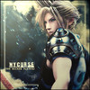
How's this? My first experience with GIMP. I can't find any good looking techniques with text, so I just kinda winged it.

#5
fs_narael
fs_narael
-

- Guests
Posted 15 May 2012 - 14:41
Nice  we always love another in the game
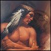
So a few CnC and tips :
.the light source is a bit absolute... it should have a bit of mystery to it, showing less than 50% of the circle it makes... it would also help if you could make it on this piece coming from over the mountain, thus allowing a bit more of detail in the background (in this case, the mountain should be darkened a bit though)...
.The render stands good there. But i guess you want to make each one better, so try copying the render a few times in the piece, and smudge the lower layers (set to lighten or something), and soft erase a few parts of the top layer (blur a bit of the edges that remain of the top render)...
.text is usually fit to personal tastes, i like transparent ones, others like curly, others like them almost non-existent... what most of us agree is that it shouldn't pull a viewer's attention for all the rest of the work... the best way to make that happen is to use a dominant color from the rest of your work (something already used a lot, so that it won't stand out. - i personally go for white text, set on overlay so it takes over the colors of the background a bit more saturated), and of course make the text easy to read, but not big enough to steal the attention... (many artists add a couple of lines of unreadable text below the normal text, it's a good trick)...
.i'm not sure if it's due to being tired or really there, but i think i see a dotted texture in the background...? if yes, it makes this particular piece look weird, but might work with others... if not i'd better catch some sleep
I hope these helped, you can find a few good tutorials in the stickied topics, they really help
we always love another in the game So a few CnC and tips :
.the light source is a bit absolute... it should have a bit of mystery to it, showing less than 50% of the circle it makes... it would also help if you could make it on this piece coming from over the mountain, thus allowing a bit more of detail in the background (in this case, the mountain should be darkened a bit though)...
.The render stands good there. But i guess you want to make each one better, so try copying the render a few times in the piece, and smudge the lower layers (set to lighten or something), and soft erase a few parts of the top layer (blur a bit of the edges that remain of the top render)...
.text is usually fit to personal tastes, i like transparent ones, others like curly, others like them almost non-existent... what most of us agree is that it shouldn't pull a viewer's attention for all the rest of the work... the best way to make that happen is to use a dominant color from the rest of your work (something already used a lot, so that it won't stand out. - i personally go for white text, set on overlay so it takes over the colors of the background a bit more saturated), and of course make the text easy to read, but not big enough to steal the attention... (many artists add a couple of lines of unreadable text below the normal text, it's a good trick)...
.i'm not sure if it's due to being tired or really there, but i think i see a dotted texture in the background...? if yes, it makes this particular piece look weird, but might work with others... if not i'd better catch some sleep
I hope these helped, you can find a few good tutorials in the stickied topics, they really help
#6
fs_harvey888
fs_harvey888
-
- Guests
Posted 15 May 2012 - 15:52
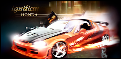
Nice for a first and check out my GFX
viewtopic.php?f=21&t=106663
Here is some more stuff for avi makers
viewtopic.php?f=21&t=79691
Those are Resources like fonts and Patterns and all that every avi maker should use that
viewtopic.php?f=21&t=106663
Here is some more stuff for avi makers
viewtopic.php?f=21&t=79691
Those are Resources like fonts and Patterns and all that every avi maker should use that

#8
Posted 15 May 2012 - 21:35
Your best bet when making an avi is do it in the 200x200 canvas it needs to be to start withHere's a second attempt at an avi. Tell me what you think
I know it's a bit too big but I can't find a good place to reduce it without dropping the quality :/ Any suggestions?


#9
Posted 16 May 2012 - 04:06
Feedback pl0x!

The blurred edge seems a bit awkward and weird to me, but I'm just going to see what you guys think.
EDIT:
Played with some more effects here's the outcome:

The blurred edge seems a bit awkward and weird to me, but I'm just going to see what you guys think.
EDIT:
Played with some more effects here's the outcome:
0 user(s) are reading this topic
0 members, 0 guests, 0 anonymous users