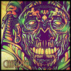
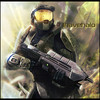
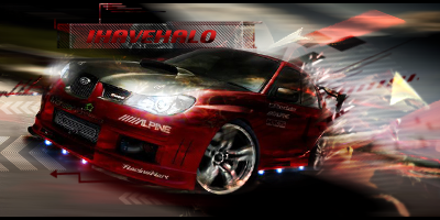
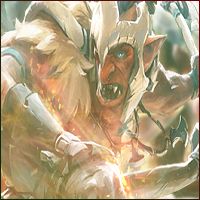
hey guy...it been a while since i post something on this forum..
here my new work...need CnC for this piece 
Posted 20 June 2014 - 07:18
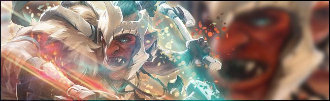
hey guy...it been a while since i post something on this forum..
here my new work...need CnC for this piece
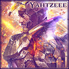
Sig made by me XD
Posted 20 June 2014 - 20:54
Hey Yahtzee, I do remember you actually
The render in the avatar is a little skewed and looks distorted. I also might even play with the contrast a bit because it looks a little washed out.
The Sig looks good but its far to wide. The Blue effect is nice but I would have smudged the background a bit so that its not immediately associate with the render but the colors will still compliment it. I would also sharpen the render just 1 more time to add more depth a noticeably.
Good work over all

So who wants to buy me Zombie Brand on League of Legends?
Posted 20 June 2014 - 21:34
Posted 20 June 2014 - 22:30
I don't think I was around when you were making GFX but I am glad I know you now  , I think you shrinked the render way too much on the avi, you did better on the sig version but the background needed to be smudged as I just don't feel it like that, the GFX and brushes touches you made in there is actually awesome and I like it a lot so good work

0 members, 0 guests, 0 anonymous users