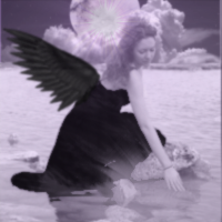
Here I am again pestering the big guns for advice. So I'm still playing around trying to get the hang of gimp.I really like avis with real life backgrounds so I'm trying to make a fairy on a lake. I started my canvas at 200x200 as was suggested, I think I'm too old for that its so little...you must all be youthful :wink: Here is what I come up with
I regret the supernova, and I have to get better at adding wings...cos I love fairies...but that's not why I'm posting.
1. I tried blending via layering and blur effects...but its too blurry, could this be partly because I had to scale down my render quite significantly? Suggestions?
2. The lighting. It seemed way too light to me so I played around with hue saturation, light source idk what else, then got all girly with a galaxy brush. I figured I'd go to you before I got to work on it any further. Idk if I made it better or worse...>.<
Anyway I you have some suggestions I'm all ears, if you are bored feel free to play around with them and repost with advice on what you did.
Liking the first version at the moment, the purply color just doesn't seem to go so well.
With the second one you could throw a nice blended gradient coloring over the top just to add some more color perhaps. Add your layer as overlay, set the opacity to around 50% (give or take) and stroke a nice multi hued gradient through the empty layer then experiment with overall opacity and hue adjustment for the gradient layer till you get something you like.
Best way to blur for depth is to do what they call in PS an 'applied image' (basically just a top layer comprising ALL layers in one).
Gimp also has this feature but slightly different name ('merge visible' or something like that).
Perhaps sharpen up your whole image before trying this next bit.
Now with that new layer select gaussian blur (or whatever works for you, gaussian is nice for this though) and apply that so the whole image gets nicely blurred.
Then the magic bit...
With a soft round brush, erase back up on that layer only the focal parts that you want up front, leaving the rest nicely blurred behind.
This method also works well in reverse, ie sharpening. Same method but sharpen the whole layer then erase back up the outer edges to a blur.
This is an excellent method to use in a piece and is well used by sig artists to achieve good depth.
Hope you don't mind me showing you a result with this.
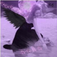
I sharpened up whole image (using whole image on new layer set to overlay + high pass filter). Then did a gaussian blur to the whole image and erased 'back up' some parts of the focal. Then did a stroked multihue gradient on a new empty layer set to overlay, adjusted opacity and hue.
note, when adjusting the hue on a gradient layer like this, many different color schemes can be chosen from...
before
after
Went quickly through this so it's not perfect but gives you an idea.
Added some gradient maps set on soft light and changed the colour balance to get rid of the purple/blue and give it a more serene black and white look. I also added some clouds and used a soft white brush at 20% to paint some light from the top left downwards. It's worth noting that the light source on the femal actually comes from the right so it's always going to look odd while the avi shows it coming from the left.
Added some gradient maps set on soft light and changed the colour balance to get rid of the purple/blue and give it a more serene black and white look. I also added some clouds and used a soft white brush at 20% to paint some light from the top left downwards. It's worth noting that the light source on the femal actually comes from the right so it's always going to look odd while the avi shows it coming from the left.
Very nicely done
Yeh I could've gone to town on it but just wanted to show those steps for the depth, coloring.
OMG that is really helpful you two...
Sustortias, I never even thought to put the blur on a transparent overlay and erase, I just kept staring at it thinking too much blur...and the clouds you added helped cover the blend of the sky I added to the background of render.
I like seeing you what you guys did.
And Athdenald funny thing, I was trying to figure out sepia on gimp but I couldn't and was a little tired or tutorials so i went black n white...thought it too drab and added the purple...(cos I am a girly girl I also like Sparklies n shinies...i make words up too) now I see the sepia is lovely, I don't understand how you got rid of all the purple though @_@ gradient maps...these scare me...I bet these water stain bushes would be neat on that...perhaps too much though? Still its screamin for sparklies tho ; )
Please, call me suss (I often refer to my work as such haha)
Happy to help in anyway I can.
The blurring of the whole image then erasing back up parts you want sharper is a nice clean way to get that effect without having to use a brush to blur in different area's. You can just apply the filter on the whole image then use an erase brush to bring back up the main details.
Another nice way to add/adjust colors is to use a brush set to overlay mode (not the layer, the brush itself). Then just apply the coloring with the brush.
The soft round brush, whether it is for erasing or coloring or shading, is one of the most useful tools to the artist.
Gradients and gradient mapping you should really learn, they are pretty easy to work with and can help loads with blending, tinting etc.
Usually gradient mapping is done towards the end of a piece in whats commonly called 'Adjustment Layers'. These will help fine tune the piece for color and depth.
When you have time as well, look up ' layer masks', as these can really help with perspective and blending and lighting and allows a person to 'non destructively' erase or reveal elements within a piece. A bit like an advanced erase brush but uses 'black' or 'white' paint to mask in and out details.
In this vid (which is really funny btw lol) the guy shows a technique for taking out 'red eye' using a layermask. The method works the same in gimp.
oh and the part 2 which I noticed they released lol ... ure=relmfu
Just remember after creating a mask to 'click on the mask' to work with it or you'll find your just editing the main layer instead of the mask and to always use black or white brushing (coloring is pointless in masks as masks work only in greyscale so colors would just be an equivalent of opacity).
You're the best Suss...I'm having so much fun trying these things out...making a mess though cos my mouse for my laptop crapped out and I've been using my touchpad as a "brush"...doesn't really matter because I'm not showing anyone these ones...giggle
:arrow: Question to anyone who uses a Graphics Tablet and Pen if I really get into this would you suggest getting one? Are they worth buying or just a tool for professional graphic artists.
:arrow: Question to anyone who uses a Graphics Tablet and Pen if I really get into this would you suggest getting one? Are they worth buying or just a tool for professional graphic artists.
You're the best Suss...I'm having so much fun trying these things out...making a mess though cos my mouse for my laptop crapped out and I've been using my touchpad as a "brush"...doesn't really matter because I'm not showing anyone these ones...giggle
:arrow: Question to anyone who uses a Graphics Tablet and Pen if I really get into this would you suggest getting one? Are they worth buying or just a tool for professional graphic artists.
I use the touchpad all the time when I'm making things, I find I have pretty good control with it actually. I would not get a tablet and pen specifically for this unless you plan on doing this commercially.
Ok thanks I'll save coin for some other fun...no I'm too old to start another new careeer, though I was showing my daughters some stuff I've done with tuts and one said if i like it I should go into business...sigh...to do something you love AND get paid...she is young. I'm actually thinking of using a stylist as a pen on my touchpad lol...