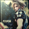
I hate the text on this one. Need to find some different stuff to use.

Again, not sure what text to use.

Posted 27 September 2012 - 22:37

Posted 28 September 2012 - 00:02
Posted 28 September 2012 - 00:23
Posted 28 September 2012 - 01:14
Both are very cool but there are some things that should be improved/changed
1st sig:
Define the focal more; the render is too blended with the effects
Text is bad, font and placement
2nd sig:
the lightsource at upper-right is awkward. Its too strong and too small, also its wrong placed as the light comes from the botton right side of the girl

Posted 28 September 2012 - 14:22
Actually those bubbles are perfect:). Other than lighting is wrong, it's solid piece.KIABoth are very cool but there are some things that should be improved/changed
1st sig:
Define the focal more; the render is too blended with the effects
Text is bad, font and placement
2nd sig:
the lightsource at upper-right is awkward. Its too strong and too small, also its wrong placed as the light comes from the botton right side of the girl
Definitely this, but to add to that, all of those bubbles in the second sig are just really distracting and annoying.

Posted 28 September 2012 - 18:04
Actually those bubbles are perfect:). Other than lighting is wrong, it's solid piece.KIA
0 members, 0 guests, 0 anonymous users