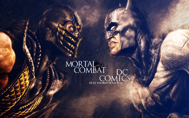
This round contestants were asked to create a piece of art that included at least one character from either Marvel or DC and at least one from either Mortal Kombat or Street Fighter.
How the voting works:
For each group you will rate each piece from 1-10 and give a small reason for the score. You have 18 points to allot to each group so if in Group 3 you give A a 10/10 the maximum score you can give B is 8/10. You DO NOT have to use all of the points for each group. At the end of the round the 2 players with the lowest total will not advance to the next round.
Voting Ends 0:00ST 1/29/2013
Here's the art:
Group 1:
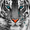
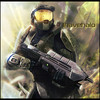
A.
 abhishek
B.
 Grimmhawk
Group 2:
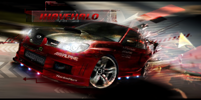
A.
 aa0007
B.
 Beastboy95
Group 3:
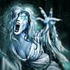
A.
 Athdenald
B.
 forhorsmn
Group 4:
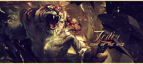
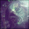
A.
 Cassafras
B.
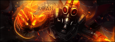
 Roan
RoanXXXXXXXXXXXXXXXXXXXXXXXXXXXXXXXXXXXXXXXXXXXXXXXXXXXXXXXXXXXXXXXXXXXXXXXXXXXXXXXXXXXXXXX


 My votes will definitely affect the outcome
 .
.