

Here are the Pictures ......... Finally.... Sorry its late....... stupid real life!
Welcome to the voting thread of Graphics of the Week March 2014.
This week, contestants had to create an avatar or signature with the following theme:
This week's theme is: The players of Fallen Sword...... how do you picture yourself?
The current pot is 12.......... 8 donated + 3 entries = 11 + 1 (to make it even)
Edit: Please comment about your choice or the vote won't count
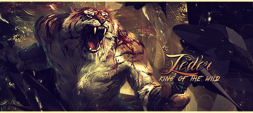
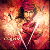
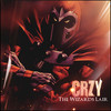
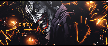
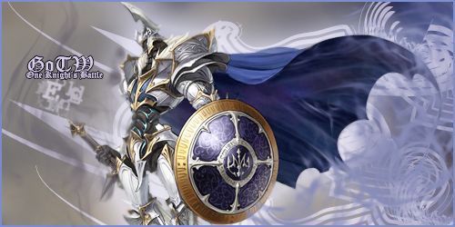
A ) Crzy
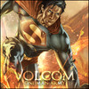
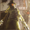
B ) Athdenald
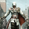
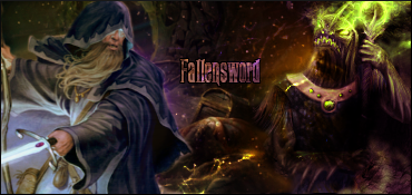
C ) Clock96
Edited by zeder, 11 March 2014 - 18:16.