

Welcome to the 7th Grand Graphics Tournament -- ROUND 3!. Artists today are gathered together to do a battle royal for top bragging rights and a bit of a prize. Who wins?
Well, that my fellow players is up to you!
The theme you're voting on is 'Black & White with a Touch of Color'.
What is 'B&W-1C'?
Everything is dull, dark, colorless, boring... except 1 small piece that dares to defy the law of B&W.
Examples: http://tinyurl.com/lpcpzvx
Below you'll find the entries. Please take a moment and look them over, vote for those in each set that you find most appealing and give a bit of a reason for your rating.
Please rate each entry in each group on a scale of 1 to 10 with a vote of 10 being 'this blows my mind it is so good' and 1 being 'this is phale'.
You have up to 15 points to distribute between the two entries in each grouping.
You DO NOT need to give out all 15 points. The MAX you can give is 10 points on 1 piece per group.
(Note: 10 points = +1, 5/10 = +.5, etc etc on tally sheet)
Please include a reason with your votes - you only have to give a reason for one per set. It doesn't have to be technical. You can just say I liked this one best, or something along those lines but we all know an artist thrives on feedback so don't hesitate to really say what you think.
If your vote looks like you're trolling or joking I will contact you about it, and it won't count unless I'm satisfied that you weren't trolling.
Example:
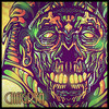
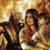
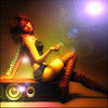
Group samples
a 10/10 - I like it, it is a decent composition. / Good but could use (insert suggestion)
b 5/10 - I don't care for it. / Needs work
or
a 5/10
b 8/10 - I liked this one best of this group
c 2/10
Voting closes at 23:59 Server Time on Saturday November 23rd
Votes that do not have a reason will not be counted. (You may say "I liked this one best from this group" or something simple - no need for a full cnc)
*artists, you may vote, but do not skip your own group, votes will be adjusted when tallied.
Please vote for every grouping.
On behalf of my fellow artists, thank you for taking the time to vote and I hope you enjoy the bounty of art that is being laid before you.
NOTE: Everyone who votes will be entered into a drawing for a FREE avatar!! Several people will be randomly selected after the voting.
Free avatars to be given out by random will be done by the following artists:
3 by cqinmi
3 by patnov
1 by MindyN5
1 by Chagryn
That's 8 chances to win an avatar!! 
Tell your friends, tell your guildmates!
Edited by WarQueen, 22 November 2013 - 21:39.
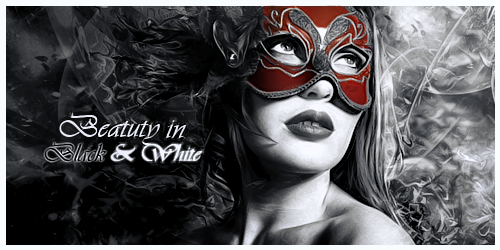

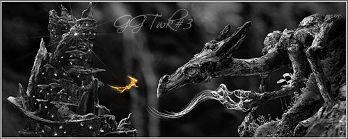

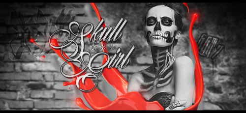
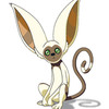
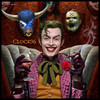
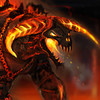
 The blending is awesome in this image. There is small distraction in the flow of the image in bottom left corner. The touch of color fits the image verywell.