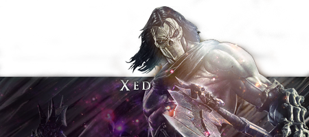
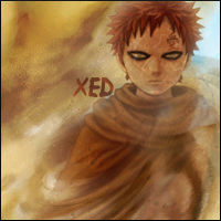
I recently made this, and I tried to take some advice from my good friend Crzy on trying to make things "flow"
Posted 01 September 2014 - 02:37


Posted 01 September 2014 - 03:06
No problemIt was meant for everyone, and thanks alot for the CnC
Keep the good work up dude 
Posted 05 September 2014 - 22:09
I like the effect...I feel like the font doesn't really fit in. and the distortion on the face bugs me even though its a sand storm, Overall its a good artwork and looks like you used a difficult concept
6/10.
6 is based on uniqueness, the pointse missing are just based off of my dislike for the font/distortion.
[Im a picky rater so don't take it harshly i love your art you're a good artist.] And i do love that you're being unique and playing with ideas. Thats a respectable cause.
Edited by kisoku, 05 September 2014 - 22:10.

Posted 11 September 2014 - 07:41
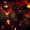
I recently made this, and I tried to take some advice from my good friend Crzy on trying to make things "flow"
The sandstorm effect is pretty neat, though I find it too smooth. You could add a little bit of noise to it. The font is alright because I believe that's the show's font. I'd just place is somewhere in the bottom left corner. (Not the immediate corner though)
good photographyer. great drawer. but im most best at photoshop.
0 members, 0 guests, 0 anonymous users