Great pieces everyone!
A - I love the concept, but the there are a couple problems to it. Mainly being there is just to much going on that is pretty noticible. The extra part added to the left side and bottom ruined your flow. And I feel like you could have done a little bit better with the text.
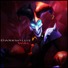
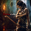
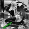
B - I love this piece, the colors are wonderful and the dragon added to back really brings everything in I feel. My only problem with it that I think you should have made the entire signature a little smaller. This is my first vote.

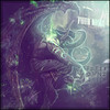
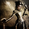
C - I like the overall of the piece but the clashing colors is the main reason why my second vote didn't go here. It seems really sloppy and that everything was kinda thrown together. One thing for sure is the black in the top right corner should have been done away with. One other area I don't like is the (I think 2px) fading border.. Borders can ruin a piece if you're not careful. Out of all the pieces the text is best in this one imo though!
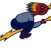
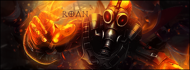
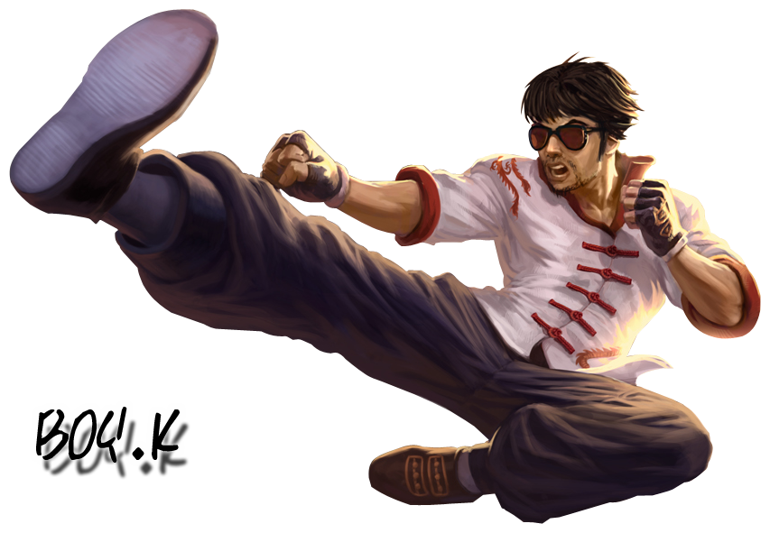
D - Although my vote goes to this piece, I must say I hate the border in this one. But! I love everything else about his piece. The Fx coming off of Lee were done wonderfully (you should have put some in under his leg!) The feel of the picture is so nice I really had to make this my second pick!
So if you didn't catch all that, my votes go to
B and
D!
Again great work everyone!


 < Cassafras
 < Grimmhawk
 < Athdenald
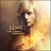
 < aa0007
 ).
).


 . Seems like we've already got a definite winner, lol. The others are still pretty close though.