Jump to content

Photo

GGT Voting Round 3 -- Black & White with a Touch of Color.


  • Please log in to reply
71 replies to this topic

#21 agenttrl

agenttrl

    New Member

  • Members
  • Pip
  • 12 posts

Posted 22 November 2013 - 06:20

G1

a:9/10 Loved this one the most.

b: 8/10 Really good, eyes bother me a bit, I don't know why.


G2

a:3/10 It looks to me the dragon sneezed out fire.

b:5/10 Its pretty good, should of had a little less color.


G3

a:6/10 Interesting.

b:4/10 Not a lot to it.


G4

a:8/10 Love this one.

b:6/10 To big of a color splash, it looks like it doesn't belong there.


#22 crow88

crow88

    New Member

  • New Members
  • Pip
  • 22 posts
  • Badge

Posted 22 November 2013 - 07:22

Group 1


A ) 9 - I like this one the most...it's very clean looking and the color looks most natural

msg-33730-0-11960700-1384652280.png


B ) 3 - don't really like this one.. color seems forced especially on the K. and I've seen that picture everywhere.. not very original

4l36.jpg


Group 2


A ) 3 - not really sure what's going on here

GGT7wk32_zps71f0ee77.png


B ) 7 - I like it, but there's too much color involved for just "one splash of color"

BlackampWhiteGGTRnd3_zps6faad822.png


Group 3


A ) 6 - color on the apple looks artificial and the thing on the right? not really sure what that is...

8El8wbo.png?1


B ) 5 - meh.. color seems forced and completely unnecessary, but I give it a 5 since it's different from all the others (color, and it's an avatar) 

GGTround3_zps80bc78e6.jpg


Group 4


A ) 7 - I like this one, though it's not very clear

devils_zps02970108.png


B ) 8 - clarity is great, color is vibrant and catches my attention

SkulGirl_zps2f510ddf.png


#23 wackyears

wackyears

    New Member

  • Members
  • Pip
  • 22 posts

Posted 22 November 2013 - 09:06

G1:

A: 8

B: 6.5


G2:

A: 5

B: 7


G3: 

A: 3.5

B: 4


G4: 

A: 6

B: 5.8


#24 Command101

Command101

    Member

  • Members
  • PipPip
  • 153 posts
  • Badge

Posted 22 November 2013 - 09:12

G1

A: 7/10

B: 8/10

These are both great pieces, but I prefer the bolder red on the second piece


G2

A: 3

B: 6

Picture A is too hard to read, but it does follow the theme better. Pic B is nicer, but it's a bit too "splashy".


G3

A: 7/10
B:4/10

A seems smoother too me (not an expert..) and the color goes well with the picture. Unfortunately B seems like it was smeered with blue...


G4

A: 6/10
B: 8/10

Both of these are well done. But I prefer the sharpness in pic B.


PM me in game if I get out bid on a piece. Thanks.Thaisetqb1_zpsiu932q47.png


#25 clock96

clock96

    Veteran

  • Members
  • PipPipPip
  • 880 posts
  • Badge

Posted 22 November 2013 - 09:18

a good number of votes on this round ;)


Edited by clock96, 23 November 2013 - 18:48.

clock96.gif


#26 MindyN5

MindyN5

    New Member

  • Members
  • Pip
  • 27 posts

Posted 22 November 2013 - 09:27

Thanks for pointing out that my votes were off, I adjusted all the votes to keep the scale.


zBAD9V9.png?1


#27 DarkWillie

DarkWillie

    Veteran

  • New Members
  • PipPipPip
  • 719 posts

Posted 22 November 2013 - 13:18

Just quick notes for votes... will elaborate if time permits... just don't want to miss my chance again...


Group 1

a - 9 excellent!

b - 6 I like it, but the image is a little blurry


Group 2

a - 8 I really like this one

b - 7 Excellent work as well, the other just appealed to me more


Group 3

a - 6 I can appreciate the work but I don't care for the image

b - 4 hmmm...


Group 4

a - 7.5 Good work... well layered

b - 7.5 Not my favorite piece but cudos to the artist.


If I win an auction, please notify me in-game


#28 WarQueen

WarQueen

    Veteran

  • Members
  • PipPipPip
  • 2,185 posts
  • Badge

Posted 22 November 2013 - 13:41

G1:

A: 8

B: 6.5


G2:

A: 5

B: 7


G3: 

A: 3.5

B: 4


G4: 

A: 6

B: 5.8


if you don't give reasons with your choices, your votes will not be counted nor will you be entered in the drawing for a free avatar.


WarQueenSig1_zpsfe2b03d4.png


#29 Roan

Roan

    Veteran

  • Members
  • PipPipPip
  • 6,278 posts
  • Badge

Posted 22 November 2013 - 15:38


Group 1


A ) 9/10 --- Loving all of it except the text.

B ) 6/10 --- Decent work, not really liking the red chosen for this. Text should be closer from focal.


Group 2


A ) 4/10 --- Nice enough but too plain. The color part isn't well exploited also.

B ) 4/10 --- Looks nice, text would need work. Too many color in here to follow the theme imo.


Group 3


A ) 5/10 --- Nothing exceptionnal but decent. Dislike the branches passing over the guy's hair. Hard for the eye to guess what the focal is. Text is nice.

B ) 2/10 --- Nice try on smudging but this doesn't work. The blue spot ain't working here.


Group 4


A ) 7/10 --- Nice concept but not lively enough for me, it's a bit plain.

B ) 8/10 --- Very nice work. The splatter gives a nice effect but it could have been nicer.


Firesinged_zpsd6b00c6e.png


#30 koenvdv

koenvdv

    Veteran

  • Members
  • PipPipPip
  • 1,327 posts
  • Badge
  • Belgium

Posted 22 November 2013 - 18:13

G1:
A - 9 (verry nice)
B - 7,5 (white splashes on the left not well done)
 
G2:
A - 5,5 (you got to work it better into the background)
B - 7 (don't like that her faces is coloured ... migh have been better if u only kept it to the red colours)
 
G3:
A - 5,5 (everything looks so blury)
B - 4 (waasn't it black and white GGT?)
 
G4:
A - 7 (The sand effect on the whole picture gives an unsharp image)
B - 7,5 (the edges of ther rendere jump out to hard)


#31 LLLovely

LLLovely

    New Member

  • New Members
  • Pip
  • 13 posts
  • United States of America

Posted 22 November 2013 - 20:28

Group 1


A )10 just sexy

msg-33730-0-11960700-1384652280.png


B )5

4l36.jpg


Group 2


A )8

GGT7wk32_zps71f0ee77.png


B )7

BlackampWhiteGGTRnd3_zps6faad822.png


Group 3


A )5

8El8wbo.png?1


Now I can see it

B )8

GGTround3_zps110812ee.jpg


Group 4


A )8

devils_zps02970108.png


B )7

SkulGirl_zps2f510ddf.png


Edited by lllovely, 22 November 2013 - 21:24.


#32 purebreed

purebreed

    Member

  • Members
  • PipPip
  • 59 posts

Posted 22 November 2013 - 21:17

G1

A - 8.8 best on the page

B - 6.5 seen this image 100 times


G2

A - 4 too busy

B - 7 good, but not to my taste


G3

A - 7.5 Good image

B - 0 link broken.... shame, such a high standard


G4

A - 6.9 Like the image, colour really stands out

B - 8.5 lot of work in this pic. 


Well done all of you I would be honoured to own any of these


#33 Elokin

Elokin
  • United States of America

Posted 22 November 2013 - 22:06

G1
A     9/10     It looks like 'beauty' is misspelled. I think you got the theme just right.
B     6/10     This one looks good too, but for me the red K was kind of distracting.
 
G2
A     10/10     It's not too busy, and I like the colored part you chose.
B     4/10     Too many colors, and too much going on for me to like this one very much.
 
G3
A     6/10     I'm not crazy about this one. I think the background is too blurry. I do like the color though.
B     5/10    I don't like the big color cloud. Maybe I am missing something though.
 
G4
A     7/10     Fits the theme well.
B     8/10     I liked this a little better than the other.

avatar by LDP


All HCS Games: Elokin

PSN, Steam: CsokiCsiga213


Eldevin Shop


#34 WarQueen

WarQueen

    Veteran

  • Members
  • PipPipPip
  • 2,185 posts
  • Badge

Posted 23 November 2013 - 02:43

votes updated


WarQueenSig1_zpsfe2b03d4.png


#35 bulseye71

bulseye71

    Member

  • New Members
  • PipPip
  • 249 posts
  • Badge
  • United States of America

Posted 23 November 2013 - 04:49

group 1

A- 8 striking, sexy...I like it

B- 6 solid, I like the theme


group 2


A- 8 I really like this...dragon/ fantsy / fairy...

B-  6 clean buy not striking...I like it but  I think its a little "bland"


group 3


A 8- Very unique and interesting...I'm intregued

B 3- boring...sorry


group 4


A -6 this is nice work I really like the image

B- 8 my favorite of all the entries in all groups...I love the crisp  graphics and the "skull girl" image and message


Edited by bulseye71, 23 November 2013 - 13:42.


#36 ghetoghost

ghetoghost

    Veteran

  • Members
  • PipPipPip
  • 1,564 posts

Posted 23 November 2013 - 05:04

group 1

A- 8 striking, sexy...I like it

B- 6 solid, I like the theme


group 2


A- 8 I really like this...dragon/ fantsy / fairy...

B-  6 clean buy not striking...I like it but  I think its a little "bland"


group 3


A 8- Very unique and interesting...I'm intregued

B 3- boring...sorry


group 4


A -8 this is nice work I really like the image

B- 9 my favorite of all the entries in all groups...I love the crisp  graphics and the "skull girl" image and message

Please fix group 4. 15 points is the maximum allowed per group; currently at 17 :o


~ ~ ~ ~ ~ ~ ~ ~ ~ ~ ~ ~ ~ Live. Love. Learn. Die. ~ ~ ~ ~ ~ ~ ~ ~ ~ ~ ~ ~ ~


Are you an artist? Want to be listed as one under the Artist Directory; click here


#37 WarQueen

WarQueen

    Veteran

  • Members
  • PipPipPip
  • 2,185 posts
  • Badge

Posted 23 November 2013 - 05:33

Please fix group 4. 15 points is the maximum allowed per group; currently at 17 :o


don't worry about it. I can subtract 1 from each to make it an even 15.
most voters see the FSBox message, they come vote, and then they leave. Hardly any of them check back later. :/


WarQueenSig1_zpsfe2b03d4.png


#38 Kedyn

Kedyn

    Veteran

  • Members
  • PipPipPip
  • 698 posts
  • Badge
  • United States of America

Posted 23 November 2013 - 06:52

G1: My favorite two pieces in this round.
 
A - 8 - great artwork, hands down one of the best pieces of the round. The color really pops in this theme.
B - 7 - I'm a fan of this one in general. Even though I've seen the image around, I think the colors on the knight himself work well, but the K is unnecessary.
 
G2:
 
A - 6 - This one is an interesting image. I think another pop of color somewhere on the dragon would have really picked the rating up on this one.
B - 5 - While I like the idea of this one, there is way too much coloring in it to fit in the theme. 
 
G3:
 
A - 3 - I like the piece that was colored in this, but just not an overall fan of the image or idea. I think this could have definitely used another bit of color in such a large picture.
B - 2 - Way to much color in this picture for me for the theme. I'm just not a fan.
 
G4:
 
A - 6 - Not a fan on the finish of this picture, but the splash of red in this picture is nice.
B - 6 - Great idea with the red in this picture, but I feel it's a little too much color in this picture.
 
Good luck to all of the artists!


#39 kimbo

kimbo

    Member

  • Members
  • PipPip
  • 105 posts
  • Philippines

Posted 23 November 2013 - 16:38

 "The theme you're voting on is 'Black & White with a Touch of Color ". So, here's my respective votes having this theme in my mind :)
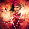
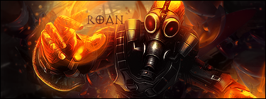
 

G-1 :


A) 8/10>> This one looks awesome and the mask stand out, much more if it was colored Red.

B)7/10>> Like the first one, this one also was nicely done only that  BW and Plus 1 was not really emphasized.
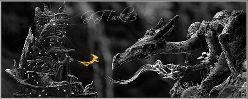


G-2 :


A)5/10>> I could not figured out what this pictures convey and the , " yellow". color makes no sense,,sorry :(

B)5/10>> Again BW Plus 1 was not followed but i like the picture, Nice .
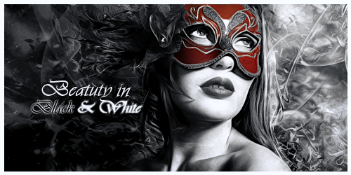


G-3 :


A)810>> So simple but pleasing to the eyes, only if the artist make the apple collor vibrant,then i would say it's amazing.

B)1/10>>This one is out of context, sorry:((
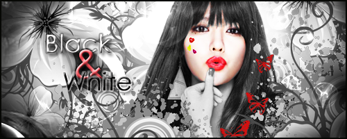
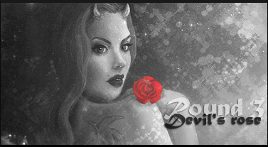
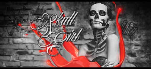
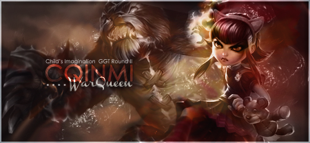
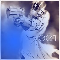


G-4 : 


A) 9/10>>This one connects straight to my eyes, Simple yet, the image convey of something mysterious and this one follow the theme well :)

B)6/10>> Nicely done but too much color splatter and the 3 stars bring no meaning at all.


Edited by kimbo, 23 November 2013 - 16:42.


#40 dregal

dregal

    New Member

  • Members
  • Pip
  • 23 posts

Posted 23 November 2013 - 22:59

1. A: 9/10 Sexy! nice composition.

    B: 6/10 not bad but more than 1 piece is coloured. Nice text.


2. A: 8/10 Nice composition and quite 'artsy'.

    B: 6/10 Too much colour but other than that, not bad.


3. A: 8/10 Don't like the font but it's good.

    B: 5/10 Hmmm .. hate to be negative but it doesn't do much for me.


4. A: 8/10 The misty smudgy thing just doesn't work for me.

    B: 7/10 The pic is really good but I find the indistinct (unrecognisable) background seems to pull the eye                      more than the focal point.


Edited by dregal, 23 November 2013 - 23:01.


0 user(s) are reading this topic

0 members, 0 guests, 0 anonymous users

Font:
Arial | Calibri | Lucida Console | Verdana
 
Font Size:
9px | 10px | 11px | 12px | 10pt | 12pt
 
Color: