This round contestants were assigned one of the 4 Archaic Elements: Earth, Air, Water, and Fire, and were asked to create a piece that embodies that element.
How the voting works: <-- Different this round!!
You will pick your 2 favorite pieces from the four entries below. Please provide a short reason for each choice along with your vote.
Voting Ends 0:00ST 3/12/2013
Here's the art:
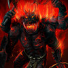
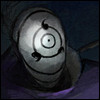
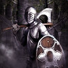
A.) Fire:
 < Grimmhawk
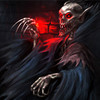
B.) Water:
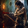
 < Athdenald
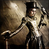
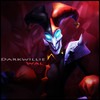
C.) Air:
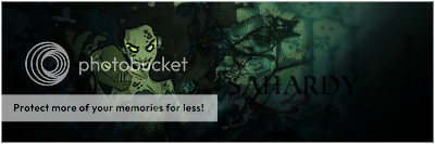
 < Cassafras
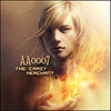
D.) Earth:
 < aa0007
XXXXXXXXXXXXXXXXXXXXXXXXXXXXXXXXXXXXXXXXXXXXXXXXXXXXXXXXXXXXXXXXXXXXXXXXXXXXXXXXXXXXXXXXXXXXXXXXXXXXXXXXXX

 .
.


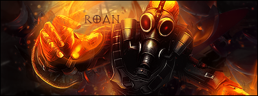

 and D, I like the idea behind it and it was very well executed, but there is something about the image of the woman that doesn't blend into the background well... maybe just me, but again, I could only pick 2