Jump to content

CnC Flame Alchemist


  • Please log in to reply
3 replies to this topic

Poll: Which Do You Like Best? (9 member(s) have cast votes)

Which Do You Like Best?

  1. Number 1 (1 votes [10.00%])

    Percentage of vote: 10.00%

  2. Number 2 (1 votes [10.00%])

    Percentage of vote: 10.00%

  3. Number 3 (3 votes [30.00%])

    Percentage of vote: 30.00%

  4. Number 4 (2 votes [20.00%])

    Percentage of vote: 20.00%

  5. None of them really appeal to me. (3 votes [30.00%])

    Percentage of vote: 30.00%

Vote Guests cannot vote

#1 fs_okomakiako

fs_okomakiako
  • Guests

Posted 12 December 2008 - 05:39

Hey all!

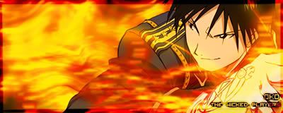
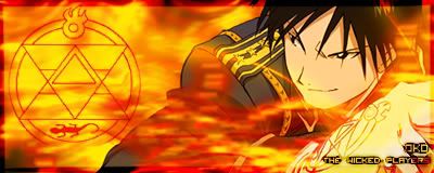
I wanted to practice making flames again and ended up with this:
Which do you like best? What improvements should i make? :D

Number 1:
Posted Image

Number 2:
Posted Image

Number 3:
Posted Image

Number 4:
Posted Image

Render:
http://planetrenders... ... ?pos=-2029

Everything except the render and the text for the guildname is made by me. Text is Visitor TT2 BRK.

Constructive and destructive comments welcome. :D
~Oko

#2 fs_hobblegob

fs_hobblegob
  • Guests

Posted 12 December 2008 - 12:29

#1 IMO is the best :)

#3 fs_arial

fs_arial
  • Guests

Posted 12 December 2008 - 20:01

I like #4. I"m finding the flame across the chin of the render distracting in all cases. Personally I would prefer a touch more red in the flames in the upper left and a little bit of white in the flames to add some texture. Either a bit of white cloud wisps or white specks.

#4 fs_jimmyjoe

fs_jimmyjoe
  • Guests

Posted 12 December 2008 - 20:48

Posted Image

Was bored... so I just did a quick color correction...


1 user(s) are reading this topic

0 members, 1 guests, 0 anonymous users

Font:
Arial | Calibri | Lucida Console | Verdana
 
Font Size:
9px | 10px | 11px | 12px | 10pt | 12pt
 
Color: