


In this round contestants were asked to make a winter themed signature no larger than 300 x 600px. We've only received 10 entries from the 17 people that registered, but something is better than nothing.
How the voting works:
For each group you will rate each piece from 1-10 and give a small reason for the score. You have 18 points to allot to each group so if in Group 3 you give A a 10/10 the maximum score you can give B is 8/10. You DO NOT have to use all of the points for each group. At the end of the round the 2 players with the lowest total will not advance to the next round.
Voting Ends 0:00ST 1/14/13
And in the future do not put your name on the artwork. Its supposed to be anonymous.
Here is the art:
Group 1:
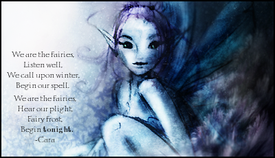
A.
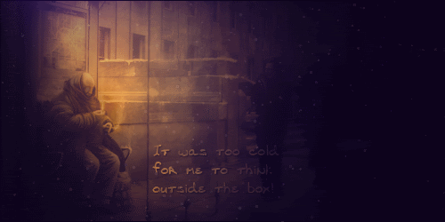
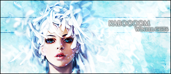 kaboooom
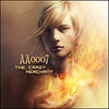
B.
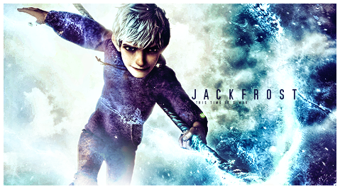
 aa0007
Group 2:
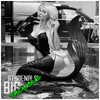
A.
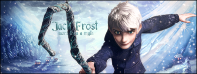
 Roan
RoanB.
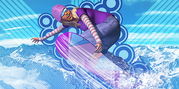
 zeder
zederGroup 3:
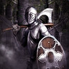
A.
 abhishek
B.
 Athdenald
Group 4:
A.
 Grimmhawk
B.
 forhorsmn
Group 5:
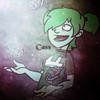
A.
 Cassafras
B.
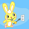
 Beastboy
XXXXXXXXXXXXXXXXXXXXXXXXXXXXXXXXXXXXXXXXXXXXXXXXXXXXXXXXXXXXXXXXXXXXXXXXXXXXXXXXXXXXXXX


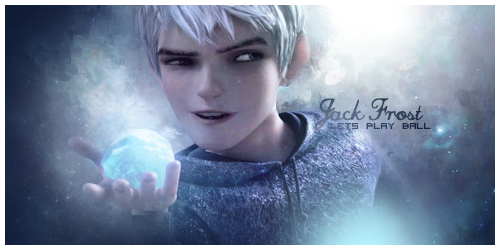
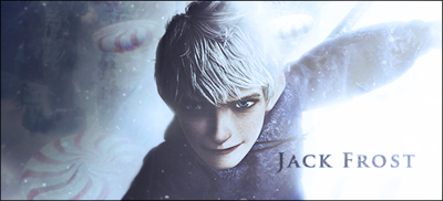
 Do you know how many fan pictures of him showed up on DA when the movie first came out? 9/10 pieces of art was related to Jack XD


 I know how you feel on not wanting to start it again. btw, you forgot to give a rating on 3 B
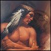