

I've noticed over a period of time that so many of the older artists have left the game and as a result the Graphics forum has taken a bit of a hit. I'm still here making things but I'd like this forum to flourish and grow again and in order to do that it needs new people involved in graphics.
I would like to help everyone get involved with graphics and as such I'm offering my time to anyone that wants it.
Some things you might want to use me for:
Q. "Hey, I've got this render but I'm not sure what to do with it, could you show me what you would do with an explanation of what you did so I can see?
A. Of course I will, nothing would make me happier (with the exception of doing jiggy jiggy with the Swedish netball team in a bath full of swarfegga.)
Q. "Could you help me find a png file of a flower, car, specific person, horse etc...
A. Yes, I won't render anything for you, rendering is something you should learn yourself and you can look up tut's all over the internet but I will happily help you find the stuff you are looking for. Think of me as a useful sprite jumping all over the internet to help you find the stuff you want and need.
Q. Could you provide CnC on this please?
A. No................ Just kidding, post away and CnC I shall give. Be warned, I'm honest to a fault.
There is no reason not to have the best software,
Adobe Photoshop CS2 is available to be downloaded for free here: http://www.adobe.com.../cs2_downloads/
It includes serial numbers and is completely legal having been released by Adobe themselves.
You can see some of the work I have produced here:
http://forums.hunted...showtopic=51990
I know people post individual threads but they get lost and people can't see the advice that was offered, on top of that there is some bad advice that gets offered and some advice that is just plain wrong. I want to simplify all of it.
I've been doing this for a long time, before I joined FS and pretty much since I have been here. I want to be able to help so please use and abuse me as you see fit.
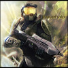
 ohh I need some cnc on this:
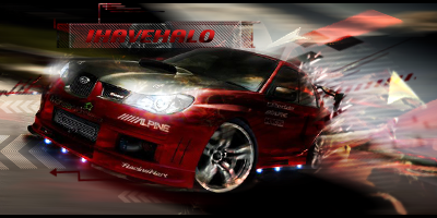


