Jump to content

Graphic Battle! (TO THE DEATH)


  • Please log in to reply
22 replies to this topic

Poll: Vote your favorite below... (11 member(s) have cast votes)

Vote your favorite below...

  1. Nocens (1 votes [5.88%])

    Percentage of vote: 5.88%

  2. Voted CryofMan (9 votes [52.94%])

    Percentage of vote: 52.94%

  3. darkarchon (7 votes [41.18%])

    Percentage of vote: 41.18%

  4. Zukira (0 votes [0.00%])

    Percentage of vote: 0.00%

Vote Guests cannot vote

#21 Dark Archon

Dark Archon

    Veteran

  • Members
  • PipPipPip
  • 2,346 posts

Posted 15 August 2008 - 02:48

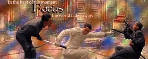
I hate the stock...

Posted Image

I may do a defeat to go with it though...

Yup... still don't like the stock...

Posted Image

I did the defeat though... I personally think I like the victory one better... though, I'm kinda indifferent... :\

That said, I think the stock sucked...

#22 Zukira

Zukira

    Veteran

  • New Members
  • PipPipPip
  • 1,991 posts
  • Badge
  • United States of America

Posted 15 August 2008 - 03:55

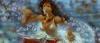
I agree about the stock... but oh well. Not so sure I like the end result I came up with, either, for that matter.

Posted Image

zukira.gif

|| signature rotates, artists varied ||

Fan my art on Facebook  || Deviant Art || Chat on Irc


When in doubt, lean to the side of mercy.

                                                                               - Cevantes


#23 Dark Archon

Dark Archon

    Veteran

  • Members
  • PipPipPip
  • 2,346 posts

Posted 15 August 2008 - 04:26

Yes Nocens, I have seen the movie - it's actually incredible.

And I'm still unsure of my feelings towards my pen tooling... In that image, there are 6 different pen strokes, each with 2 layers - so 12 total. Plus there's 6 different splatter brush effects on top of that. Then there's another 6 layers on top of those to give some more glow and blurring effect. I'm trying to get better at it (hence why you see it so much from me).

Yeh, I had a period where I used the pen tool in everything I made... I think the pen tool in your forum sig is amazing... your tooling seems good in most pieces... but imo, some could do without it...


1 user(s) are reading this topic

0 members, 1 guests, 0 anonymous users

Font:
Arial | Calibri | Lucida Console | Verdana
 
Font Size:
9px | 10px | 11px | 12px | 10pt | 12pt
 
Color: