4 way battle [VOTIN!!!]
#1
Posted 30 May 2012 - 21:46
voting format
A:
B:
C:
D:
A
B
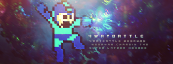
C

D
#2
Posted 30 May 2012 - 21:53
but eventually my vote goes for C
cuz i don`t know why there is red and green in B
A:
B:
C:1
D:
^ Various Artists
#3
Posted 30 May 2012 - 22:21
A:
B:
C:1
D:1
|| signature rotates, artists varied ||
Fan my art on Facebook || Deviant Art || Chat on Irc
When in doubt, lean to the side of mercy.
- Cevantes
#4
Posted 30 May 2012 - 22:31
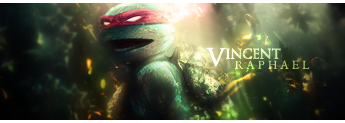
B- Colors in BG don't match the render enough for me to like it. I do like the use of the C4Ds in the BG.
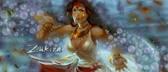
C- Don't really like the lighthing, face is too bright. But I really like the smudging done in the BG, it's great!
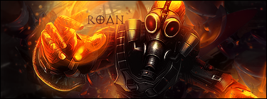
D- Too small for me and I don't really like the rainbow and overall a bit too bright. Here also, the smudging is awesome, really awesome!
Soooo who gets my lucky vote? C.
A:
B:
C:2
D:1
#7 fs_faint
Posted 30 May 2012 - 22:46
I like the smudging in it as well.
A:
B: 1
C: 4
4: 1
#8
Posted 30 May 2012 - 23:46
A - Those lights, lighting effects, and c4d renders goes poorly with 8bit MM. Again, would have looked awesome with a different render.
B - LOVES THE CHARGE BOLT EFFECT ON THE HAND! VERY NICE TOUCH! However, your background is too colorful. Minimalist colors would have suited nicely. Shades and tones of blue would have been perfect specifically.
C - Feels over smudged and the light coming from the top to the bottom right is distracting. Lower your smudge settings from what looks like 100% to 80% and I think it would have been right on the money (Or you used the sharpen effect on the smudge layer) either way. Looks good but just too much smudge.
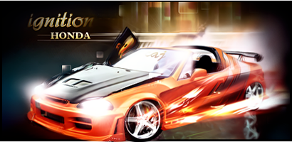
D - Very small. However, the smallness upgrades the quality of the render and looks less 8 bit-ish lol. I like the "drag" effect because in the video games during a power dash he did the same thing. Hell, just because it was on SNES gave it a "drag" affect alone lol. The lighting is good. Love the placement. However, Text is my only complaint. With good text I would purchase this.
D - gets my vote
Overall you guys each used your special abilities to make a sig of your own style. My comments are not meant to be rude but to be taken lightly. I could easily tell who each artist was because the styles are so different. Good job guys.
A:
B: 1
C: 4
4: 2
#9
Posted 30 May 2012 - 23:53
B: 1
C: 4
D: 3
my vote goes to D i just like it better than the other 3.. all nicely done tho
#10
Posted 31 May 2012 - 08:25
C, B, C, B, C, B...I guess C
A:
B: 1
C: 5
D: 3
#11
Posted 31 May 2012 - 08:33
A: 1
B: 1
C: 5
D: 3
Hunting Setup Guide: http://wiki.fallensw...ting_setup_list
Create Setups: http://jagger.atwebpages.com/fs/
How to get to map: http://games.jmle.net/fs.htm
#12
Posted 31 May 2012 - 08:37
I actually like 'A' it has a nice flow In an odd, quirky, choppy, pixelated kinda way
A: 2
B: 1
C: 5
D: 3
#14
Posted 31 May 2012 - 14:34
^ SAHARDY ^
<><><><><><><><><><><><><><><><><><><><>< Selling Stuff ><><><><><><><><><><><><><><><><><><><><>
#15
Posted 31 May 2012 - 17:11
I just like the background
A: 4
B: 1
C: 5
D: 3
#16
Posted 31 May 2012 - 20:01
I'll have to go with C. Because umm... hell, I dunno why...
A: 4
B: 1
C: 6
D: 3
#17
Posted 31 May 2012 - 20:13
I'm glad I didn't have to work with that render .
I'll have to go with C. Because umm... hell, I dunno why...
A: 4
B: 1
C: 6
D: 3
#18
Posted 31 May 2012 - 20:30
I tell ya Grimm, I still have nightmares from working with it lol
I'm glad I didn't have to work with that render .
I'll have to go with C. Because umm... hell, I dunno why...
A: 4
B: 1
C: 6
D: 3
lol, could be worse. You could be having nightmares of Wes dressed up as megaman .
#19
Posted 31 May 2012 - 20:32
#20
Posted 01 June 2012 - 15:34
0 user(s) are reading this topic
0 members, 0 guests, 0 anonymous users