Jump to content

Photo

GGT Voting Round 1


  • Please log in to reply
94 replies to this topic

#1 WarQueen

WarQueen

    Veteran

  • Members
  • PipPipPip
  • 2,185 posts
  • Badge

Posted 26 October 2013 - 01:47

Welcome to the 7th Grand Graphics Tournament. Artists today are gathered together to do a battle royal for top bragging rights and a bit of a prize. Who wins?

Well, that my fellow players is up to you!


The theme you're voting on is 'Time Travel'.


Below you'll find the entries. Please take a moment and look them over, vote for those in each set that you find most appealing and give a bit of a reason for your rating.

Please rate each entry in each group on a scale of 1 to 10 with a vote of 10 being 'this blows my mind it is so good' and 1 being 'this is phale'.

You have up to 15 points to distribute between the two entries in each grouping. You do not need to give out all 15 points.

Please include a reason with your votes - you only have to give a reason for one per set. It doesn't have to be technical. You can just say I liked this one best, or something along those lines but we all know an artist thrives on feedback so don't hesitate to really say what you think.

If your vote looks like you're trolling or joking I will contact you about it, and it won't count unless I'm satisfied that you weren't trolling.

Example:

Group samples

a 6/10 - I like it, it is a decent composition. / Good but could use (insert suggestion)
b 3/10 - I don't care for it. / Needs work
c 9/10 - I love it!

or

a 5/10
b 8/10 - I liked this one best of this group
c 2/10

Voting closes at 23:00 Server Time on Monday October 28th

Votes that do not have a reason will not be counted. (You may say "I liked this one best from this group" or something simple - no need for a full cnc)

*artists, you may vote, but do not skip your own group, votes will be adjusted when tallied.


Please vote for every grouping.

You are voting upon the theme of Time Travel.


On behalf of my fellow artists, thank you for taking the time to vote and I hope you enjoy the bounty of art that is being laid before you.


^Stole Zukira's words from a couple GGT's back as I can't possibly do a better wording job. ;)


Edited by WarQueen, 28 October 2013 - 13:32.

WarQueenSig1_zpsfe2b03d4.png


#2 WarQueen

WarQueen

    Veteran

  • Members
  • PipPipPip
  • 2,185 posts
  • Badge

Posted 26 October 2013 - 01:47

GROUP 1


A ) Jzaz -- WINNER Group 1

GGTENTRYROUNDONE_zps78c455f4.png


B ) patnov

q9rs.jpg


GROUP 2


A ) MindyN5

DW0S0Jy.png?1


B ) zeder -- WINNER group 2

time10_zpse9d2018b.png


GROUP 3


A ) clock96 -- WINNER Group 3

msg-34948-0-11245700-1382559185.jpg


B ) AttorraRu

GGTRound1_zpsf4fd5e0e.png


GROUP 4


A ) jsustin12 -- WINNER Group 4

msg-33730-0-54795200-1382046192.png


B ) ghetoghost

ggt-timetravel_zps0cc8ac66.png


GROUP 5


A ) artistgorn -- WINNER Group 5

cjdx.png


B ) Chagryn

GGTEntry1_zps2267e4b4.png


GROUP 6


A ) beanopoly

TimetravelEntry1_zps4ec328c8.png


B ) aa0007 -- WINNER Group 6

2u4skzo.jpg


GROUP 7


A ) Roan

Week1_zpsf388b3da.png


B ) treefrog88 -- WINNER Group 7

xmk3ld.jpg


Edited by WarQueen, 29 October 2013 - 04:17.

WarQueenSig1_zpsfe2b03d4.png


#3 WarQueen

WarQueen

    Veteran

  • Members
  • PipPipPip
  • 2,185 posts
  • Badge

Posted 26 October 2013 - 01:48

G1
A- 151
B- 148.5


G2
A- 107
B- 118


G3
A- 122
B- 67


G4
A- 154.5
B- 152.5


G5
A- 182
B- 148


G6
A- 161.5
B- 164.5


G7
A- 105.5
B- 189.5


Right now, I'm just adding points. After the voting ends, points voted by the artist on their own pieces will be deducted from the tally. (i.e. if the artist voted 5 on his entry then those 5 points will be deducted in the end)


Edited by WarQueen, 29 October 2013 - 04:08.

WarQueenSig1_zpsfe2b03d4.png


#4 jsustin212

jsustin212

    Veteran

  • Members
  • PipPipPip
  • 3,554 posts

Posted 26 October 2013 - 02:36

G1
A-  8/10 - liked the concept the lighting and effects
B-  6/10 - the blending and conpect are good, its a little too monochromatic for me personally, and the random Eiffel Tower threw me off


G2
A- 4/10 - rather blurry
B- 4/10 - took me a minute to figure out what was going on ( could be just cuz im slow at times)


G3
A- 3/10

B- 3/10 - i prefer this one


G4
A- 7/10 - not a bad piece but not the best either
B- 8/10 - like the effects in this, simple concept but well blended, i like this


G5
A- 8/10 - i like this piece, lighting is good love the text
B- 7/10 - good concept 


G6
A- 6/10

B- 9/10 - really like this piece (if the artist could contact me i would like to discuss buying it after voting is done)


G7
A- 6/10 - not bad, i think it could have used something else, but i dont know what it is
B- 9/10 - once again i really like this piece,  (if the artist could contact me i would like to discuss buying it after voting is done)


jsus_zpsa8d5d247.png


#5 WarQueen

WarQueen

    Veteran

  • Members
  • PipPipPip
  • 2,185 posts
  • Badge

Posted 26 October 2013 - 02:46

I won't be voting but want to say I hope the artists consider auctioning their pieces as there are a few I'd like. Including a couple you want, jsustin. ;)


Edited by WarQueen, 26 October 2013 - 02:57.

WarQueenSig1_zpsfe2b03d4.png


#6 jsustin212

jsustin212

    Veteran

  • Members
  • PipPipPip
  • 3,554 posts

Posted 26 October 2013 - 02:52

lol


Edited by jsustin212, 26 October 2013 - 02:53.

jsus_zpsa8d5d247.png


#7 Chagryn

Chagryn

    Veteran

  • Members
  • PipPipPip
  • 995 posts
  • Badge

Posted 26 October 2013 - 03:17

G1
A- 5/10
B- 3/10

Both works are not excellent but the idea and composition of them are good. A is the better of the group. 


G2
A-2/10
B-6/10

I don't really get what A is doing but B looks real good. Great concept. Wish it would have been a larger format


G3
A-2/10
B-2/10

I like A better because of the render.


G4
A-7/10 
B-8/10 

A looks good but is honestly a little hectic. Make it hard for viewers to focus. B needs WAY better text but looks Amazing


G5
A- 7/10
B- 7/10

Both works appear okay. B needs text. A seems a little too dark for my liking.


G6
A-7.5/10
B-7.5/10

Those lighting effects looks excellent in both pieces. I rank them evenly only because I am limited to 15 points. Good work guys


G7
A-5/10
B-10/10

A looks good but it just feels lacking. B is spectacular. The lighting and originality is off the charts. 


BrandSig_zpsf2e5098b.png

So who wants to buy me Zombie Brand on League of Legends? 


#8 Command101

Command101

    Member

  • Members
  • PipPip
  • 153 posts
  • Badge

Posted 26 October 2013 - 03:23

G1

A)5/10

B) 7/10

I like B better, it speaks louder about time travel


G2

A)8/10

B)6/10

I prefer A because it seems to flow better than B does


G3

A)5/10

B)4/10

Both pieces didn't appeal that much to me, but of the two I'd have to say A was better for it's clarity.


G4

A)8/10

B)7/10

I liked both of these pieces, but I prefer the colorfullness of picture A.


G5

A)8/10

B)5/10

Picture A seemed better to me, I got a little lost in picture B


G6

A)7.5/10

B)7.5/10

These are both wonderfull pieces and I couldn't chose which one I like better.


G7

A)7/10

B)6/10

Unfortunately I am not a fan of Dr. Who, but I prefer the color choice in picture A rather than the choice in B.


Edited by Command101, 26 October 2013 - 03:32.

PM me in game if I get out bid on a piece. Thanks.Thaisetqb1_zpsiu932q47.png


#9 Chagryn

Chagryn

    Veteran

  • Members
  • PipPipPip
  • 995 posts
  • Badge

Posted 26 October 2013 - 03:25

15 on 97

lol wrong place! 


BrandSig_zpsf2e5098b.png

So who wants to buy me Zombie Brand on League of Legends? 


#10 ghetoghost

ghetoghost

    Veteran

  • Members
  • PipPipPip
  • 1,564 posts

Posted 26 October 2013 - 04:06

G1
A-8 > Captures the theme pretty well
B-5 > The other one was better


G2
A-2 > Too blah
B-4 > Also pretty blah


G3
A-3 > Funny but blah
B-3 > Again, blah


G4
A-7 > Can't go wrong with back to the future
B-7 > Eh could be better


G5
A-8
B-7

> Both amazing pieces, but A is more my style i had to give it that extra point


G6
A-7
B-7

> I don't know, 7's felt right


G7
A-5 > Good concept
B-10 > Best piece overall imo


Edited by ghetoghost, 26 October 2013 - 04:07.

~ ~ ~ ~ ~ ~ ~ ~ ~ ~ ~ ~ ~ Live. Love. Learn. Die. ~ ~ ~ ~ ~ ~ ~ ~ ~ ~ ~ ~ ~


Are you an artist? Want to be listed as one under the Artist Directory; click here


#11 WarQueen

WarQueen

    Veteran

  • Members
  • PipPipPip
  • 2,185 posts
  • Badge

Posted 26 October 2013 - 04:44

votes updated


WarQueenSig1_zpsfe2b03d4.png


#12 aa0007

aa0007

    Veteran

  • New Members
  • PipPipPip
  • 4,379 posts
  • United States of America

Posted 26 October 2013 - 04:53

1A - 6/10 - I like the concept here, and the execution is pretty nice. The colors all match up pretty well, and there is a good amount of blending. I'll point out that it is a bit undersaturated (maybe could do with some more colors in general) and a bit too bright on the top right (so you can't read the text effectively. You should have made it a bit darker so it's still readable while not being so dark as to be confused as the main text.) It seems that her right shoulder is a bit pointy ... not sure if that was a mistake with the eraser tool, but that is a bit obvious. Overall, pretty decent.

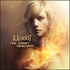
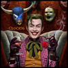
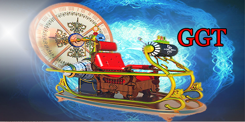
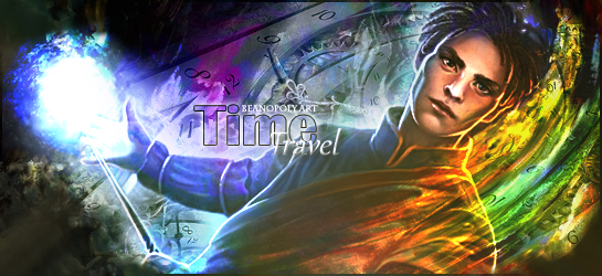
1B - 5/10 - Decent attempt, but there's a few flaws here that really detract from the general sig. I'm not familiar with the character so I'm not sure if there's an element of the time travel theme that is being followed here, so I won't comment on that. However, with the clock and the Eiffel tower, their blending is a bit off - they seem to be just pasted in without any regard for blending (some effects on top of them around the edges would help make it appear as if it was in the background). The fire effects are too bright, and a bit too sharp. Some blurring would have been nice, but it seems as though the foreground was sharpened without the background being blurred. Also, I think the choice of font for text could use a little work. Either way, I enjoy the effects. By the way ... what's with that face to the bottom right of the subject?


2A - 3/10 - To be honest, I'm not quite sure what is going on here. There's way too much blue just ... everywhere. I think the goal here is that there is supposed to be a sorceress looking through a portal of some sort at a futuristic time, but that's not what I'm getting here. What it looks like to me is there is a scene of rain that has been whitewashed at the bottom and ripped in the left side to reveal something else underneath (referencing the jagged edges). I think the biggest thing here is the white light - it's just way too overpowering relative to the brightness of all of the other aspects (rather, lack there of). One thing that would have helped a good bit is a thick black border, probably just the horizontal bars. That would introduce some contrast to the white light and make it less overpowering. Additionally, the top right corner is quite bare - I'd suggest putting some sort of moon in there, maybe a few space stocks set on screen to just add some diversity to the background. One thing I must say I like is the text though, good job on that.


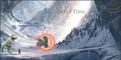
2B - 4/10 - While it is a decent sig, I'm not quite sure how much work was done here. My guess would be that there are two distinct backgrounds which meet at the white light (which might explain why there seems to be a bit of a blending problem to the left of the bridge), and then some dinosaur renders and that person (archer/hunter, maybe?). The background does look nice, and the green dinosaur to the left has colors that blend pretty well with the entire scene (though the blueish tint to the left of the dinosaur is a bit off. Mess with curves /levels to try and fix that). The biggest thing for me here is the RED portal on the blue/white background though. It simply doesn't fit - it's a huge eyesore. It is a better attempt at a portal than some of the other pieces, but it could use some work. Also, it seems like it was just "placed there". There's no interaction with the background - I'd suggest you try and make the portal light blue (replace the reddish color on the outside), and greyish-white (replacing the yellow). Then, maybe use a liquify tool on the background to try and distort it slightly to reflect a disruption in space-time. Other than that, decent idea, but a bit too simple for my taste.


3A - 1/10 - This is little more than a text slap. It seems like there's a stock background image off of google (which was placed incorrectly, there's an extra white pixel border on the bottom, though that could be due to the magic wand on the time machine which was then shifted up one pixel), which then has a render placed on it with some lighting that's way too bright and some text that just doesn't fit. Sorry if I'm being a bit harsh ... but there's just really nothing to like here. My assumption is that the artist here is submitting this as one of his or her first pieces ever, which is then acceptable. My advice would be to try and work on blending first and foremost, and then try and tackle the issue of color balance and lighting. Blending in this case could have been achieved by having some elements of the background brought to the foreground (maybe some lightning/ripples in front of the time machine), and a different color background could have worked better (unless a different effect was being attempted, but I would doubt that).


3B - 3/10 - This is roughly on the level of 2A. While it is a little easier to understand what is going on here, and with the theme fitting slightly more directly with the assigned topic, there's quite a few technical flaws that make this a very low scoring piece from me. First of all ... rule of thirds. NEVER  (with very few exceptions) place a render in the center ... always have the center /main part of the render 1/3 or so of the width off either edge, depending on the orientation of the render. For the background, I like the colors, though the blur is a bit extreme. Also, you'll notice that there's a bit of a failed effect on the right - I think the overlay stock that was used to color the entire image wasn't wide enough, or was shifted a few pixels to the left by accident. Either way, it's an eyesore. The large white building to the right is way too distracting, though I do want to point out that it fits the lighting scheme, so that's good. It's just that when you blur things, the lighting becomes more prominent (lighter things become even lighter, darker things become even darker), so because it already had a bright light on it that effect just got compounded and it becomes an eyesore. Finally I want to point out the terrible cut on the doctor ... that should have been fixed by blending the hair a little bit. And he's too blurry anyway. Oh, and fix the text while you're at it.


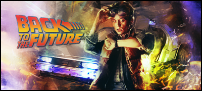
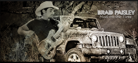
4A - 6/10 - Pretty obvious back to the future sig ... but I'll take it. No points lost for that. My main problem with this is that there is SO much going on - which isn't always a problem - in this case. The effects are pretty decent, and there's a good understanding of blending and lighting and such. I would have liked to have seen the character (Marty, is it?) be a little sharper and have the background have a bit more depth of field, which, in an item like a car, is pretty easy to achieve. Another bit to consider is that the entire left side is just too bright, and that brightness doesn't really follow a flow of the image (ie the general line of the car), it's just ... there. Same thing for the bottom right. While the colors are mostly spot-on, they're generally oversaturated. And I'm not exactly sure what's going on in the top right corner. Oh, and finally I think the sig is a little small for everything going on in it, but that's just personal preference again.


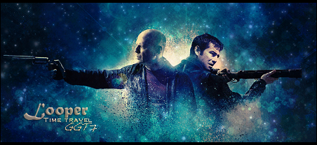
4B - 7/10 - I quite like this, actually. The colors are nice, the concept is great, but there are a few things that throw it off for me. First and foremost is those few lines coming from the white source of light ... it seems that there was a stock image off of a site that you forgot to erase lines from to purchase legally. Also, this does fit to the rule of thirds better than an example earlier, but it's still a bit off. The thing that I really don't like (and that might just be a problem with the way the renders are arranged) is that the guns go basically to the edge of the canvas, which is a problem in my eyes. Also, the blending for the renders, while interesting, needs some work to match the rest of the sig. The biggest thing was probably the text though - I think you can fix that bug by saving, closing PS and restarting. Other than that, I don't have much to say about it. Good piece.


5A - 7/10 - While I like the piece, I think it's overall a bit too dark. It seems like you just took a giant grey layer and set the opacity a bit low, darkening the entire thing while also "greying" it out. So the colors all seem a bit off to me. As for the piece itself, I think the abstractness of the entire image is great, it's well developed and it all fits. The two bright spots are REALLY overwhelming though, especially considering how dark the rest of the image is. Also, I think this might have been better served with less text and a slightly wider canvas.


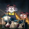
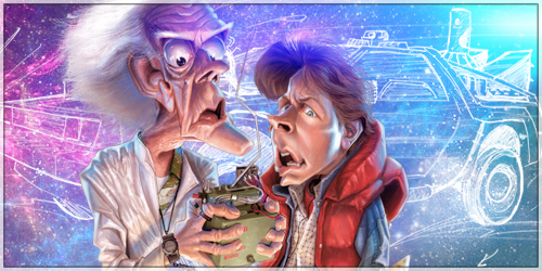
5B - 6/10 - This one is just WAY too bright for me. While lighting is good, too much lighting can obviously kill an image, as seen here. I like the idea of using the blueprint/sketch of the deLorean in the background, but I don't particularly like the caricatures of the characters. The colors themselves are pretty good, actually, and they reflect nicely onto the characters. However, there's just light EVERYWHERE. There needs to be some contrast, some dark area in this image, of which there is none. Your eyes are constantly redirected to different locations due to the multiple sources of light, so the characters don't get the focus they deserve. Instead of having light at the edges, you might want to consider having light behind the characters, throwing light at them while having the edges blackened/darkened/burned a little bit.


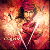
6A - 6/10 - I'm not quite familiar with this character, so as before, I won't be judging based on how well this fits the theme directly. However I will mention that the clocks and such overlayed in the background are a nice touch, they're implemented well. What sets me off about this one is how far the character is angled - if it wasn't fitting in the slot, try not to rotate it to do so next time, and just choose a different character. This might have been better suited to an avatar. Either way, I like the text a lot, this is probably one of the finest examples of text in this selection of signatures. I absolutely love the colors on the bottom right, but since those basically only work because of how far the character is rotated ... I'm feeling slightly neutral about them. You should work on improving the bottom left and top left though, basically the areas in the left apart from the big (perhaps too big) bright light. They're just a bit dull right now in comparison to the rest of the image. Also, on a whole I think the entire thing could do with a bit more black instead of the greenish brown that you've got in dark areas.


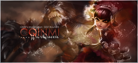
6B - 8/10 - I'd say this is one of the better pieces in this round. The first thing that strikes me is that there's a lot of fire ... while it is executed nicely in that it does flow and it does have some blur to add depth, it might have been more interesting if the fire started to thin out toward the top left and we got to see more of the space that's near Dastan's head (to his left). The text is done pretty well, though the "of" is slightly difficult to read - perhaps a stronger drop shadow was needed. The other thing I'm noticing is that the bottom right corner is just slightly too blurry, but that's a minor detail. You'll also notice that inside the border corners there's a bit of a bend in the inner glow, which means that there were better ways to get this effect than the technique used here (and as such to avoid those corner points). But, overall I'd say it's a pretty nice piece. I'd consider using this as a sig :D.


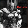
7A - 5/10 - It's a good signature, perhaps just with an unfortunate pairing. The placement of the various objects is pretty good, and there is some flow established with the moving particles. The render seems to stick out like a bit of a sore thumb, however, even though the colors match up nicely. Some more blending (through smudging, other various effects laid on top of him or otherwise) could really have helped. This is also the first sig that I think really does the clock aspect well, so kudos to you for that. The biggest thing for me here is the text though ... black text on a black background just doesn't do too well, even with a white outer glow. The subtext is nice, but that font and that color on the main text needs to go. One final note, I think this could have done well with a border, because with so much of the clock visible it leaves me wanting more, but that is almost cheated out of me with the sig with a lack of a border - an explicit denial of "more" would be less hurtful, and better for the sig overall.


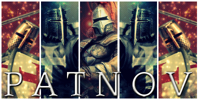
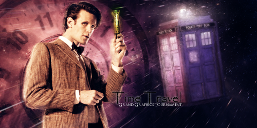
7B - 8/10 - In this case, the best really is saved for last. I've ranked this as the same as the 6B, simply because I'm not going to give decimal ranks. However, if I were I'd give this a slight edge over 6B, calling this the best in the group. I love the concept and the execution, it's done very well. There are a few things that stick out to me that prevent me from giving it a higher score, however. First and foremost it's that border around the entire sig ... for me, at least, when the large horizontal bars are used there shouldn't be any vertical bars - if there are, they should both be the same thickness. So that's a problem in my book. Also, looking at the bubble c4ds placed around the tardis in the 1886 version (and less visibly so in the 31440 side), I can see that they basically don't match the background. There are better ways of making the tardis stand out, of which I'm sure the artist is aware. I think it might have looked fine without those particular c4ds, perhaps even better. I do really love the split between the two halves though, very nice effects that I can't find any problem with. So good job. As a final note, the text is just crap in both. I understand that text is needed to prevent stealing, but I think in this particular instance the sig would look a LOT better without the text to distract you from the glory of the rest of it.


Sorry if I was a bit harsh guys ... but hey, it's the GGT. It's not meant to be easy :D. Hopefully people see my comments as helpful more than hurtful, even if people's egos aren't necessarily stroked by these comments. Sorry again :P.


#13 WarQueen

WarQueen

    Veteran

  • Members
  • PipPipPip
  • 2,185 posts
  • Badge

Posted 26 October 2013 - 04:56

The first round is the easiest ;)
Each round is harder until only the best is left


WarQueenSig1_zpsfe2b03d4.png


#14 artistgorn

artistgorn

    Veteran

  • Members
  • PipPipPip
  • 695 posts

Posted 26 October 2013 - 05:28

Uhmm, I will vote tomorrow with my long comments. I can't write anything right now


Sxr2pU.png


#15 Patnov

Patnov

    Member

  • Members
  • PipPip
  • 382 posts

Posted 26 October 2013 - 09:54

Group 1

A: 7

B: 8

I like both, but A is a little bit to "fade" for me, in B i love the Eiffel Tower, the Pyramids and the Watches.


Group 2

A: 5

B: 4

In A i like the idea of the portal but to blurry and to big, B, the portal with the triceratops doesn't look right...


Group 3

A: 3

B: 3

To simple... both...


Group 4

A: 7

B: 2

I like both, but i check B on TinEye... 33 results, almost any work on it... =(


Group 5

A: 7

B: 4

I like A, but, again, i little bit to "fade", B funny but not my style...


Group 6

A: 5

B: 8

A, I don't know, i don't like the render, B awesome, maybe the best of this round


Group 7

A: 7

B: 8

I like them both, but B is better...


Edited by Patnov, 26 October 2013 - 09:56.

Patnovsig.png


Sig By DMR > Thx Dear, i love it!


#16 WarQueen

WarQueen

    Veteran

  • Members
  • PipPipPip
  • 2,185 posts
  • Badge

Posted 26 October 2013 - 12:52

votes updated...


WarQueenSig1_zpsfe2b03d4.png


#17 Mao

Mao

    Member

  • Members
  • PipPip
  • 341 posts
  • United States of America

Posted 26 October 2013 - 13:23

Group 1.


A )  7/10 Very well done the image of the women stands out nice. The detail used in the background is in good amount, nothing over used, good effects, and good font. Overall a great image it wasn't oversaturated with too much detail, gave it a very beautiful simple energetic look.


B ) 7.5/10 The detail in this one is a little overwhelming I feel it could of been toned down a little. The fire effect looks absolutely beautiful the main character sits perfectly in the image. The added detail used in the back the pyramids, Eiffel tower, and clocks were a nice touch, but I feel the Eiffel tower was unneeded, and could have been used better to spread the clocks out.


Group 2.


A ) 3/10 Nothing to extravagant I can say. The lighting, and water effects look great, but I feel the two main focal points of the piece the women, and object in the background are not focused on enough.


B ) 6/10 I think this is very well done the background is beautiful, the small portal used sticks out very well isn't drowned out by the rest of the image. I feel the dinosaurs, and human used should of been upscale compare to the overall size of the image to add a little more detail, and a better font type or maybe just a little more detail would of added to the piece.


Group 3.


A ) 0.5/10 This was not done well.


B ) 0.1/10 Blurry, pixilated, poor choice in font along with very little overall detail.


Group 4.


A ) 6.5/10 I feel a little to many effects were used perhaps tone that down a little bit next time. The font fits perfectly, the placement of the car is great, but I feel this could of been looked at a different angle giving more view of it. The main character is in a great position, and has good detail, but the expression he has on his face seems wrong for how the tone of the image is set.


B ) 8/10 This looks beautiful I enjoy having something in the background a building, vehicle, anything that adds depth to the image, but even without this the image speaks for itself. The star detail compliments the two people in the image, the font used is placed perfectly, and the overall size seems right on. I have very little negative to say about this piece. I feel the artist could of added more detail, but with the detail used I feel it came out perfect.


Group 5.


A ) 8.5/10 This is perfect in my eyes. The only thing I would change is the character used for the image, but to each their own. The detail, font, sharpness is just great. The ability to simply notice everything without struggling is placed perfectly. I can't honestly say anything negative about this piece. I do wish the artist expanded the overall size of the image, but never the less it is fantastic.


B ) 6.5/10 Beautiful piece, very different, and unique a very great different look on how it was created. The down side is besides how different it is visually the characters, and the car outlined used I don't see much else that is attention grabbing, but still very well done.


Group 6.


A ) 6/10 The picture looks great, but the overall detail of it looks a little dull. The background is more beautiful than the actual image used, along with the effects used. I feel that if positioned differently more upright, and maybe a more symmetrical effect used it would of been better.


B ) 7.5/10 The overall completion of the image fits together great. The only thing standing out is the planet in the right hand corner, but the colors used flows together perfectly with the image it adds a very nice subtle detail. The character stands out great really good choice of positioning. The only downside is the effects used that spread out to the left of the image, from the characters knife/hand. I feel it is empty, maybe move the font over to the right a little more, and cut a good chunk of the left side off. Making the overall image smaller, or add something to the left for a little more detail.


Group 7.


A ) 6.5/10 The image is done up very clean looks great, and nothing is out of the ordinary, but the overall concept seems lacking. The size of the image makes me feel like there should of been more. I don't get a strong vibe of time traveling, more of a universal stand than anything else. Adding some more effects or changing the background would of been great, but other than that what was used, was used very well.


B ) 8.5/10 This piece reminds me of Group 5/A it's simply perfect. While I'm sure there are small things that could be looked at, and changed I feel the artist knew what they were doing, and simply did this image how they felt it should of been done. I truly don't think this artist needs any help with their work. They have this down lock, and key. I get the feeling they know what they wanted from the start, they spent a great amount of time both creating, and editing it to their exact feel of how the image should look, and that it is what it's supposed to be.


P.S While this is the first time I've voted in the GGT in a long time, I don't exactly remember why we can only use 15 points for judging these pictures. I came across this at least three times when I wanted to give one piece a higher score then I did, but simply couldn't because I gave the other piece a decent score too.


Mao2_zpsd2e6a8ef.png


#18 WarQueen

WarQueen

    Veteran

  • Members
  • PipPipPip
  • 2,185 posts
  • Badge

Posted 26 October 2013 - 13:27

P.S While this is the first time I've voted in the GGT in a long time, I don't exactly remember why we can only use 15 points for judging these pictures. I came across this at least three times when I wanted to give one piece a higher score then I did, but simply couldn't because I gave the other piece a decent score too.


It's to prevent multiple ties. If there's only 15 points to be given, people can't be handing out 10/10s to every piece all the time. ;)


WarQueenSig1_zpsfe2b03d4.png


#19 clock96

clock96

    Veteran

  • Members
  • PipPipPip
  • 880 posts
  • Badge

Posted 26 October 2013 - 15:05

GROUP 1

A)7

B)8- this one is better because of combining ancient things like the Pyramids and The Eiffel Tower


GROUP 2

A)6

B)10- I like the Graphics more in this one


GROUP 3

A)10- I prefer this one

B )4- the rendering in this one was bad , part of the hand is erased


GROUP 4

A)8- the work on this one is better

B )7


GROUP 5

A)9- this one is more related to Time Travel

B)6


GROUP 6

A)5

B)10- this one is one of the best in this GGT :)


GROUP 7

A)5

B)10- this one also is super , one of the best , the idea of the sig here is amazing


Edited by clock96, 26 October 2013 - 15:06.

clock96.gif


#20 beanopoly

beanopoly

    Member

  • Members
  • PipPip
  • 182 posts

Posted 26 October 2013 - 16:51

G1
A- 6
I like the layering and usage of the subtle colors but not sure if I like the girl subject
B- 3
The over concept is not bad but the execution colors are a little off for me. Too much on the red contrast for my taste


G2
A- 2
I can't really make out the image and the layering seems off to me.
B- 2
I think the theme for time travel but not too creative on the design

G3
A- 2
Theme makes sense but design is lacking
B- 1
Not sure about the theme nor the design

G4
A- 5
I get the theme but I am not sure about the creativity of the design or usage of text to enhance the design
B- 6
The subject is goo and layout works but the thing the bothers me is the usage of dissolve on one of the cloud or mist layer.

G5
A- 10
I think this is the best one out so far, I love the usage of the colors, the layering and the text position and layout looks great. This designer has skills in my opinion.
B- 5
This sig concept is ok. I understand the subject matter and interesting render but not sure of the design overall

G6
A- 8
The layers and and usage of color blends well and you can see that by the glow on each side of the subjects face and body. You can see the subject blending with the character.  The subject is moving/spinning through time so the angle signifies that.
B- 7
The theme works and text works well in this sig but I am not sure about the time spend to make this sig.


G7
A- 4
matched the theme but the layering and blending of the subject is not there in my opinion
B- 8
I like the overall design and creativity.  There are a lot of elements to this design and love the fading/blending of the periods together.  The thing that throws it off for me is that it is missing a subject the is traveling through time.  I have respect for this designers skills.


Ultron_zps605d70ae.png


Made by Chagryn


0 user(s) are reading this topic

0 members, 0 guests, 0 anonymous users

Font:
Arial | Calibri | Lucida Console | Verdana
 
Font Size:
9px | 10px | 11px | 12px | 10pt | 12pt
 
Color: