Please include a short reason with your vote, and keep the tally.
A ) Shiver--> 
B ) Kisoku --> 
Edited by MyCurse, 11 May 2015 - 04:20.
Posted 09 May 2015 - 06:13
Please include a short reason with your vote, and keep the tally.
A ) Shiver-->
B ) Kisoku -->
Edited by MyCurse, 11 May 2015 - 04:20.
Posted 09 May 2015 - 06:57
Posted 09 May 2015 - 17:48
Not sure if we could vote for ourselves, but
A-1
B-1
You certainly have improved and all the things Donce stated about your sig is true, but it lacks the basic essentials that signatures have: light source, blending, and flow. Your work kinda reminds me of my old style when I first started ahah.
Posted 09 May 2015 - 18:53
Not sure if we could vote for ourselves, but
A-1
B-1
You certainly have improved and all the things Donce stated about your sig is true, but it lacks the basic essentials that signatures have: light source, blending, and flow. Your work kinda reminds me of my old style when I first started ahah.
A-1
B-2
Thank you for the compliment though im lacking some keyfactors, I can't see whats going on in your signature. I can just see some green. Pitch black and a glowing green capsule...I don't really see flow or depth since its so dark.
[Not being rude or knockong on your art, I like that you have a unique style of art] Its just i really can't see whats going on in the signature and it bugs me. For all i know there isn't depth or flow in it  is the only reason the darkness bugs me
Edited by kisoku, 09 May 2015 - 18:59.

Posted 09 May 2015 - 19:24
A-1
B-2
Thank you for the compliment though im lacking some keyfactors, I can't see whats going on in your signature. I can just see some green. Pitch black and a glowing green capsule...I don't really see flow or depth since its so dark.
[Not being rude or knockong on your art, I like that you have a unique style of art] Its just i really can't see whats going on in the signature and it bugs me. For all i know there isn't depth or flow in it
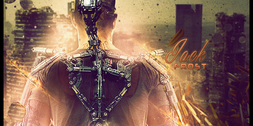
Derp, if I have to point out everything about my sig and reiterate basics (don't worry, this isn't directed at you, and it should help others here):
Flow: What direction is the signature going towards?
Depth: Is there something being focused? Does the render look closer to the front than the background?
Light source: Where is the light coming from? Take advantage of the original light source that's already on the render.
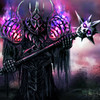
A. I manipulated the C4D's to make the flow of the signature towards the left with the render
B. Original background: http://hdw.eweb4.com/out/383219.html I recolored it to be more green, flipped it horizontal, and blurred it more in the back than in the front.
C. The tank thing on this back gives off light, not to mention most of the lighting already on the render is behind him. So, since I chose a background that took place at night, it made sense to darken the overall sig.
Posted 09 May 2015 - 19:33
A-2
B-2
My vote is for A.
A- Contrast too dark. Great color and layout.
B- Contrast too bright. Slighty too wide but looks very good. Maybe place text closer to render 
Very good battle guys!

So who wants to buy me Zombie Brand on League of Legends?
Posted 09 May 2015 - 20:10
A-2
B-3
This was a hard one at the end I had to flip a coin so B got my vote.
A-I like the green glow, I like how much of the render was used, I even like the darkness to it...it makes the green really pop.
If I had to point out any CnC is that I did not like the background but that's about it.
B-Hands down I liked the colors. The txt was very nice. I liked the brush effect behind the render. For any CnC I wish you used more of the render.
Great job to the both of you.
Waz's pet dragon 
Posted 09 May 2015 - 20:52
You both cancelled each other out by voting for yourself for some weird reason so I won't change the tally, but in the future - No, you can not vote for yourselves.
Neither can I vote, since I could be showing bias for the artist I'm closer too.
The sig battle is supposed to be anonymous, that's the whole point of it. Voters are supposed to vote for what THEY like.
I reveal names at the end.
Just putting this out there so you guys know.
Posted 09 May 2015 - 22:04
You both cancelled each other out by voting for yourself for some weird reason so I won't change the tally, but in the future - No, you can not vote for yourselves.
Neither can I vote, since I could be showing bias for the artist I'm closer too.
The sig battle is supposed to be anonymous, that's the whole point of it. Voters are supposed to vote for what THEY like.
I reveal names at the end.
Just putting this out there so you guys know.
I didn't know never entered one nor was the rules written my bad.
Edited by kisoku, 09 May 2015 - 22:06.
Posted 09 May 2015 - 22:10
You both cancelled each other out by voting for yourself for some weird reason so I won't change the tally, but in the future - No, you can not vote for yourselves.
Neither can I vote, since I could be showing bias for the artist I'm closer too.
The sig battle is supposed to be anonymous, that's the whole point of it. Voters are supposed to vote for what THEY like.
I reveal names at the end.
Just putting this out there so you guys know.
But we can recognize styles lol. It might be better to leave out names from the topic titles, too, if possible.
Posted 09 May 2015 - 22:23
Perhaps, might have to make another opinion poll on that...
I just did it the way Treefrog did a few years ago using the same template.
For now let's just keep it this way - I'm sure not everyone can recognize styles, and those who can - well keep mum about it lol.
Edited by MyCurse, 09 May 2015 - 22:23.
Posted 10 May 2015 - 11:16
Aww you people started without me!
My vote goes to : A [Could the OP please decide the tally?]
A: It's too dark. I don't like that. but it has a certain flow that runs all over the piece even circling behind the focal. I like that.
B: Too wide, Too bright, No use of lighting at all.
Feel free to leave out the names from the title. But I believe a title with some interesting names brings more voters out of curiosity
I would still prefer if the people battling organized things among themselves. Decide whether to keep it anonymous, who makes the posts etc.
If you are trusting a third person to do it for you, please do not reveal any information not dealt by the OP. If you think something should be necessarily included or discluded - PM the person responsible. Goes without saying, do not put any recognizable text on the piece. If others can guess your style, let them.
Edited by Pix3, 10 May 2015 - 11:20.
Posted 11 May 2015 - 01:06
When does this vote end?
They are both nice.
A~ I like the dark feel to it but I don't like the text font
B~ I like the use of color but I don't like how thin the sig looks
they both have there ups and downs so I want to split my vote. In past votes we were allowed to split the vote. Not sure if we can here but I'm doing it.
A 3.5
B 3.5
still a tiebreaker
Sexy and I know it.
Posted 11 May 2015 - 02:16
My vote goes to A
A-4.5
B-3.5
A- I love the flow you have created with the curved c4ds and your greens are terrific against the dark background. Normally I would criticize the darkness in the sig but it really works in this piece.
B-Really for me this sig just has too much going on and there isnt enough contrast. The brightness doesnt work well with the render and it draws attention to all the empty space you have. Your effects dont create much of a flow and scatter your colors too much. However, the piece does have a lot of good aspects of it and effects.
Sorry but Photobucket decided to take down my Signature.
Posted 11 May 2015 - 02:32
You win Shiver congrats .
My first signature ever using a C4D. Feels rough to lose but i expected to lose from the start.
Edited by kisoku, 11 May 2015 - 02:32.
0 members, 0 guests, 0 anonymous users