The avatar I created during this tut isn't the best, and wasn't meant to be...merely an example on the techniques described...
O.K., I'm going to start with a pretty simple avatar and we can build on that...my goal here is to get you up and running as quickly as possible for the simple reason that the longer it takes the more your avvies are going to come out like mine, and we want you to have your own style...
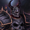
I downloaded the .png...always make sure your renders are .png files because they support transparancy....jpg files work like a canvas, that is to say that anything that isn't covered by your picture is white...jpg and .gif files support transparancy, so your pictures don't have to be square they will be whatever shape you make them...so here's an example of what I mean:
This first picture is a png file that I opened over a red background

Here is that same file as a jpg opened over the same background:

You see how the jpg filled in the background with black because it can't handle the transparancy.
OK...so now we know that png files can handle transparancy and jpgs can't...
So, we download the render in a png file so that we can put it in front of the background that we want without having to cut out the black/white/whatever that a jpg will put around our render.
Next thing we need to do is decide how to resize our render...the particular render that we have here started out 800x785 and we can only use 200x200 images...so we use the cropping tool to get it to the right size...this is a trial and error operation...what I usually do is start out by picking the smaller of the two original dimensions and just squaring it off...so for this one I made the box 785x785 and centered it so that 7 pixels were cut off of one side and 8 off of the other...then I try resizing that to 200x200 to see where we're at...for that you go to Image/Scale Image...make sure you change it to cubic instead of linear interpolation...this will make the quality better after scaling...

OK...at 200x200 the image is too small and you can't make out the details. Also the image quality is diminished quite a bit...so now we know that we have to cut out some of the image to get a smaller starting point so that we don't have to shrink it quite so much...I try to keep the main focus of the image centered and start cutting with the least important parts or the extremities that are unnecessary...for example if there's a long sword sticking out on one side you can lose part of that sword and people will still know that the sword sticks out past the frame...here I think we can lose allot of the brown on the bottom and some of the tails on the top without really losing the essence of the picture...

You can see that this makes the character much clearer...I ended up cutting the picture down to 500x500 and centering it using the x: and y: coordinates located on the bottom half of your main GIMP window...now that we have our character set up we can start with the background...
Now for the background...the simplest background to use is a fractal...a fractal is just a cool looking 3d design that is computer generated using algorithms that we input the variables for...there are some really easy to use fractal generators out there and GIMP has one built into it...you can go to Filters/Render/Nature and find flame and IFS fractal generators...play around with these to see what they do...another program that's really popular for making fractals is apophysis...either way a fractal is a cool design that you can put behind your character to break up a flat background color and they are easy to manipulate to match your render...

Note that because we are using the fractal as our background it doesn't matter if it's a jpg or png file...if it's a png with transparancy(not all png files will use transparancy) you can make a new layer with a base color to put behind it...
If the colors don't fit with your image just highlight that layer and go to Colors/colorize...play around in there and you can change the colors easily...
Now that we have a couple of layers it's important to note that as you work you should save projects as xcf files...that is to say avatar.xcf ... xcf are GIMP files and you will be able to open them and continue working as if you never stopped...I have an xcf file for every avatar I've ever made...png and jpg files don't support layers, so when you save them everything gets smashed together into one layer...
Now, for our first sample avatar all we really need is the name and guild name...go to dafont.com as they have tons of good, free fonts...once you have selected and installed your desired font a good way to make it blend in is to use the eyedropper to get a foreground and background color from your picture(make sure that the layer you are trying to grab from is highlighted)...you then write the text where you want using those colors:

Now, you can barely make out where the text is let alone read it, right?? So, what we're going to do is this:
1. Create a duplicate of each layer with text.
2. Right click on the original layer and choose alpha to selection.
3. Go to Layer/layer to image size.
4. Go to Select/Grow and grow the selection by 2 pixels.
5. Go to the Edit menu and fill the selection with the opposite color as the one you wrote in.
Now we can see the text clearly:

Still doesn't look quite right...so what we're going to do is select that original layer again and go to Filters/Blur/Gaussian Blur...I like to do this twice with each piece of text...
Next in your layers dialog up at top where you see Mode: Normal play with the different modes to get the effect you want for that text...for your name I used multiply and for your guild I used subtract so you can see the different effects that made:

I know it's not great, but like I said it's a simple one to start out with and get you playing with GIMP...this is how most of my avatars were made when I first started...