Jump to content

Photo

GGT Round 3 Voting (Mythology)


  • Please log in to reply
20 replies to this topic

#1 Chagryn

Chagryn

    Veteran

  • Members
  • PipPipPip
  • 995 posts
  • Badge

Posted 29 December 2014 - 03:41

OFFICIALBANNER_zpsb3f0bfcc.png


Welcome to the 8th Grand Graphics Tournament -- ROUND 1!. Artists are coming up together for an epic battle to see who's the best artist of the moment! Who wins?


You're the one who will choose!


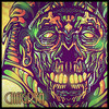
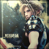
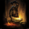
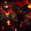
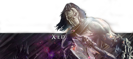
This week's theme is : Mythology


Artists were asked to create a piece of art depicting a something related to Mythology.  


HOW TO VOTE

Please rate each entry in each group on a scale of 1 to 10 with a vote of 10 being 'this blows my mind it is so good' and 1 being 'this is boring'.

You have up to 18 points to distribute between the two entries in each grouping.

You DO NOT need to give out all 18 points. The MAX you can give is 10 points on 1 piece per group.


Please include a reason with your votes - you only have to give a reason for one per set. It doesn't have to be technical. You can just say I liked this one best, or something along those lines but we all know an artist thrives on feedback so don't hesitate to really say what you think.

Example:
 

Group 1:
a 10/10 - I like it, it is a decent composition. / Good but could use (insert suggestion)
b 5/10 - I don't care for it. / Needs work


Votes that do not have a reason will not be counted!

**Artists, you may vote, but do not skip your own group, votes will be adjusted when tallied.**


Please vote for every grouping.


On behalf of my fellow artists, thank you for taking the time to vote !


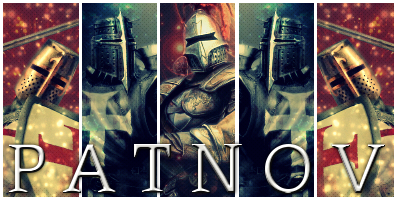
This week we say good bye to fellow artists: Flamer, Crzy, and Patnov. 


Group 1:

c_zps52fd9521.png


d_zps955fb0e8.jpg


Group 2:

GGT8Round3_zps0e41350e.png


a_zpsfbddc9e6.png


Group 3:

b_zpsa9c673fc.png


BrandSig_zpsf2e5098b.png

So who wants to buy me Zombie Brand on League of Legends? 


#2 ghetoghost

ghetoghost

    Veteran

  • Members
  • PipPipPip
  • 1,564 posts

Posted 29 December 2014 - 04:15

Overall, all these pieces are amazing! Competition arose in this round by a lot. 


Group 1:

A:5 - I really don't know what to say about this piece. Compared to the others its eh.

B:7 - Great piece! I love the text, it's a perfect fit. The background, flawless. I like it!


Group 2:

A:8 - My favorite piece! I just like the effects, only reason why its my favorite.

B:7 - Nice! Reminds me of LP and Grimm


Group 3:

A:7 - Anubis! The border around his head captures my attention and i like it for some reason. It's cool!


~ ~ ~ ~ ~ ~ ~ ~ ~ ~ ~ ~ ~ Live. Love. Learn. Die. ~ ~ ~ ~ ~ ~ ~ ~ ~ ~ ~ ~ ~


Are you an artist? Want to be listed as one under the Artist Directory; click here


#3 MyCurse

MyCurse

    Veteran

  • Members
  • PipPipPip
  • 670 posts

Posted 29 December 2014 - 15:29

First of all I really wish I could've participated in the GGT this year - the themes are so well rounded and broad. You have so much scope to showcase creativity. The last time I participated we had themes like "Tarot Cards, Neon Gases, Destination Billboards etc." and though I loved the challenge it posed - I felt it limited me and other artists. 

So whoever is choosing the topics, good job!

Group 1A - 3/10. I see what the artist was trying to do but I think it's safe to say it didn't come off. At this stage and with such an excellent theme, I'd expect a lot better.

Group1B - 8/10. I really like the slickness of this piece. It's very similar to how JadeDreams used to do graphics, and I used to dig her style, so I dig this. 


Group 2A - 7/10. Love the smudging and lighting in this piece. Text is a bit too overstated and that yellow border is a huge no-no, but otherwise very well done.

Group2B - 8/10. Keep it simple! Very nice, clean piece. I love the monotone look. If you added the yellow lighting on the render then fair play to you person - it's an excellent touch. The text is a bit iffy but that's not too important.


Group 3A - 5/10. I like the idea, but there is a lot of room for improvement in this one. Looks a bit rushed.


#4 Chagryn

Chagryn

    Veteran

  • Members
  • PipPipPip
  • 995 posts
  • Badge

Posted 30 December 2014 - 04:07

come on guys we need some votes. These rounds are getting better! 


I will donate 1 avatar or sig to a random voter in this thread. If anyone else would like to donate work just post. Maybe we can pull some people in!


BrandSig_zpsf2e5098b.png

So who wants to buy me Zombie Brand on League of Legends? 


#5 Kurban

Kurban

    New Member

  • New Members
  • Pip
  • 3 posts

Posted 30 December 2014 - 04:18

I say group one has done the best great concept and detail


#6 Cat Girl IRL

Cat Girl IRL

    Veteran

  • New Members
  • PipPipPip
  • 501 posts

Posted 30 December 2014 - 05:52

1 A: It was hard to get to the flow at this picture. Once I noticed  the character is a centaur though, I realised what were done here. There is really not much room for adjustments so I give you 8.


1 B: Ah medusa. Great choice for character and the image flow is just fine, but I get conflicting feeling when I see the star effects on the background, it reminds me of 80's scifi movie dune. (It's great btw.) I give you 6.


2 A: I have no idea what the character is but this is near to perfection. Wow 10.


2 B: Skyrim it seems to me. Anyway theres very much red in the picture, too much. The text doesnt work with the overall image. It could be cause of the borders. Yes text and borders clash in the image. 4


3: I hate the character, hate the smudge work, but I have never seen anyone use symbols in the background so creatively and the background is nice + the box in the head somehow works with the image verywell. Overall very great work. 9


#7 SlntScream

SlntScream

    Member

  • Members
  • PipPip
  • 466 posts

Posted 30 December 2014 - 16:20

Group 1

A: 4 - Hmm, it's okay, but a bit messy and I'm not a fan of the color choices. Had to score this low due to it not being up to par with the others.

B: 10 - Love it


Group 2

A: 9 - Sexy~ (Lol) I must say this is an interesting interpretation of Faun.. might have fit better in the horror theme round!! Over all great piece.

B: 6 - I like the simple and clean look, but it's too red and too dark imo. Had to search twice to see the text.


Group 3

A: 5 - This one is almost too simple, nothing really stands out for me. Also, massively overused render.


TluddMk.png


#8 cordio

cordio

    New Member

  • Members
  • Pip
  • 21 posts

Posted 30 December 2014 - 18:57

1a Has a good idea, but too confusing to follow what is going on especially at the bottom. 4/10


1b Is sharp and clean, wonderful use of color to balance the elements. A lot going on but forefront hold its place while the rest is good eye candy.  The only draw back is the large amount of text -it is too much and too small and blocks/ distracts from the rest of the piece. 8/10


2a Great detail work in the face. The background on the left is nice in the way it accentuates the fore ground. The background on the right however needs a little more detail. I understand it is be cloudy, but a think a small bit more detail is desired to have a better idea what it is. 7/10


2b I like the mono chrome usage in the whole room and the idea. Well drawn, but certain parts put me off personally. Mainly a think certain thinks are a bit overboard (for me) - the ears seem too big, the feathers on head seem a little too much, and the skull seems out of place. 6/10


3a I really like the choice. Seems a little fuzzy, but I think that is what was being shot for. Would be lice to see a small touch more detail in his body. The square around the head throws me way off -don't like it at all. Otherwise it is the best of all the pictures for theme. . .it is the most mythological by far. 9/10


Hope that was helpful. :)


#9 winemaker

winemaker

    Member

  • Members
  • PipPip
  • 448 posts
  • Badge

Posted 31 December 2014 - 00:17

I am by no means a artist so don't let my taste or option stop any of you from what you love doing.  

Group 1:

A:5 - not very clear but i like it anyway.

B:6 - its a good piece but no sure why there is a story on it.


Group 2:

A:6 - I just like the effects.

B:9 - Nice with a touch of oh yea.


Group 3:

A:6 -could use work but like the concept !


#10 Xed

Xed
  • United States of America

Posted 31 December 2014 - 02:57

Group 1:

A - Sorry, but gonna give this one a ...~1~..., simply because of the fact that not much work was done, I searched it on google and it was barely editted.

B - I like this one alot, text is the only thing throwing me off, I like the "Medusa" part of it, but the rest of the text seems to be in a different font that doesn't match well if you ask me. ...~7~...


Group 2:

A - This, this is awesome! I absolutely love this piece. I'm more of a "effects" kinda guy over simplicity in art, and this is what I personally like to see. ...~10~...

B - I like this one, but as I stated above, I'm more of a "effects" kinda guy, so this wasn't as exciting for although, for some reason I actually like it  quite a bit, just the "GGT8" text really ruins alot of it for me, you could have done some text somewhat like the "Medusa" one and that would have fit I think. All that in mind, I give ...~7~...


Group 3:

A - This is so simplistic yet...well..not! I like this one and would actually love to know who made it so I could get a avatar done that looks like this! Text fits, render fits, background fits, really nothing to complain about, except one thing, I personally would have tried to do a bit more with the render/background to make them "flow" together that much better. Gonna give this one a ...~9~...


TLDR - G1:1/7 G2:10/7 G3:9


P.S. Keep up the great work guys, sorry I just started voting, didn't even realize this was going on  :blink:


Xed.gif


Xed's Graphic Shoppe: http://forums.hunted...graphic-shoppe/


#11 drdoom123

drdoom123

    Veteran

  • Members
  • PipPipPip
  • 776 posts
  • Badge

Posted 31 December 2014 - 03:15

Group 1

A-7: the text is abit hard to read cause of the background but otherwise i like it.

B-10: I am just in love with this you can really feel like the eyes are piercing your heart i love it !!!


Group 2

A-8: this is really nice i love the way the font has been used i like it.

B-6: same with A on group one the text is abit tricky to see.


Group 3

A-9: This is kick ass perfect picture perfect font but whats the box around his head for ?


2u3y71v.png


Eldevin

drdoom123 - lvl EOC

AWhiteGuy - lvl EOC

Lowko - lvl 18 Ranger


Fallensword: drdoom123 lvl 824


#12 Patnov

Patnov

    Member

  • Members
  • PipPip
  • 382 posts

Posted 31 December 2014 - 23:55

Sorry for letting you down guys, but i was on holidays... I love what you  have done, all the entries are amazing, i will take some time to vote tomorrow during the day... And HAPPY NEW YEAR!


Patnovsig.png


Sig By DMR > Thx Dear, i love it!


#13 beanopoly

beanopoly

    Member

  • Members
  • PipPip
  • 182 posts

Posted 03 January 2015 - 18:36

Group 1

A: 6 - Good blending and effects on the artistic side.The thee selection is right on too.  The challenges I have are, this is not a sig size, borders are not even, and the font selection seems off to me so it is a bit hard to read.

B: 9 - Great theme and color selection, like this one a lot!


Group 2

A: 9 - Over all this is a great sig! Love the render for the theme and font selection is nice. The only CNC I would give is on the smudging on the right side.I would have liked too see a little more done.

B: 5 -  A bit plain and needs more I think. Seems unfinished to me.  The font selection is not good here because it is very hard to see.


Group 3

A: 4 -  I am not sure where to start with this one.  The smudging does not seem even and blend well. The over all image is a bit faded, unless that was what the artist was going for, but I would have wanted the render ore vibrant. On the positive side I like the effects layers with the characters and the render, eventhough over used is good for the theme.


just my 2 cents. :)


Ultron_zps605d70ae.png


Made by Chagryn


#14 ghetoghost

ghetoghost

    Veteran

  • Members
  • PipPipPip
  • 1,564 posts

Posted 03 January 2015 - 19:03

When does this end and when does round 4 start? 


~ ~ ~ ~ ~ ~ ~ ~ ~ ~ ~ ~ ~ Live. Love. Learn. Die. ~ ~ ~ ~ ~ ~ ~ ~ ~ ~ ~ ~ ~


Are you an artist? Want to be listed as one under the Artist Directory; click here


#15 Wesleysdf

Wesleysdf

    Veteran

  • Members
  • PipPipPip
  • 4,011 posts

Posted 03 January 2015 - 21:16

Group 1:

a) Text failed hard on this one. Plus, with mythology theme I think you could had chosen a better image to work with. Yours would fit better in fantasy or something along those lines

4/10

B) Can't find nothing wrong, but I won't give the 10/10, this is already for other piece in this round :P Good work here

9.5/10


Group 2:

a) I can see some small flaws on this signature but the amazingness of the smudging, border and text overcomes them. Absolutely mindblowing. 10/10

B) Again, fantasy theme would be better on this one. Anyways, the photomanipulation is good, I guess... but the text is not convincing. 7/10


Group 3:

a) 5.5/10 The smudging on the render is bad, seems unfinished and that it doesnt belong there. Im having trouble to see where is the focal point. Overall a few more adjustment layers could have done better the blending work


Edited by Wesleysdf, 03 January 2015 - 21:17.


#16 Chagryn

Chagryn

    Veteran

  • Members
  • PipPipPip
  • 995 posts
  • Badge

Posted 04 January 2015 - 02:02

When does this end and when does round 4 start? 


I plan on concluding voting around the 7th. Sorry I didn't put that. 


I'd also like to say thanks for voting everyone! Tell your friends! The free avatar from me will be randomly picked on the 7th as well. 


BrandSig_zpsf2e5098b.png

So who wants to buy me Zombie Brand on League of Legends? 


#17 JustChris

JustChris

    New Member

  • Members
  • Pip
  • 28 posts

Posted 04 January 2015 - 23:56

Group 1:

1: 5. This image is a little tame for me, all the others were bold and daring. Not a big fan, but still nice

2: 6. The eyes of this are what did it for me. The text could be removed, but all in all, I like it. I'd use it!


Group 2:

1: 8. I like the image itself, it's powerful, unfortunately it got stuck with the best opponent of them all this week.

2: 10 Love it. Love the colors, the shadows, the use of depth. My favorite of the bunch.


Group 3:

If number 1 of group 2 was in group three, that image would win.

1: 7 I like the face work and the color scheme, but the background and haze leaves something to be desired.


#18 Bacona

Bacona

    New Member

  • New Members
  • Pip
  • 1 posts

Posted 05 January 2015 - 04:14

Group 1: 

1: 7. I like the overall image, but the background is too light and airy-looking.

2: 8. A little distracting, but the eyes are very vibrant and stand out wonderfully.


Group 2: 

1: 8. Very nice image but the picture looks a too little washed-out.

2: 6. Cool picture, but the edges all seem too perfect and animated-looking.


Group 3:

1: 5. The way Anubis's head is framed makes his head seem off-proportional to his body.


#19 Chagryn

Chagryn

    Veteran

  • Members
  • PipPipPip
  • 995 posts
  • Badge

Posted 09 January 2015 - 06:19

~*~ Voting Closed ~*~


BrandSig_zpsf2e5098b.png

So who wants to buy me Zombie Brand on League of Legends? 


#20 Pix3

Pix3

    Member

  • Members
  • PipPip
  • 66 posts

Posted 09 January 2015 - 07:18

Group 1
 
A: 59
 
B: 94.5
 
Group 2
 
A: 100
 
B: 81
 
Group 3
 
A: 80.5

Edited by Pix3, 09 January 2015 - 07:21.


0 user(s) are reading this topic

0 members, 0 guests, 0 anonymous users

Font:
Arial | Calibri | Lucida Console | Verdana
 
Font Size:
9px | 10px | 11px | 12px | 10pt | 12pt
 
Color: